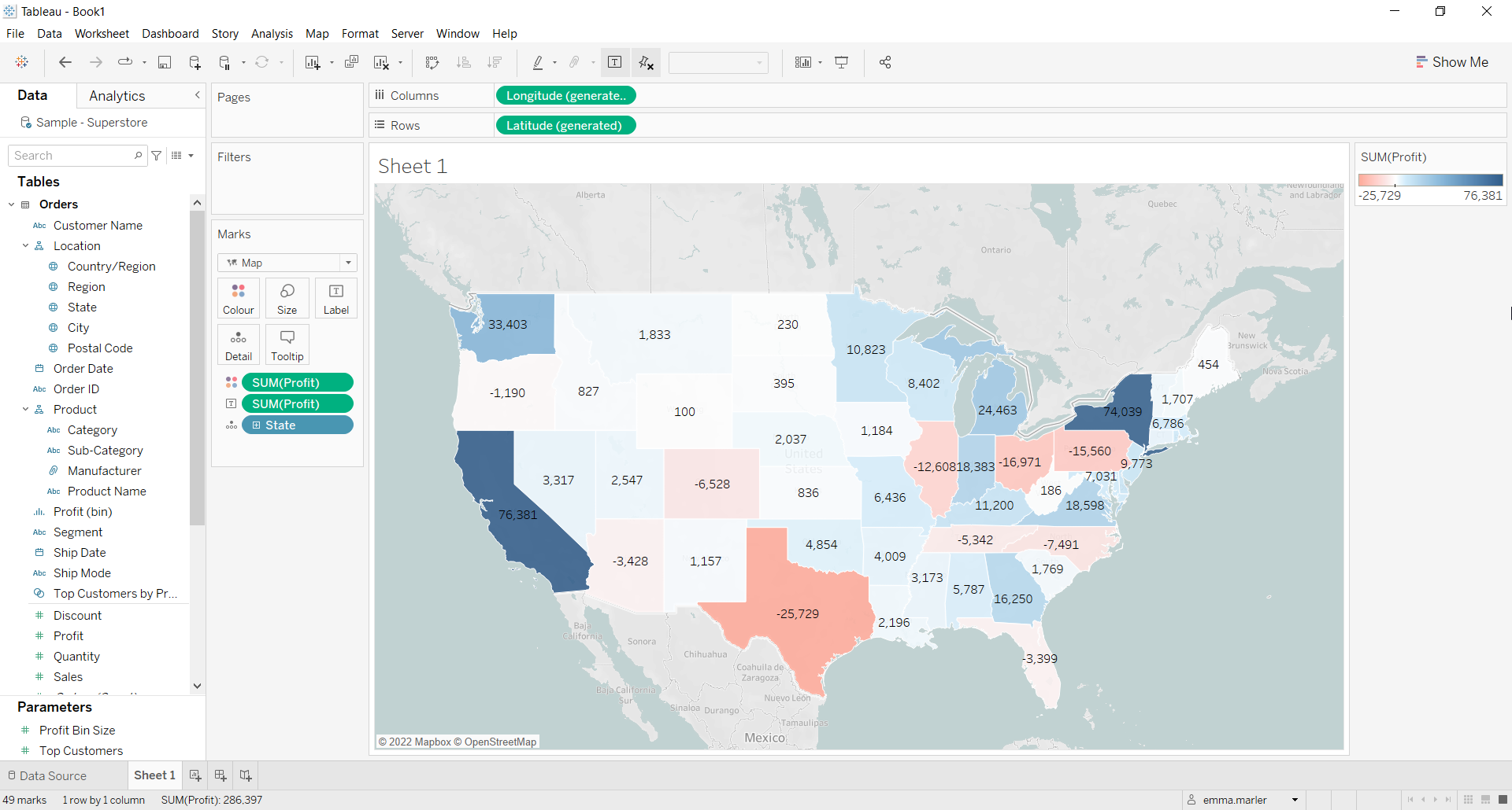
Choropleth maps are a great way to visualise regional patters or trends. A gradient color scale is assigned to ranges of values.
Let us then see how to build step-by-step a choropleth map showing profit by state on the US map from the Sample Superstore data.
Step 1. Create a choropleth map
- Connect to the data source Sample – Superstore.
- Drop State on the view.
- Select Map from the dropdown menu in the Marks card.
- Drag Profit on Color in the Marks card. You can choose the color palette you prefer from Color in the Marks card.

- Drag Profit on Label in the Marks card if you want. Done!

Don’t wait! Contact us to learn more and continue to follow upcoming news on our website and LinkedIn channel.