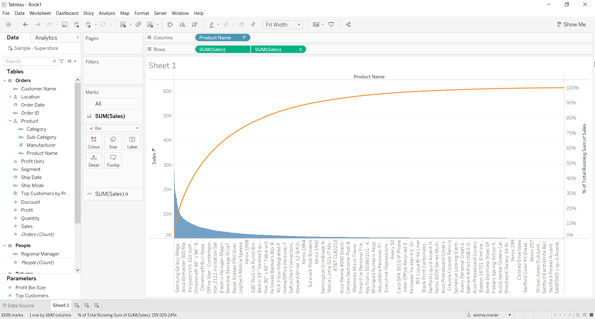
A Pareto chart is a simple bar chart that ranks related measures in decreasing order of occurrence, thereby measuring their frequency, and a line graph, which represents the cumulative total.
Let us then see how to build step-by-step pareto diagram on Tableau. Our goal is to create a graph showing the sales of the products contained in the Sample Superstore data.
Step 1. Create the chart
- Connect to the data source Sample – Superstore.
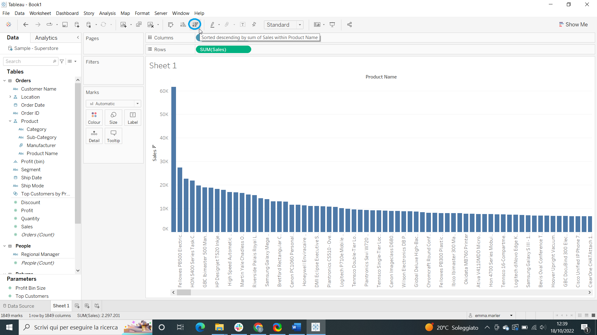
- Drag Product Name to the Columns. When asked, select Add all members.
- Drag Sales to Rows.
- Click on the descending order icon (marked with the blue circle).

- In the toolbar, select Fit width.
- Drag Sales on the right side of the view until a green rectangle appears.

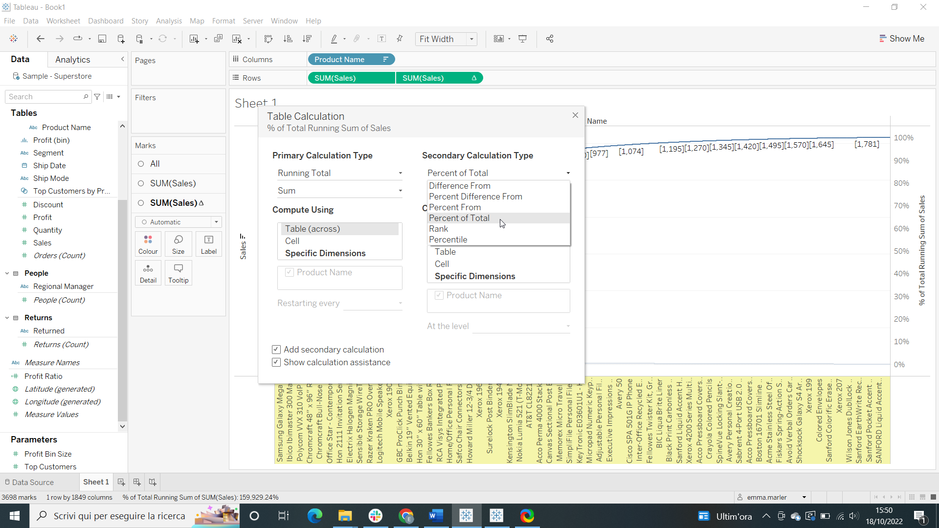
- Right click on the second SUM (Sales) tab in Rows. Select Quick table calculation > Running total.
- Right click on the second SUM (Sales) tab in Rows again. Select Edit table calculation, tick Add secondary calculation > Percent of total from the dropdown menu.

Step 2. Personaliz the chart
- From the second SUM (Sales) Marks card, select Line from the dropdown menu and assign a different color.
- From the first SUM (Sales) Marks card, select Bar from the dropdown menu and choose a different color if you want. Done!

Don’t wait! Contact us to learn more and continue to follow upcoming news on our website and LinkedIn channel.