Web accessibility for people with various disabilities is an increasingly addressed topic. It’s also possible to enhance accessibility in Tableau by creating dashboards that meet everyone’s needs with simple, yet significant, adjustments.
Visual disabilities
Visual disabilities vary, and there are certain considerations to make reading dashboards easier.
For people with low sensitivity to visual contrast, it’s better to modify the dashboard shading by clicking on format and setting the background to white, and making all texts black.

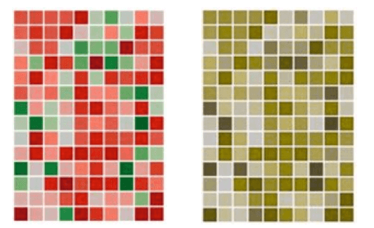
Another useful tip is to avoid using red and green together. In fact, many people have difficulty seeing these colors and perceive them both as brown, making it impossible to distinguish between red and green elements. Thus, the attribute of color would become almost useless.
How red and green are seen by many people:
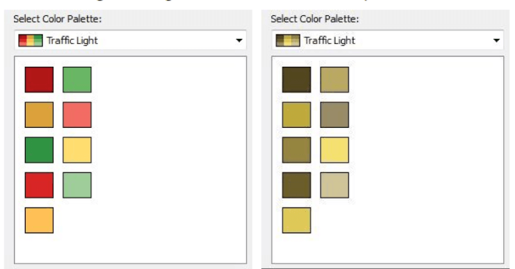
However, it’s not just red and green that are problematic. The traffic light palette, which also includes yellow and orange, is not well distinguished by many either.
How the traffic light palette is seen by colorblind individuals:
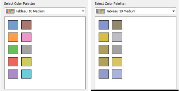
But pink and gray are also problematic when used together, as they are both perceived as gray by colorblind individuals.
How gray and pink are seen by colorblind people:
So, how can these issues be addressed?
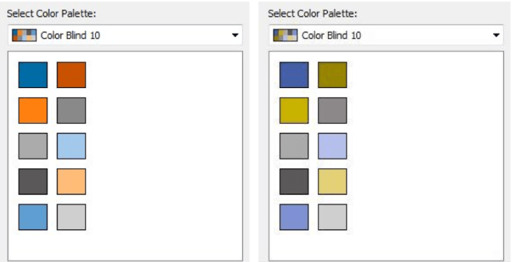
Tableau offers a “Color Blind” palette, which is suitable for people who have difficulty distinguishing certain colors. Color is a fundamental attribute for making dashboards more effective, so it’s necessary to choose colors that are also suitable for those who struggle to see them.
How the Color Blind palette is seen by colorblind individuals:
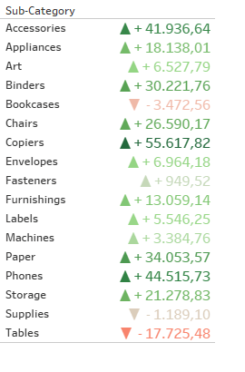
If it becomes absolutely necessary to use red and green together, it would be better to use additional elements to distinguish them. For example, if red is used to identify negative values and green for positive values, arrows pointing up or down could be added for clarity.
Learning disabilities
A very common learning disorder is dyslexia. To avoid misunderstandings in reading letters, it’s important to choose the right font. The font in question should not have too many curves, as italic fonts can be difficult for dyslexics to read. The best fonts are:
- Helvetica
- Arial
- Verdana

Another learning disorder is dyscalculia. In this case, it’s necessary to try to limit the use of numerical labels as much as possible. When necessary, use a simple-to-read font, like the ones previously mentioned. For people with dyscalculia, it’s better to use shapes and colors to make the data trends clearer.
For individuals with ADHD, it’s important to create dashboards with few elements, spaced well apart to avoid distractions. The layout of the dashboard should be carefully considered.
Motor Disabilities
In cases of motor disabilities such as tremors, it’s necessary to include tabs in the dashboards that allow navigation without the need to use a mouse. People with motor disabilities tend to prefer the keyboard, as it’s less complex to use. Find out which commands to use in Tableau.
Conclusions
Being inclusive is truly important, especially in the world of data. Data is the foundation of our society and must be made accessible to everyone. Therefore, as we have seen in this article, it’s not necessary to perform complex feats to help others, but rather to implement a few simple adjustments.
Read all our articles on Tableau.
Do you want to discover the latest features or delve into certain functions to become an expert?

Visualitics Team
This article was written and edited by one of our consultants.
Sources:
Accessibility, Fonts, and Dyslexia – www.medium.com
Best Practices for Designing Accessible Views – www.help.tableau.com
Build Accessible Dashboards – www.help.tableau.com
Creare dashboard accessibili – www.tableau.com
How to make dashboards more inclusive – www.thedataschool.co.uk
Making Dashboards Accessible in Tableau – www.thedataschool.co.uk
5 Tips on Designing Colorblind-Friendly Visualizations – www.tableau.com
Share now on your social channels or via email: