Forecasting has become a crucial element for companies wishing to fully leverage their data to optimize operational processes and improve their efficiency and effectiveness. This method relies on the analysis of historical data which, through the use of advanced statistical algorithms and machine learning techniques, identifies patterns and trends useful for predicting future events.
With today’s technological evolution, it is possible to process large volumes of data with precision and speed. As part of Var Group Data Science for Analytics, we support numerous companies that adopt this methodology to gain a significant competitive advantage. It is a key tool for anticipating market trends and guiding business decisions proactively. Forecasting is applied in various sectors, including e-commerce, healthcare, retail, and finance, demonstrating its versatility and cross-sector value.
In this article, we will look at the various forecasting analysis tools provided by Power BI.
Can Forecasting be done in Power BI?
Power BI is not limited to the analysis of current data but can also be used to predict future trends. There are mainly two tools with which to perform forecasting in Power BI:
- Time Series Forecasting in Power BI: Power BI provides users with a set of tools for time series analysis to explore trends and patterns in historical data and make predictions based on predictive models. The forecasting features are accessible and intuitive for users, as they allow modifying forecast parameters such as length, seasonality, and confidence interval directly from the graphic menu in the visualization panel. Add-in
- Extensions for Forecasting Analysis: Power BI can incorporate and utilize analysis tools such as R and Python, enabling users to leverage the libraries of these languages to create custom machine learning models and statistical techniques to generate forecasts.
To replicate the examples provided in the article, download all the necessary files here.
Time Series Forecasting in Power BI
As mentioned, Power BI offers multiple advanced data analysis features, among which the built-in forecasting is particularly noteworthy. This tool allows for simple and quick predictive analysis while maintaining the same data granularity. If you need to make a forecast for the next 30 data points, and by data point you mean “day,” then the historical records must report the measurement to be forecasted (numerical value) with a daily level of detail. If, on the other hand, by data point you mean “week,” then this will be the required level of detail to proceed with the forecast.
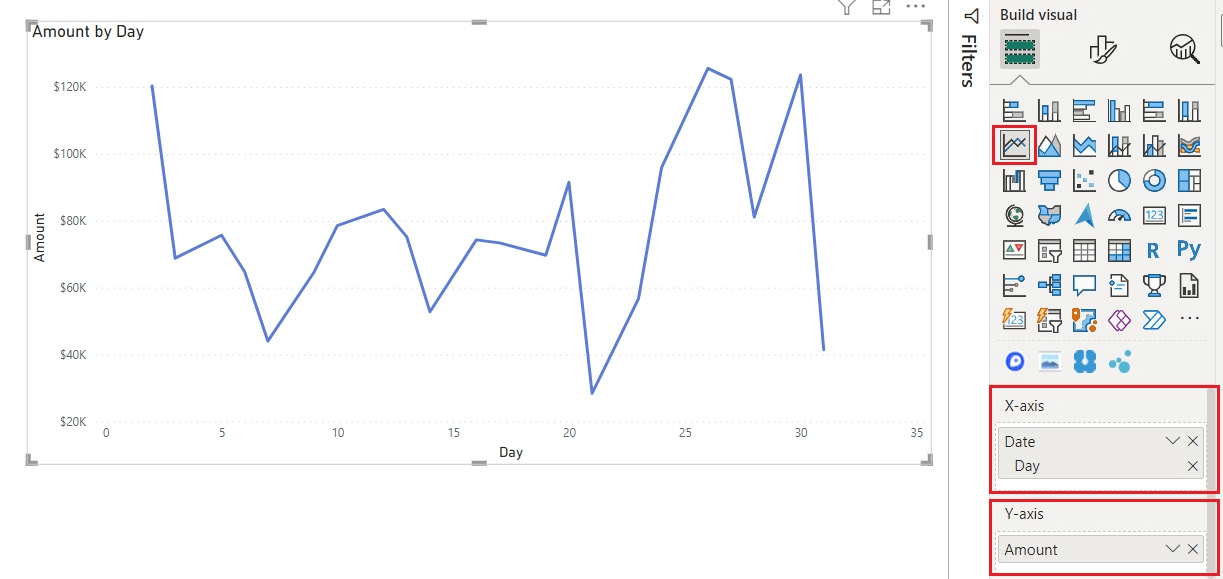
In summary, forecasting is a prediction with the same level of granularity as the data point used. After importing the dataset, temporal analysis via the built-in option involves using a line chart because it is essential to have a continuous temporal reference on the x-axis. On the y-axis, you will insert the aggregated measure, relative to the data point’s granularity level, for which we want to calculate the forecast. The dataset characteristics must be as follows:
- The X-axis displays continuous and uniformly increasing values (see data point granularity) with data type: date or date/time.
- The Line Chart must contain only one measure; it cannot, therefore, contain multiple “lines.”

To enable the forecasting option, select the third icon under the “Analytics” section and then activate the “Forecast” option. It is important to ensure that the right conditions are met to activate this feature, as forecasting is not available if Power BI does not detect any dates in the chart.

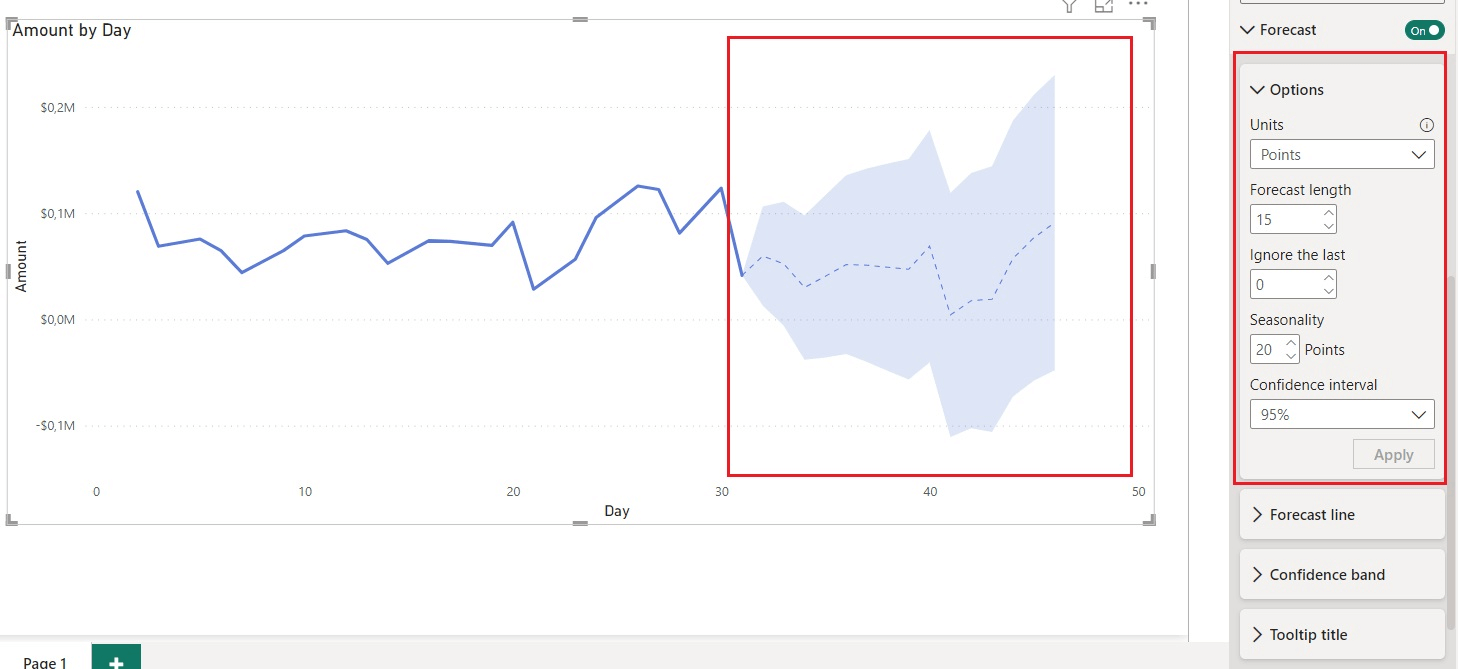
Power BI’s forecasting analysis includes several parameters that can be set to modify the final outcome:
- UNITS: Units are used to determine whether you want to make a forecast in years, quarters, days, or any other available option based on the type of dates present in the chart.
- FORECAST LENGTH: This corresponds to the length of the forecast. You can decide the number of units you want to predict. In this example, we use a forecast length of 15, which means we will make a forecast for 15 units, i.e., 15 days.
- IGNORE THE LAST: This option allows you to specify which values – and corresponding data points – to ignore when you believe that certain time intervals should not be included in the forecast analysis because they are associated with data considered not significant for the analysis. For example, a business might choose to ignore sales in August because it does not consider them representative due to the many holiday days when the business was closed.
- SEASONALITY: Seasonality is an option in Power BI used to identify certain trends over a specific period. It detects variations throughout the year. It is the period in which a certain pattern recurs multiple times within the forecast length. It cannot be greater than the number of units present in the chart. The larger the historical data relative to the number of units to predict, the greater Power BI’s ability to make more accurate predictions.
- CONFIDENCE INTERVAL: Finally, there is the confidence interval. This is a range that represents the estimate of a parameter. Although it is expressed as a percentage (e.g., 95%), it does not mean there is a 95% probability that the parameter falls within the two extremes of the interval. A 95% confidence interval means that if the forecast were repeated, in 95% of the cases, the interval would contain the actual value. The confidence interval is used, in other words, to determine the reliability of the value. A smaller confidence interval increases the probability that the actual value is not contained within the extremes of the interval because the estimate becomes more precise. Conversely, increasing the confidence interval increases the probability of finding the right range for the actual value but decreases the precision of the estimate.
In the image below, you can observe an example of the use of forecasting analysis in Power BI through the application of certain parameters. The dashed line represents the predicted values of Amount, while the blue band represents the confidence margin established by the chosen percentage interval value.

The forecasts in Power BI are based on a very complex forecasting algorithm called Exponential Smoothing. To be precise, there are two models of Exponential Smoothing: Seasonal Data (ETS AAA), which accounts for additive trends and seasonality, and Non-Seasonal Data (ETS AAN), a simpler model that considers only trends.
The ETS AAA model is also known as the Holt-Winters algorithm. It is the more complex of the two because it searches for optimal parameters to minimize the mean squared error (MSE) in the training model’s forecasts, taking into account not only the “closest” forecasts but also those with a longer time horizon, in order to reduce their variation and preserve the trend. Essentially, the model applies a weighted average of historical observations, giving more weight to recent observations compared to older ones.
In both cases, Power BI automatically applies the best algorithm based on the available data.
To replicate the example, refer to the Power BI workbook “PBI Forecast built-in and R Script.pbix” included in the “1_example” folder you downloaded.
Extensions for Forecasting Analysis
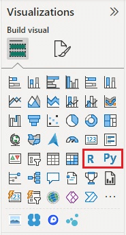
Power BI offers the capability to use R and Python libraries and tools as additional extensions to its existing features. For both programming languages, there are specific visuals available that enable direct insertion of code to create custom charts, which can then be easily incorporated into Power BI dashboards.

When you select the icon of one of these visuals in the Power BI visualizations pane, a new item is generated in the workspace, and a dedicated editor opens to insert the necessary code for developing the forecasting model. To integrate data into your R script, you simply drag the fields of interest into the “Values” section of the visualization configuration panel, following the same procedure applicable to any other visual element in Power BI. It is important to note that only the fields inserted in this area will be accessible and usable in the R script.
Note: There are some prerequisites for using R and/or Python within Power BI. You must ensure that R and/or Python are correctly installed on your local computer, along with the necessary libraries and packages for analysis. Additionally, R and/or Python scripting must be enabled in Power BI Desktop under File Options > Settings > Options > Global by selecting either R Script or Python Script, depending on which one you want to enable. Verify that the local R and/or Python installation is specified in the correct home directory.

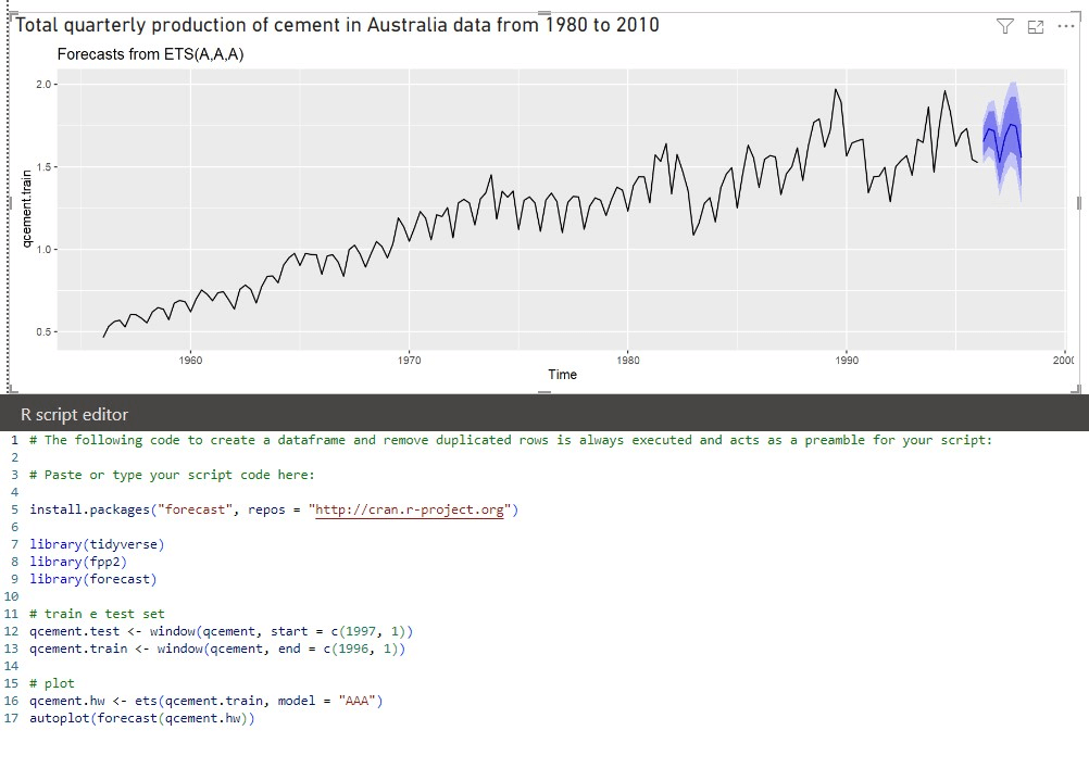
In the example shown above, we imported the libraries containing the necessary functions to apply a forecasting model based on the Exponential Smoothing algorithm, the same one used in Power BI. Using a sample dataset, we divided the sample into training and test sets using the “window” function. It is good practice to allocate about 70% for the training set, which is the portion of data used to train the model to make accurate predictions. The remaining 30% is used for the validation set (test set), which is a separate portion of data not used in the training phase and serves to evaluate the final performance of the model in terms of predictive capacity on new data. For this reason, we assigned the dates from 1956 to 1996 (40 years) to the first set and the dates from 1997 to 2014 (17 years, about 30% of the available dataset) to the second set.
After dividing the data into training and validation sets, it is necessary to specify which algorithm to use (ETS stands for “Exponential Smoothing”, line 16) by assigning it with the “model” parameter the method used by the framework: the first letter specifies the “error type”, the second the “trend type”, and the last the “season type”. In our case, “AAA” identifies an Exponential Smoothing Seasonal Data with additive error, additive trend, and additive seasonality.
The different color trails around the forecast line produced by our model in R show the two default confidence intervals established by R if no different values are specified: 80% (dark purple) and 95% (light purple).
In this case, we did not apply specific parameters to the model that would have produced a more accurate result. In general, the phases of training the model and validating it on the test set data are iterative, meaning they are repeated several times to find the best combination of parameters to achieve a more realistic forecast.
You are also invited to replicate the example starting from the Power BI workbook “PBI Forecast built-in and R Script.pbix“.
Comparison of Forecasting Techniques in Power BI
At this point, let’s assume we want to compare the forecasts produced by relying on the built-in option in Power BI Desktop with statistical models whose parameters can be specified by the user, thanks to the execution of Python scripts directly in Power BI. As mentioned, the ability to execute Python or R code is at the core of the add-in extensions for forecasting.
Below, a qualitative comparison will be presented between the actual value, the predicted value with the native and integrated option (PBI Forecast), and the forecasts calculated through the training of two models based on: SARIMA and Holt-Winters. The dataset we start from collects day-to-day sales transactions over a span of a few years starting from 2017.
Here is the setup of the example:
Dataset:
- Conversion of dates into the mm/dd/yyyy notation.
- Daily granularity, so sales are aggregated (summed) at the day level.
- Training set, composed of data in the time span 01/01/2019 – 31/12/2019.
- Actual values set, composed of data in the time span 01/01/2020 – 31/03/2020.
- Public visibility.
To replicate the example found in the folder “2_example”:
- The PDF file Instructions_and_Python_Script.pdf, containing instructions for creating the virtual environment and setup in Power BI Desktop. It also includes the basic code for fitting models that can be imported with the StatsModels library from Sci-kit learn.
- The dataset EXTRACT.csv, containing sales and the day they occurred – this is an extraction from the Contoso dataset freely distributed by Microsoft.
- The dataset Sum of Sales Amount by Date.csv, containing the sales projection calculated with the built-in forecast functionality in Power BI Desktop. Used to show a comparison in the dashboard between the forecasts calculated by different models.
- The PowerBI workbook Predictive_Analysis_Comparison.pbix, containing the report development code.
In Power BI, the Python script that manipulates data targets a tabular data structure from the Pandas library, the DataFrame, which by default is referenced through the variable ‘dataset’. This information is crucial to keep in mind when writing the code, as only these specific data structures can be stored and accessed also from the Power Query ETL environment. For this purpose, we chose to execute the Python script as a step in Power Query, then access the DataFrame containing the forecast result.
The sales series analyzed shows a weak trend and a seasonal pattern, not directly influenced by the passage of time. Therefore, we decided to resort to two well-established models (the process of hyperparameter estimation is beyond the scope):
- SARIMA (Seasonal AutoRegressive Integrated Moving Average) is the extension of the ARIMA model for historical series with a seasonal component.
- Holt-Winters or Exponential Smoothing (similar to what Power BI offers natively) with an “additive” model type.
The report consists of two pages:
- “Actual + Forecasting” displays three different line charts, showing the sales trend in the historical data, then in the training set (the historical series with which the models were fitted both through the Python code and through the built-in feature of Power BI Desktop), followed by the calculated forecasts.
- “Forecasting” shows the comparison on the same chart (activated via selection) of the values:
PBI Forecast, predicted with the built-in option of Power BI Desktop
SARIMA, predicted with the namesake model
Holt-Winters, predicted with the namesake model
and compared with the expected value, Actual values.
Taking into account secondary factors such as the knowledge of models and techniques for estimating non-ideal values of hyperparameters, the predictive analysis done by Power BI Desktop turns out to be of good quality and advantageous for its low operational cost. This makes Power BI a good tool, despite the limitation of not being able to directly access the predicted values and their confidence intervals, which are available only by exporting the data from the visual object.
Conclusions
To conclude, forecasting in Power BI allows obtaining predictive insights starting from a series of historical data already possessed. There are several tools capable of performing forecasting analysis, each with a different degree of user orientation.
Learn to create your Dashboards with Power BI
To learn how to create your own dashboards with Power BI and connect to data sources to build impactful interactive dashboards, sign up for our course.

Visualitics Team
Questo articolo è stato scritto e redatto da uno dei nostri consulenti.
Fonti:
- Describing the forecasting models in Power View: www.powerbi.microsoft.com
- ETS: Exponential Smoothing state space model, R Documentation: www.rdocumentation.org
- Exponential Smoothing in R Programming, GeeksforGeeks: www.geeksforgeeks.org
- Holt-Winters: www.statsmodels.org
- How to Forecast Data in Power BI, SQL Server Central: www.sqlservercentral.com
- Pandas DataFrame: pandas.pydata.org
- Python: www.python.org
- SAS, Analisi Predittiva: www.sas.com
- SAP, What is Predictive Analysis?: www.sap.com
- SARIMA: www.statsmodels.org
- Time Serie Forecasting with R (Part 2), Medium: www.medium.com
- Venv: www.docs.python.org
Condividi ora sui tuoi canali social o via email: