In this article, we will guide you through the process of creating a Sunburst chart, illustrating step by step how to do it on two popular Business Intelligence tools: Tableau and Power BI. The Sunburst chart is an effective visual representation for showing hierarchical relationships between various levels of categories and subcategories, allowing users to quickly understand the data structure and identify important patterns.
What is a Sunburst chart?
The Sunburst chart is an ideal tool for visualizing hierarchical data. Each level of the hierarchy is represented by a ring, with the innermost ring representing the top of the hierarchy.
Let’s see then how to build a Sunburst chart on Tableau and Power BI step by step!
How to create a Sunburst chart on Tableau?
Our goal is to create a chart that shows sales for each category and subcategory starting from the Sample Superstore data.
We start by connecting to the data source. After connecting, it is necessary to create a calculated field named “Position”, using the formula: MAKEPOINT(0,0).
Next, we drag this field into the worksheet. This action will automatically generate latitude and longitude values, which will be placed in the rows and columns of the sheet. Afterward, take the same “Position” field and drag it again into the sheet. This time, however, it is important not to release it in any position, but to place it precisely on the option “Add a Marks Layer”, which will be found at the top left of the screen.
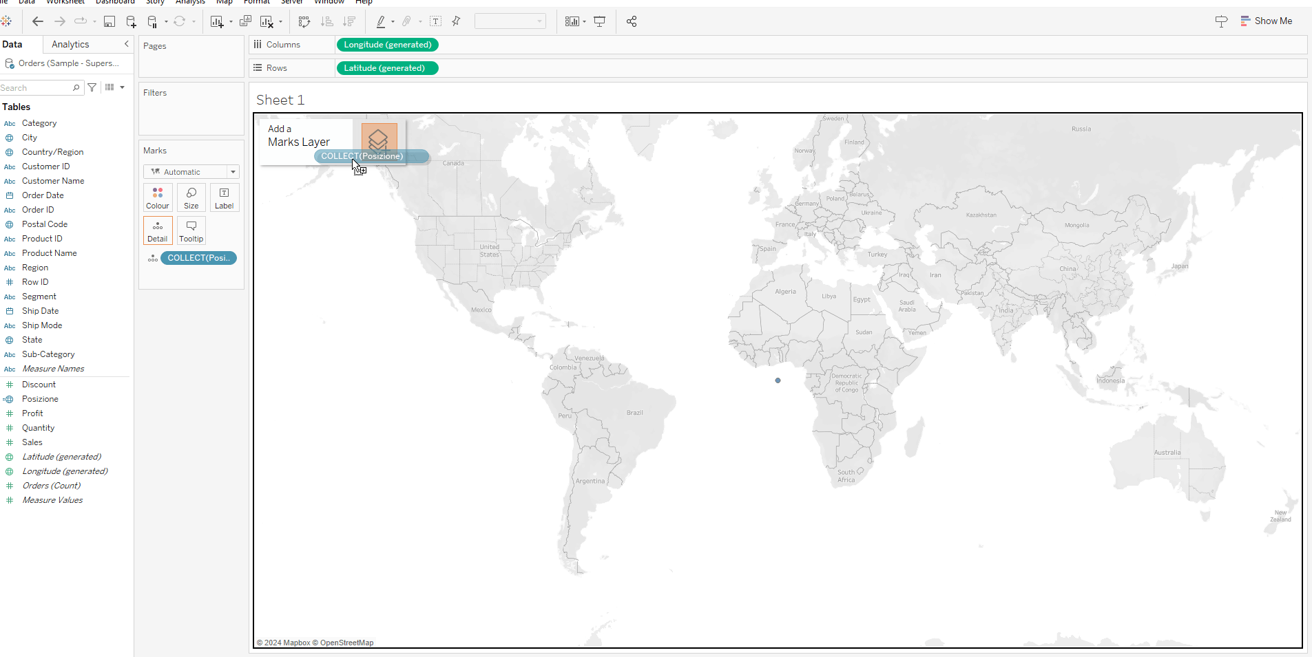
Then, the operation must be repeated two more times on the same sheet, in order to obtain 4 position fields in the Marks Card.
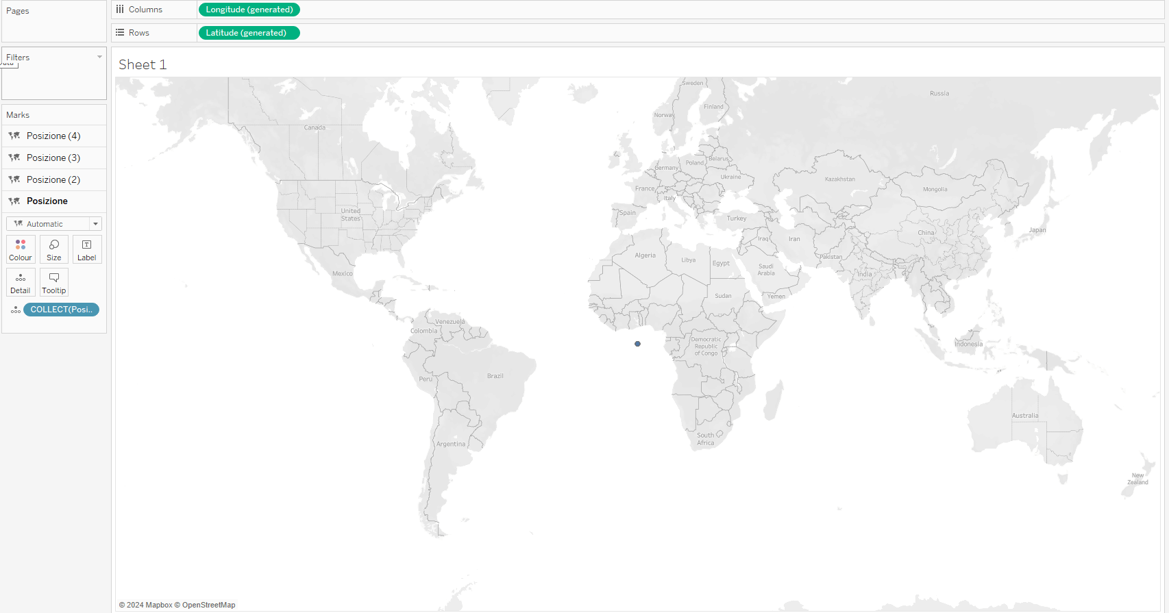
At this point, we need to remove the latitude and longitude fields.
To proceed with the creation of the chart, it is crucial to modify each single position in the Marks Card.
We start from Position 4: here, we set the color to white and change the marker type from automatic to circle. It is also necessary to slightly reduce the size.
Next, it’s time to organize our data in a more structured way. We drag the “Sub-Category” field onto “Category” to create a hierarchy.
We continue by selecting marker 3 and dragging “Category” onto color. Here, we set the Marks Card to display a pie chart and place “Sales” in angle.
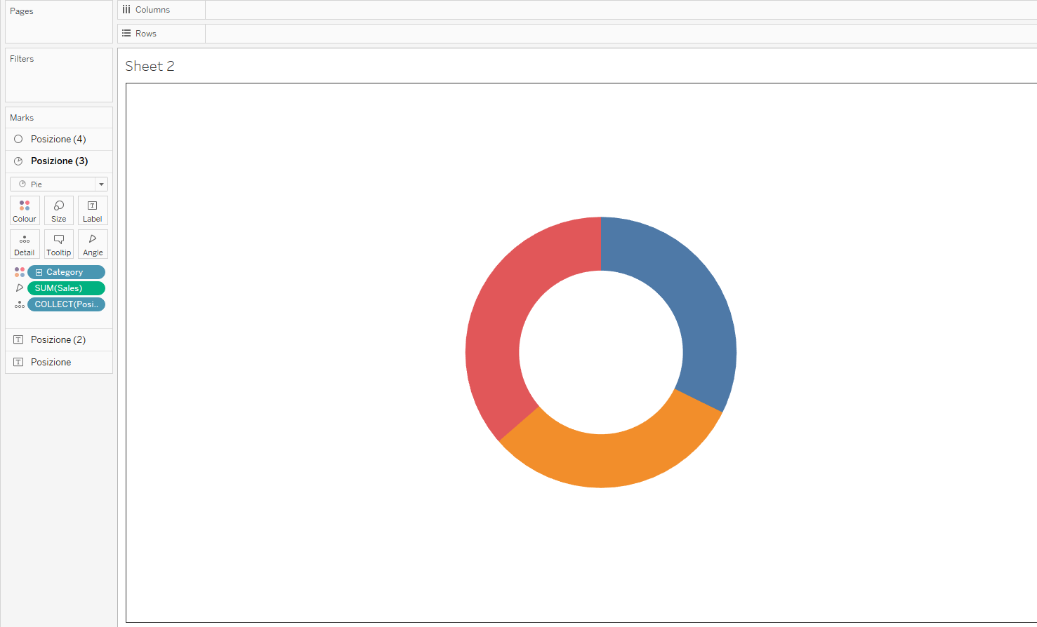
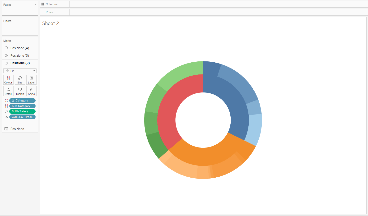
The next step involves working on Position 2, where we repeat a similar process: “Category” is dragged again onto the color section. We change the marker type to pie and insert “Sales” in the size, increasing its size for better visualization.
Finally, we expand our hierarchy by clicking on the “+” symbol next to “Category”, bringing up a new label “Sub-Category”. We click next to “Sub-Category” and select “Color” to add an additional level of detail to our chart, making it not only informative but also visually appealing.
How to create a Sunburst chart on Power BI?
The Sunburst chart is not included among the native visualizations offered by Power BI, so to proceed, it is first necessary to search for an appropriate custom visual. This can be easily done by clicking on the three dots located below the list of standard visualizations and selecting “Get more visuals”. This will open the catalog, where, using the search function, it is possible to quickly find the available options.
When adding custom visuals, it is advisable, if possible, to opt for those that bear the “Microsoft Corporation” brand. These visualizations are generally free and offer security guaranteed directly by Microsoft.
For the Sunburst chart, we particularly recommend the following:
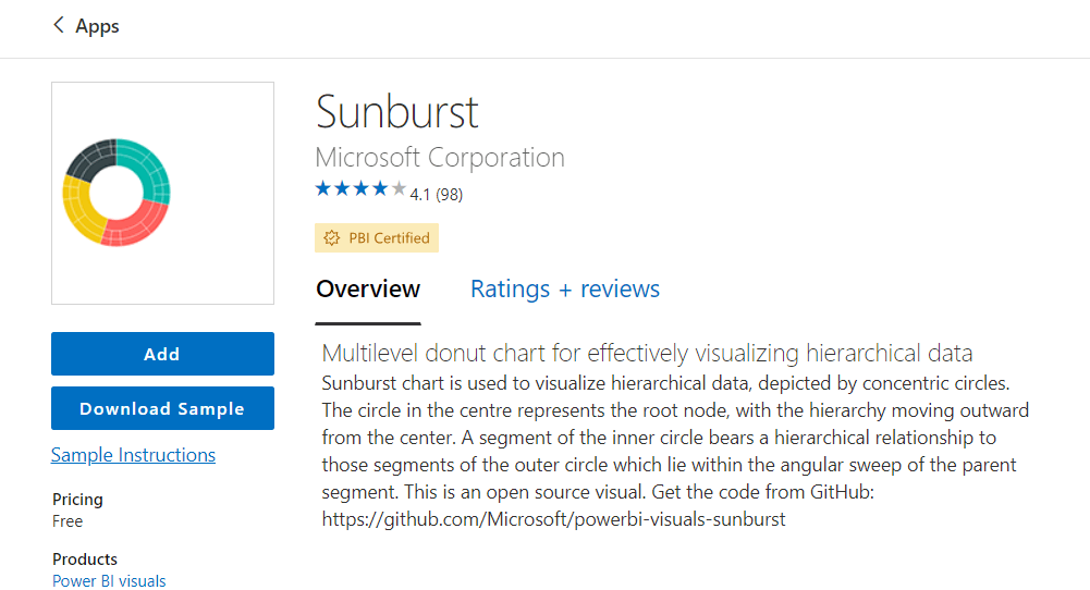
After selecting it, simply click on “Add” to see it appear on Power BI Desktop below the standard visualizations.
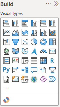
Clicking on the visualization creates an empty instance of it. At this point, it is enough to drag or add the desired fields into the Build Pane, placing the categories you intend to analyze in “Groups” (for example, Category and Sub-Category) and the measure to represent in “Values”.
By doing so, you obtain a first version of the Sunburst chart.
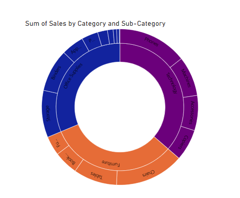
The next step involves exploring the formatting panel to refine the visualization. Here, you can adjust the title, labels, tooltips, and the coloring of the various elements of the hierarchy until achieving a functional and visually satisfying display.
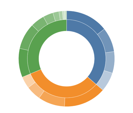
Benefits of a Sunburst Chart
So, what are the main advantages of choosing a Sunburst Chart in brief?
- It is a type of visualization that allows encapsulating information related to the composition of a total and the hierarchy of data in a single chart, clearly showing how the lower levels of the hierarchy (the outer rings) are related to the higher ones (inner rings).
- It enables viewing the data as a whole, enhancing understanding and improving the quality of one’s work.
- It helps to quickly and easily find the focus of the analysis.
What is the difference between a Sunburst chart and a Treemap?
The Treemap and the Sunburst allow for the representation of very similar data categories, but understanding the differences between the two is crucial to make the most appropriate choice for one’s type of data.
In particular, the Treemap is excellent for representing macro analyses about the composition of a total, but it can become difficult to read when a focus on a deeper level of subcategories is necessary. The Sunburst, on the other hand, is the ideal choice precisely when the analysis cannot be limited to a “high” level but requires a more detailed examination of what happens through the various levels of a hierarchy.
Conclusions
With a few simple steps, it is possible to construct a Sunburst chart both on Tableau and on Power BI. It is a chart that allows for the simple and fast representation of hierarchical data and enables an analysis among the relationships of various categories, and is definitely a type of visualization to consider for one’s future analyses!
Read all our articles on Tableau
Do you want to discover the latest features or delve into certain functions to become an expert?

Visualitics Team
This article was written and edited by one of our consultants.
Sources:
What is a Sunburst Chart and When to Use a Sunburst Chart in Excel – www.simplesheets.co
Share now on your social channels or via email: