“Datapedia” is our monthly column where we illustrate the meaning of terms often misunderstood and confused in the world of Business Intelligence (BI) and Data Visualization.
Many concepts may seem similar but have distinct goals and applications. They are often used imprecisely, causing confusion even among industry professionals.
In this article, we will explore some groups of terms and clearly explain what they indicate and when they should be used. We will examine the distinction between Data Quality and Data Cleansing to understand how they improve data reliability. We will compare Donut Charts and Treemap Charts to determine their best applications. Finally, we will analyze the statistical concepts of Mode, Mean, and Median to interpret and analyze data effectively.
Data Quality vs Data Cleansing: An In-depth Analysis for Business Data Management
Data Quality refers to the degree of accuracy, completeness, consistency, and reliability of data, ensuring it is suitable for the intended use. It includes attributes such as accuracy, completeness, validity, timeliness, consistency, and data integrity. The main goal of data quality is to ensure that data is useful and reliable for making informed business decisions.
Data Cleansing, or data cleaning, is the process of identifying and correcting (or removing) incorrect, corrupted, improperly formatted, duplicate, or incomplete data within a dataset. It involves activities such as removing duplicates, correcting formatting errors, filling in missing values, and validating data. The goal of data cleansing is to improve data quality, making it more accurate and consistent, thereby facilitating more precise analysis and reporting.
Comparison: Differences and Objectives
- Purpose: Data quality involves measuring and managing the overall quality of data, while data cleansing is a specific activity aimed at improving data quality by correcting errors.
- Focus: Data quality focuses on broad and continuous attributes of data quality, while data cleansing targets specific interventions to correct problematic data.
- Implementation: Data quality requires a systematic and ongoing approach to monitor and improve data, while data cleansing is an operational process performed at regular intervals or when specific issues are identified.
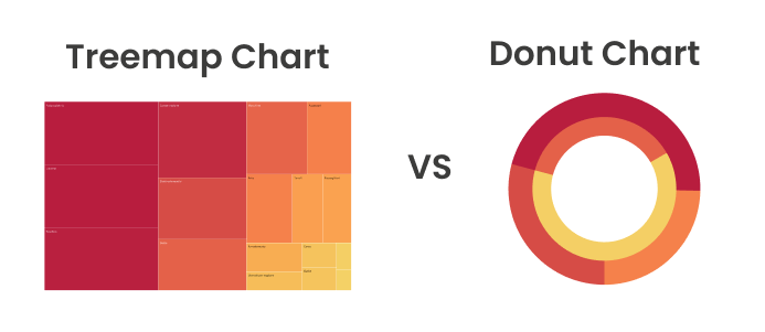
Donut Chart vs Treemap Chart: Comparing Data Visualization Tools
A Donut Chart is a variant of the pie chart, characterized by a central hole that makes it resemble a donut. This chart represents the proportions of parts of a whole, displaying the data in a circular form with arc sections. The central hole can be used to insert additional information, such as the total data value. This visualization is useful for showing the percentage composition of a small series of categories and is ideal for visualizing the relative proportions of a single series of categorical data, such as the market share of different companies.
A Treemap Chart represents hierarchical data as a series of nested rectangles. Each rectangle represents a category with a size proportional to the value of that category. It displays data as rectangles within larger rectangles, with the size of the rectangles proportional to the data values. This type of visualization is often used to display a large amount of categorical and sub-categorical data, particularly large volumes of hierarchical data, such as the distribution of sales by product in different regions or the structure of a website.
Comparison: Differences and Objectives
- Form and Representation: The donut chart is circular with arc sections, while the treemap chart is rectangular with nested rectangles.
- Visualization Capacity: The donut chart is limited in the number of categories it can clearly display, whereas the treemap chart can display many categories and sub-categories.
Mode, Mean, and Median: Statistical Fundamentals for Data Analysis
Mode is the value that appears most frequently in a dataset. It can be used for categorical, ordinal, interval, or ratio data. A dataset can have one mode (unimodal), multiple modes (multimodal), or no mode at all. For example, in the dataset {1, 2, 2, 3, 4}, the mode is 2.
Mean, or arithmetic mean, is the sum of all the data values divided by the total number of values. It is sensitive to extreme values (outliers). For example, in the dataset {1, 2, 3, 4, 5}, the mean is (1+2+3+4+5)/5 = 3.
Median is the central value of an ordered dataset, either in ascending or descending order. It is not influenced by extreme values and divides the data into two equal halves. For example, in the ordered dataset {1, 2, 3, 4, 5}, the median is 3. In a dataset with an even number of observations, the median is the average of the two central values.
Conclusions
In summary, these concepts represent key elements in data management and analysis. While Data Quality focuses on the overall accuracy, completeness, and reliability of data, Data Cleansing involves specific activities to correct and clean erroneous or incomplete data. Donut Charts and Treemap Charts are data visualization tools that, although both useful, differ significantly in their approach to data representation. The former is suitable for showing simple proportions, while the latter is ideal for visualizing large amounts of hierarchical data. Finally, Mode, Mean, and Median are statistical measures that, although all indicative of the central tendency of a dataset, offer different perspectives. The mode indicates the most frequent value, the mean represents the arithmetic average, and the median is the central value. Understanding these distinctions is fundamental for effective data use in organizations.
Become an Expert in BI and Data Visualization
If you’re looking to learn the fundamentals of key BI tools or become an expert in Visual Analytics, discover our training programs.

Visualitics Team
This article was written and edited by one of our consultants.
Share now on your social channels or via email: