As a team of designers specializing in Data Visualization, we share our 6 practical tips for creating the perfect data visualization. These suggestions come from years of experience working alongside businesses and clients across various sectors, aiming to make data clearer, more understandable, and useful for strategic decision-making. Good design is not just about aesthetics; it guides the viewer through the data, helping them uncover insights and tell a clear and engaging story.

The Importance of Design in Data Visualization
Data visualization bridges the gap between raw data and actionable insights. Without a solid design framework, even the best data might fail to communicate its message effectively. The role of design is to make data accessible by transforming it into visual forms that users can explore and interact with. Our goal is to present large datasets in an intuitive and visually engaging way. The more complex the data, the more essential design becomes to structure and simplify the information.

Key Design Principles for Effective Data Visualization
Clarity and Simplicity
Visualizations must be clear and easy to interpret. Avoid overwhelming users with too much information at once. When the dataset is large and intricate, simplicity helps focus attention on key insights. Start with a clear goal: what story should the data tell? Keep the design aligned with this goal by eliminating unnecessary visual noise.
Visual Hierarchy
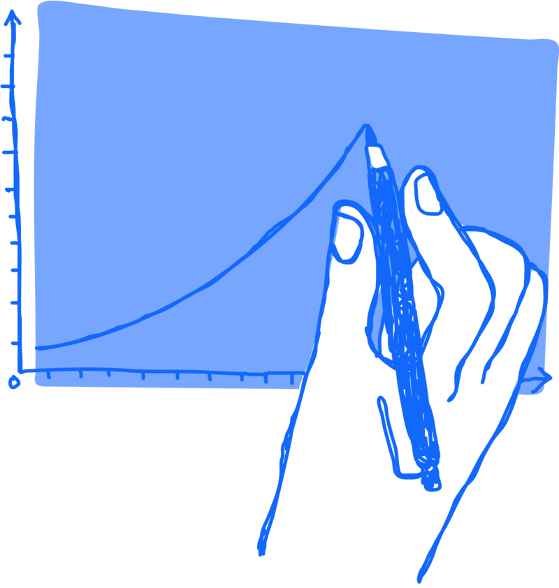
Good design leads the user through the data by establishing a visual hierarchy. This can be achieved using size, color, and positioning. Larger elements or vivid colors can highlight key insights, while smaller or muted details provide context without overwhelming the user. Structuring the visualization to reflect the natural reading process (top to bottom, left to right) improves usability.

Choosing the Right Chart Types
Selecting the right type of visualization is one of the most important aspects. Each dataset has a chart that suits it best. For example:
- Bar charts are ideal for comparisons.
- Line charts work well for showing trends over time.
- Maps are perfect for geographic data, showing distribution patterns across regions.
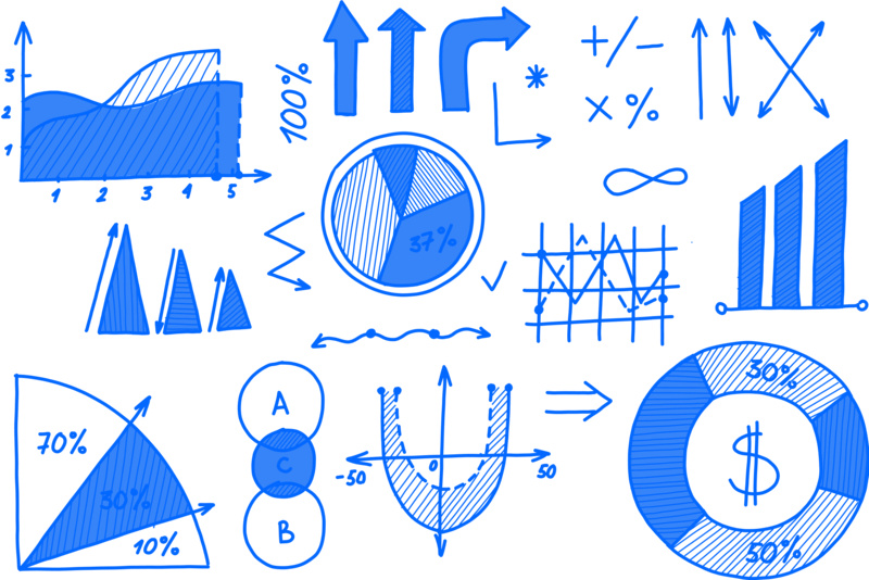
Always match the chart to the data type and the message you want to communicate. Misusing chart types can mislead viewers or make data harder to understand.
Color and Contrast
Color is a powerful design tool, but it must be used carefully. Colors can indicate different regions, categories, or trends. However, too many colors can confuse users. Stick to a color palette that enhances readability and maintains consistency.
Contrast is equally important—it helps differentiate between data points and highlight crucial information. For instance, using bright colors for key insights and neutral tones for background elements directs attention where it is needed most.

White Space and Layout
White space refers to the empty space around design elements and is essential for reducing visual clutter. A well-balanced layout allows users to navigate complex datasets without feeling overwhelmed. By strategically placing charts, text, and other elements and leaving enough space between them, the design becomes more understandable.
When large datasets are displayed over extensive geographic or conceptual areas, effective use of white space can help divide the information, allowing users to focus on each area or level of data without distractions.

Consistency in Design
Consistency in the use of fonts, colors, and chart types is crucial for creating a smooth user experience. When elements are consistent, the visualization is easier to follow and looks more professional and polished.
For example, if you use shades of blue for a region or category, keep that color throughout the dashboard or report.

Conclusion
Designing the perfect data visualization requires a balance between aesthetics and functionality. The goal is to make large and complex data sets understandable and useful through clear and intuitive design. By focusing on clarity and consistency, designers can create visualizations that are not only visually appealing but also provide valuable insights. Crafting an effective data visualization is achievable with these tips, regardless of the Business Intelligence tool used, whether it’s Tableau or Power BI.
Read all our articles on Data Visualization
Would you like to learn more about Data Viz and view the world through data?
Visualitics Team
This article was written and edited by one of our consultants.
Share now on your social channels or via email: