In this article, we’ll explain what an area chart is, its purpose, and why it’s useful. Additionally, we’ll walk you through how to create one step by step in Tableau. An area chart is a type of visualization used to represent trends in data over time and compare multiple data series in a single chart.
What is an Area Chart?
An area chart enhances a traditional line chart by filling the area below the line with color. It’s particularly useful for showing how a phenomenon evolves over time and for analyzing the performance of each subgroup, such as product categories, both in terms of total contribution and comparative performance (e.g., Category A vs. Category B).
When to Use a Stacked Area Chart
If your goal is to understand the overall trend of a phenomenon without losing sight of each subgroup’s contribution, then a stacked area chart is the best choice.
Let’s now see how to create a Stacked Area Chart in Tableau step by step. Our goal is to create a chart showing monthly sales trends for each product category over a selected year, using data from the Sample Superstore dataset.
1. Create a Stacked Area Chart
Connect to the Sample – Superstore data source.
Drag Order Date to the Columns shelf. Right-click on it and select the option Month (May 2015).
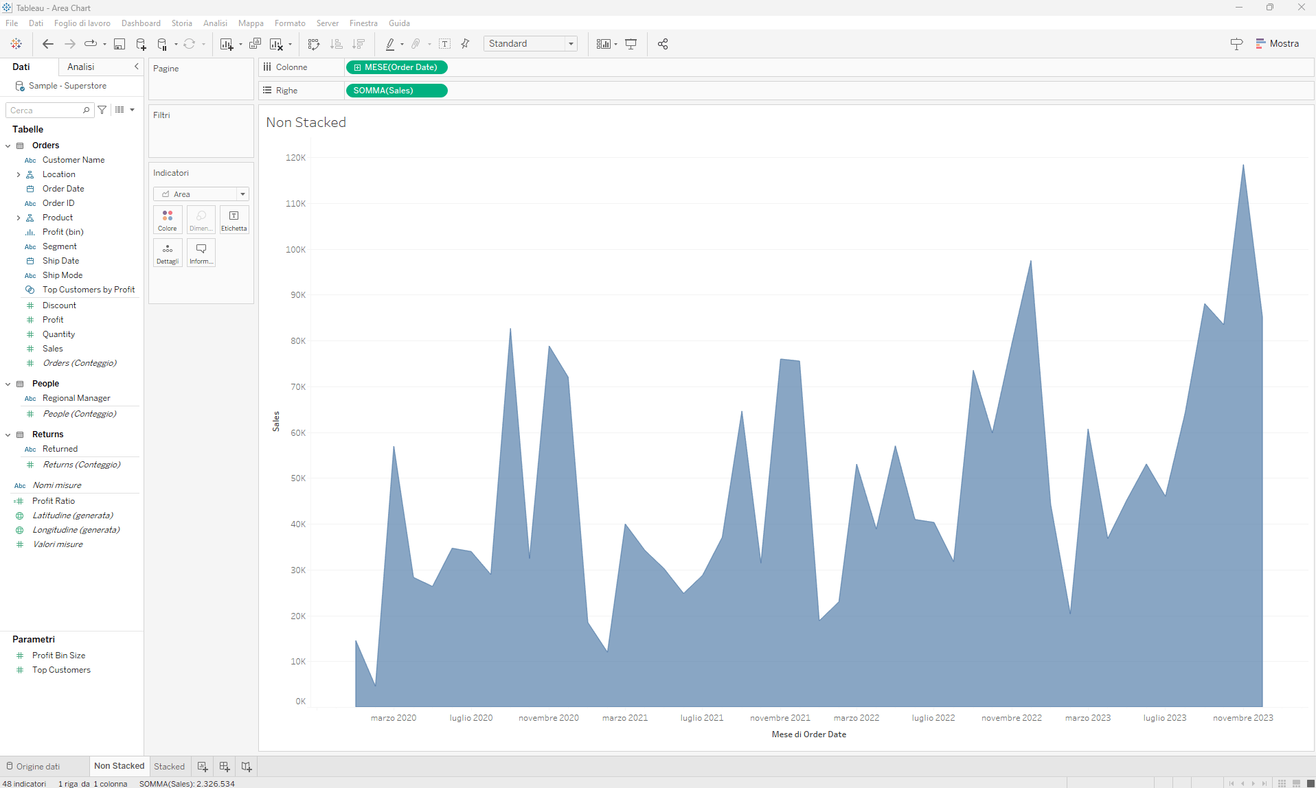
Drag Sales to the Rows shelf. Tableau will automatically generate a line chart.
In the Marks card, choose Area from the dropdown menu.
Area Chart
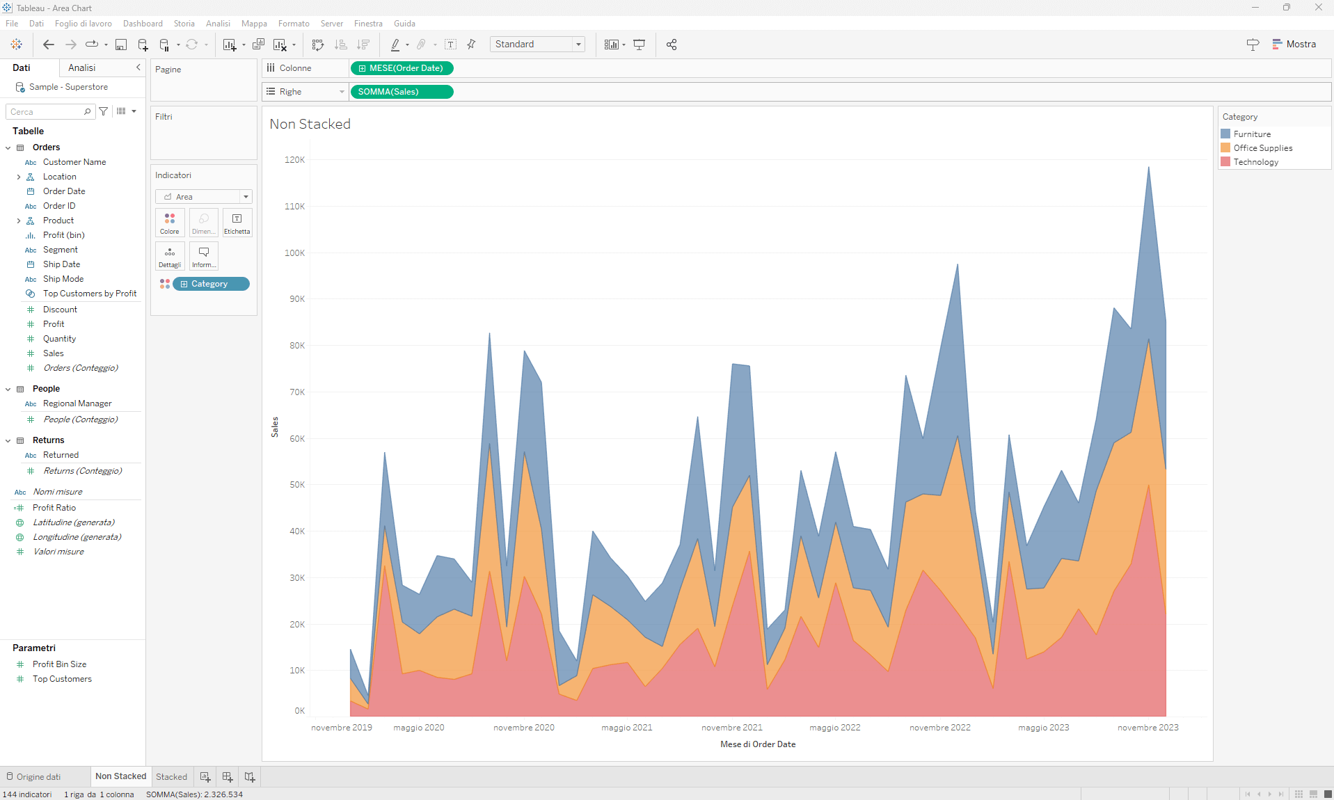
Drag Category (under Product) to Color on the Marks card. And there you have it!
Stacked Area Chart
When using a stacked area chart, be mindful of the number of subgroups/categories you’re representing. Too many categories can make the chart harder to read and confuse your audience.
When to Use a Non-Stacked Area Chart
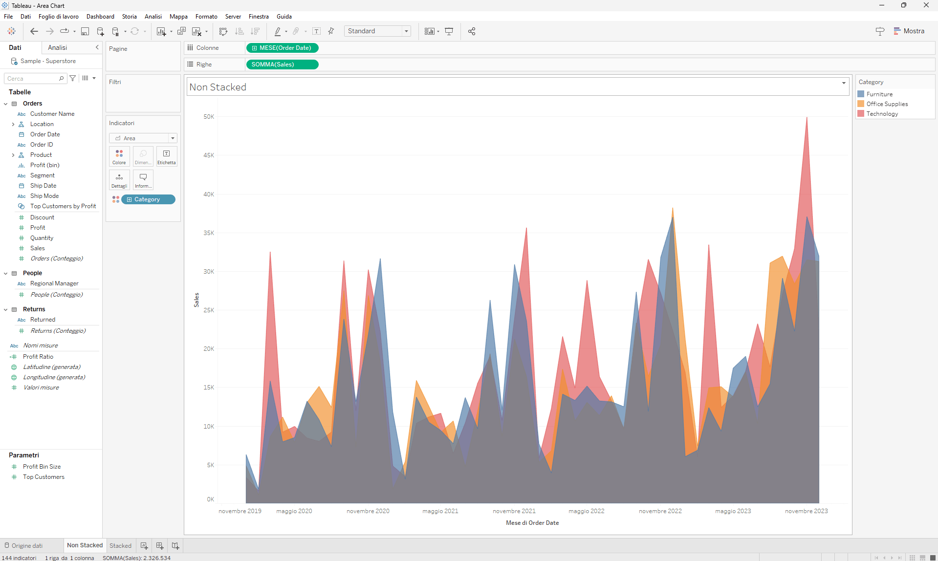
Using the example of the chart we just created, imagine you want to more clearly compare the sales trends over time for Furniture, Office Supplies, and Technology. In this case, you can use a non-stacked area chart.
To create a non-stacked area chart, follow steps 1 to 5 outlined earlier, and then perform one additional operation: from the Analysis menu, click on the Stack Marks option and choose Off.
The result will be a non-stacked area chart, which allows for easier month-by-month comparison of each category’s performance. However, it won’t visually convey the cumulative total of the three categories.
Non-Stacked Area Chart
Conclusions
We’ve explored what an area chart is, its purpose, and when to use the stacked or non-stacked variants. To summarize:
An area chart represents data using a colored area rather than just a line.
A stacked area chart lets you observe how each category contributes to the total over time.
A non-stacked area chart makes it easier to compare subgroups directly but doesn’t show the cumulative total.
Read all our articles on Tableau
Do you want to discover the latest features or delve into certain functions to become an expert?