In this article, we’ll explain what a pie chart is, what it’s used for, and why it’s useful. Additionally, we’ll provide step-by-step instructions on how to create one in Tableau. A pie chart is a visualization tool used to provide an overview of the part-to-whole relationship. It is particularly useful for displaying the breakdown of a measure across a dimension with a limited number of members (2-5).
What is a Pie Chart?
Invented by William Playfair in 1801, a pie chart represents the breakdown of a measure by a dimension, showing how multiple parts contribute to the whole. To display how a part composes a total, the measure can be expressed in absolute terms or as relative percentages (the more common approach).
Pie charts are suitable for categorical or qualitative variables but are not meaningful for continuous data.
As the name suggests, a pie chart resembles a pie, with each slice representing a category. The area of each slice is directly proportional to the value of its respective category. The larger the slice, the greater the weight of that category within the total.
The Usefulness of Pie Charts
To use a pie chart effectively, the following conditions should be met:
- There must be a total that can be divided into a limited number of distinct parts.
- The goal is to compare each group’s contribution to the whole, rather than comparing groups to one another.
Pie charts are ideal for illustrating the distribution and relative weight of components within a whole, such as product sales by category.
Best practices for using pie charts include:
- Keeping the number of categories limited (2-5) for readability.
- Using the chart when precise slice sizes are not the primary focus (the human eye compares lengths more easily than areas).
- Ensuring one category significantly outweighs others.
Pie charts are valuable because they offer an immediate understanding of proportions, making it easy to identify predominant components (if any) and conveying an overview of the part-to-whole relationship. To optimize cognitive load, label each slice with its associated value to facilitate comparisons between similar slices.
How to Create a Pie Chart in Tableau
Let’s explore the steps to create a pie chart in Tableau. Using the Sample – Superstore dataset integrated into Tableau Desktop, we’ll analyze sales distribution by product category.
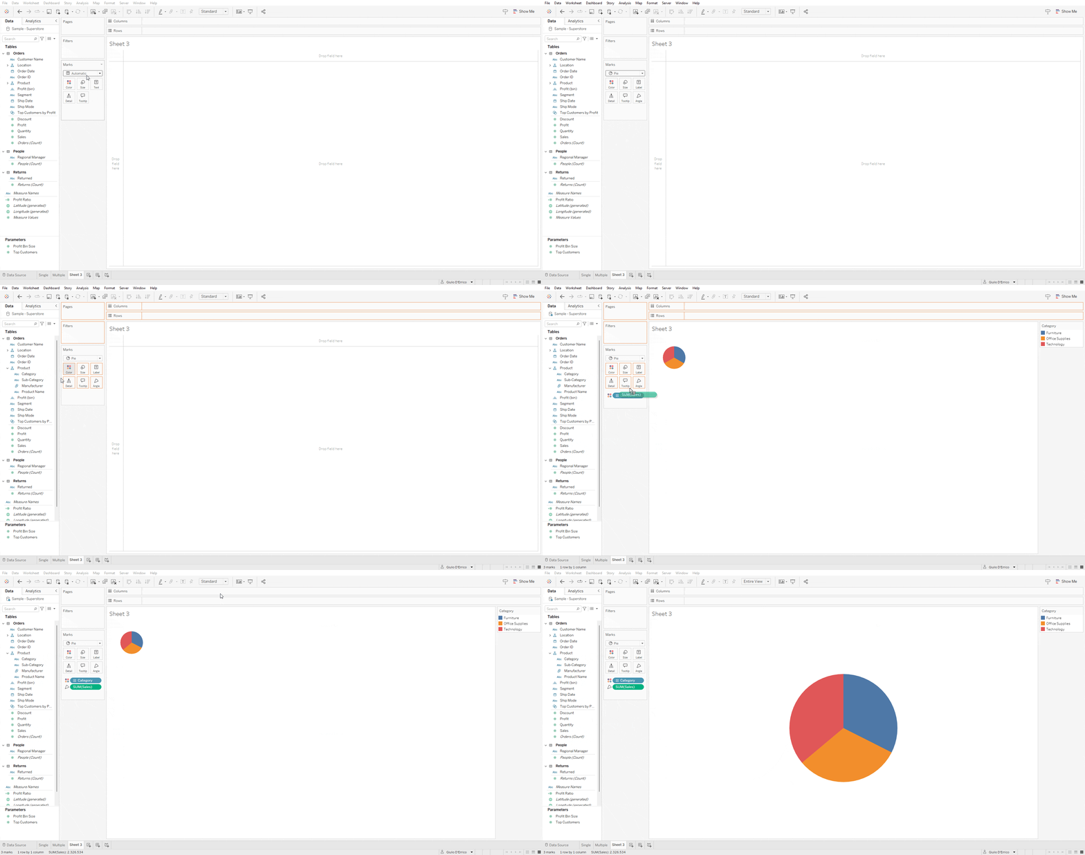
1. Create a Pie Chart
- Connect to the Sample – Superstore data source (Connect Data Pane → Saved Data Sources) and create a new Sheet.
- In the Marks card, select the Pie option.
- Drag the Category dimension to Color on the Marks card.
- Drag the Sales measure to Angle on the Marks card.
- From the top toolbar, select Entire View.
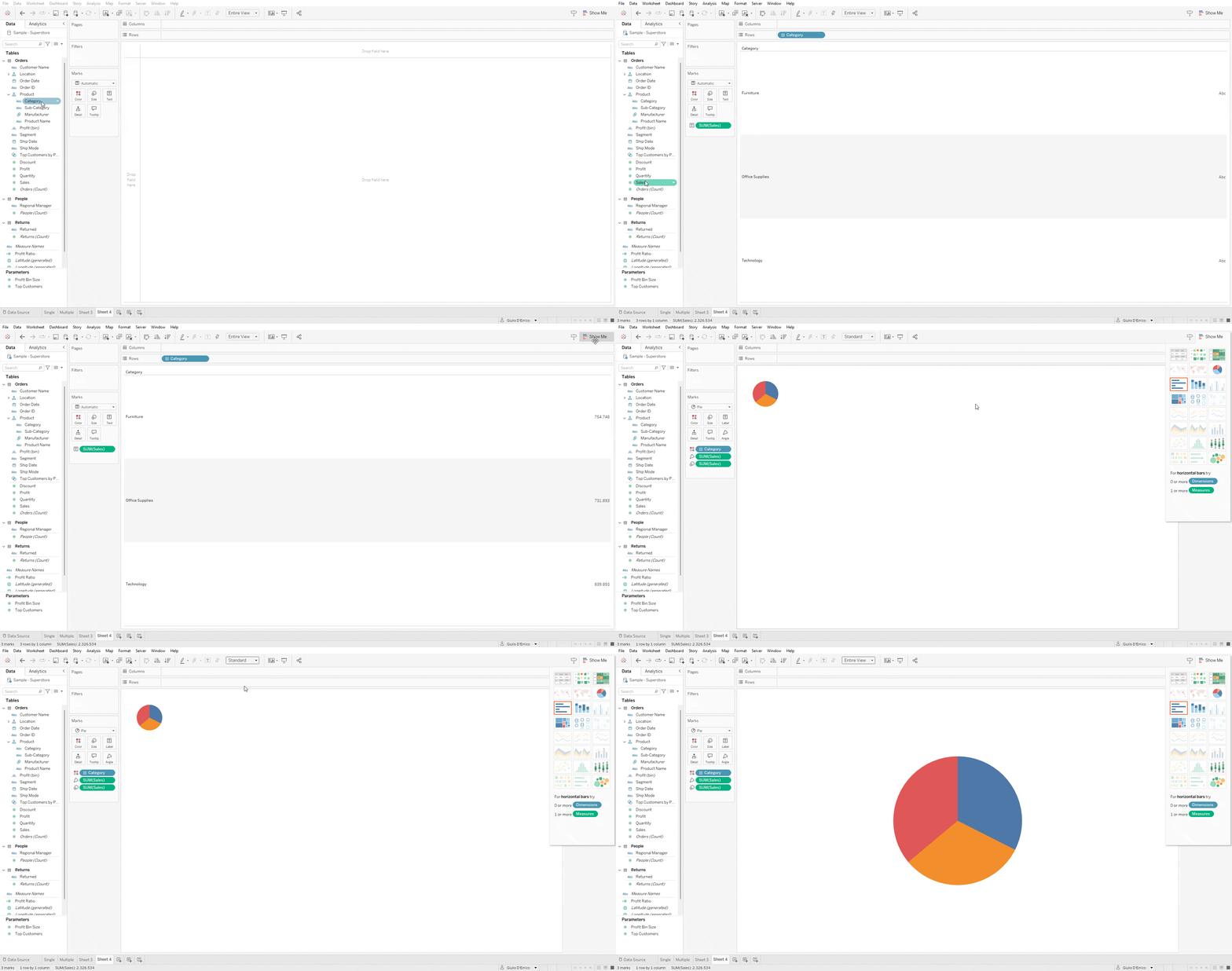
1. (bonus): Create a Pie Chart (Show Me)
- Double-click on the Category dimension and then on the Sales measure.
- From the Show Me tab, select the pie chart icon—your chart is ready!
- Remove Sales from Size in the Marks card.
2. Add Details
- Drag Category and Sales to Label on the Marks card to include more details in the chart.
- Right-click on Sales and select Quick Table Calculation → Percent of Total to display the relative contribution of each category to total sales.
- To format percentages, right-click on Sales, select Format, and adjust the settings. Under Default, select Percentage from the dropdown menu and set decimal places to 0 for whole numbers.
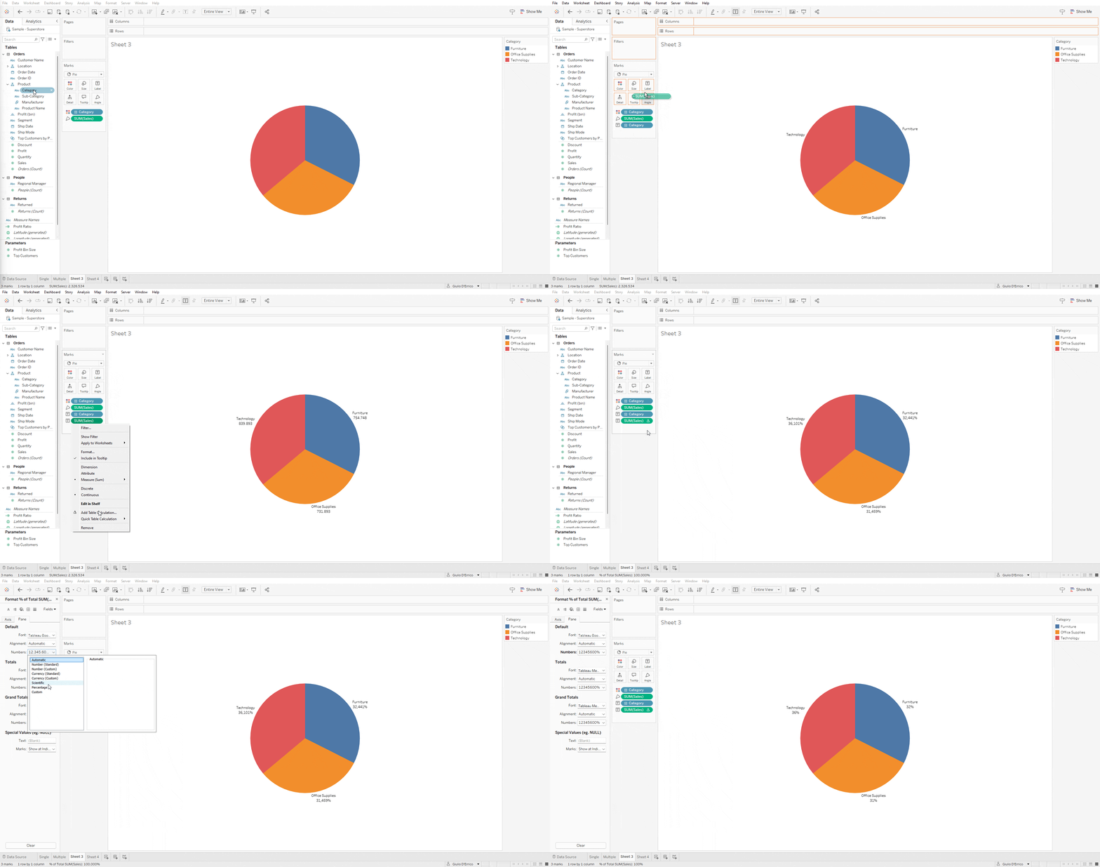
Done! You have just created a pie chart that shows the breakdown of sales across different product categories. Now you can analyze which categories contribute the most to total sales.
Creating Multiple Pie Charts
Pie charts can also be used side by side to compare proportional parts of multiple wholes across different categories, such as analyzing sales distribution by region for different product categories.
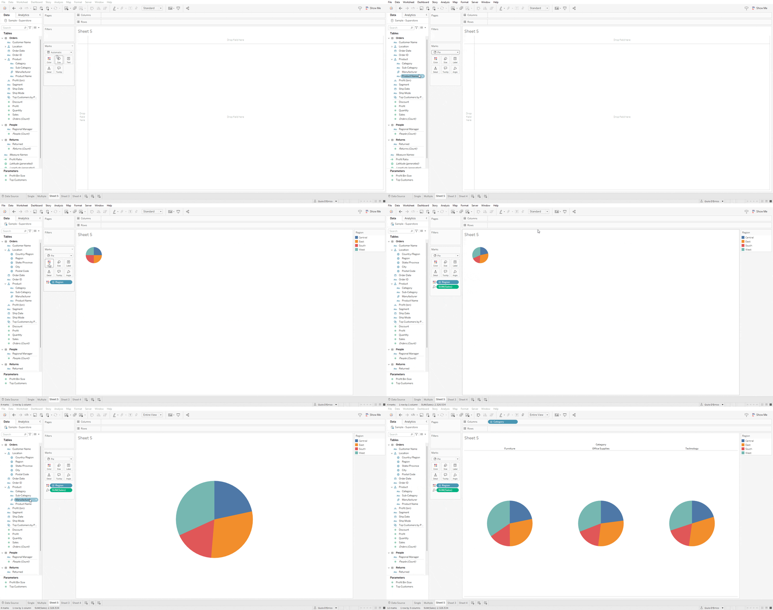
1. Create Multiple Pie Charts
- Repeat the steps for creating a single pie chart, but add the Region dimension to Color on the Marks card.
- Drag the Category dimension to Columns.
2.Add details
- Follow the steps for a single pie chart, ensuring the Region dimension is added to Label on the Marks card.
- To display accurate percentages, right-click on Sales in the Marks card, select Compute Using, and choose Region.
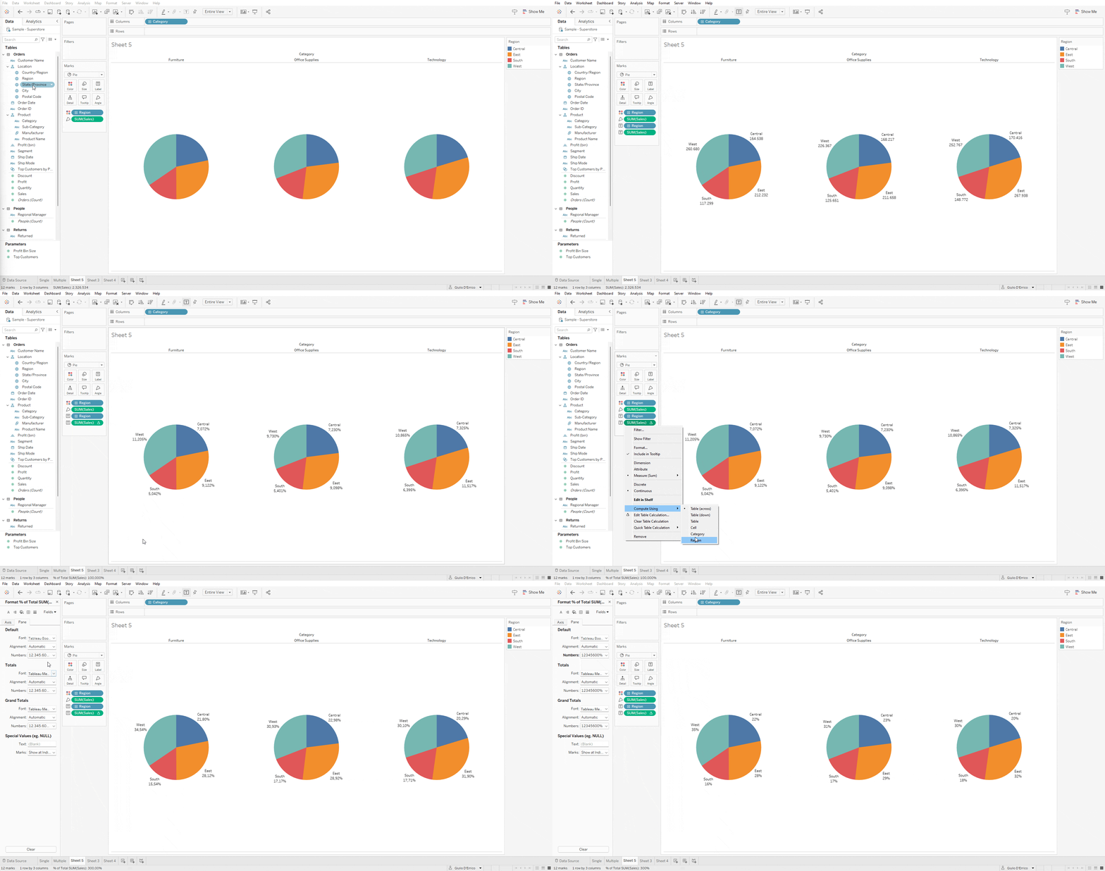
Done! You have just created multiple pie charts displaying the sales breakdown across various regions and product categories. Now you can analyze which category contributes the most to total sales in a specific region.
Conclusions
We’ve covered what a pie chart is, its uses, and its benefits, along with practical examples in Tableau. To summarize:
The pie chart is an effective tool for gaining an overview of part-to-whole relationships when the total can be divided into a limited number of distinct parts, and the goal is to compare each group’s contribution to the whole. Multiple pie charts can also be used side by side to compare proportional parts of different wholes across categories.
Read all our articles on Tableau
Do you want to discover the latest features or delve into certain functions to become an expert?
Visualitics Team
This article was written and edited by one of our consultants.
Sources:
A complete guide to pie charts – www.atlassian.com
Multiple Pies Chart – vizzlo.com
Pie Charts – www.tableau.com
What is a pie chart? – www.spotfire.com
Share now on your social channels or via email: