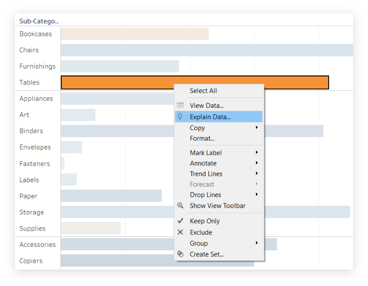
Taking a quick look at the chart, we notice that one Sub-Category, Tables, has high sales but negative profit, the worst of all the product sub-categories. Let’s right-click on the Tables bar and then Explain Data.

TABLEAU
With the release of version 2019.3, Tableau Desktop has added a new tool to its already rich list of features: Explain Data. The goal of its introduction is, intuitively, to help Tableau users explain their data.
to help Tableau users explain their data.
Leveraging Artificial Intelligence, Explain Data offers faster analysis to provide analysts with an explanation of their data from advanced statistical models.
When we use this feature on a point in a graph, Tableau generates a statistical analysis that takes into account both the fields that contribute to that point, as well as other fields possibly related to it, even if not present in view. The output is a visualization accompanied by a textual description, which takes into account several dimensions and measures for understanding the data.
The workings behind Explain Data are quite complex, but let’s try to give a few pointers. Explaining data is done through the use of Bayesian statistical models.
These predict the value of a point in the data; then the system determines if that point has a higher or lower value than predicted, given the model applied. Once this is done, additional information is considered in the analysis (e.g., other fields in the data source, outliers, etc.) as possible explanations.
For each of these, a new model is generated and an assessment is made of how unexpected that value is. Considered that the possible explanations can be numerous, a score is assigned to each explanation and only some, those of greater quality, are offered to the customer.
Let’s try a practical example on using Explain Data. Starting with Superstore data, let’s create a bar graph showing the distribution of sales by category and product sub-category, relying on profits to define the color.

Taking a quick look at the chart, we notice that one Sub-Category, Tables, has high sales but negative profit, the worst of all the product sub-categories. Let’s right-click on the Tables bar and then Explain Data.


Once done, Tableau automatically generates a window, like the one shown in the image below, that helps us understand the data we want to analyze. Let’s now see what sections make up this window.
Explain Data provides us with several elements to explain our data. This is an excellent starting point from which to continue searching for the links between the data we are analyzing.
To learn more about the world of Business Intelligence, visit the official Tableau page, keep following us on our blog and on our social channels Facebook and LinkedIn.
Subscribe to the newsletter
Per restare informato sulle novità Tableau e Alteryx, sui nostri prodotti e servizi e sugli eventi Visualitics in programma, iscriviti alla nostra newsletter; potrai scegliere la tipologia di invio che preferisci e disiscriverti in qualsiasi momento!
Quali aggiornamenti vuoi ricevere?