We all use calendars in our daily lives to keep track of events and activities to remember. It’s possible to create a calendar in Tableau based on a date field, which is very useful for visualizing information related to a specific month.
How to Create a Simple Calendar in Tableau?
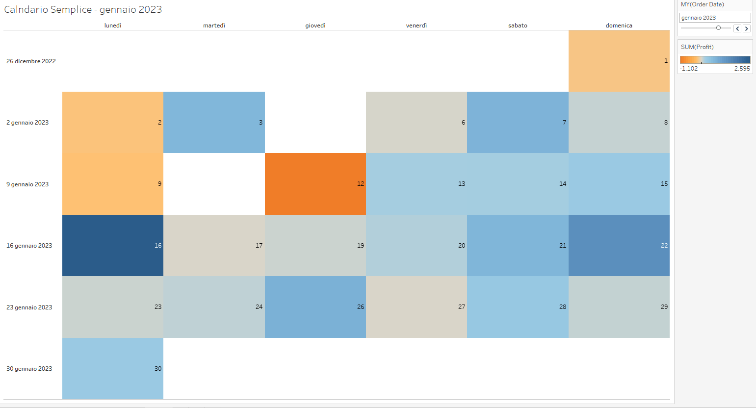
To start, connect to Tableau’s “Sample Superstore” dataset. The goal is to build a calendar that displays the daily profit based on the Order Date field.
Here’s the effect we aim to achieve:
Simple Tableau Calendar
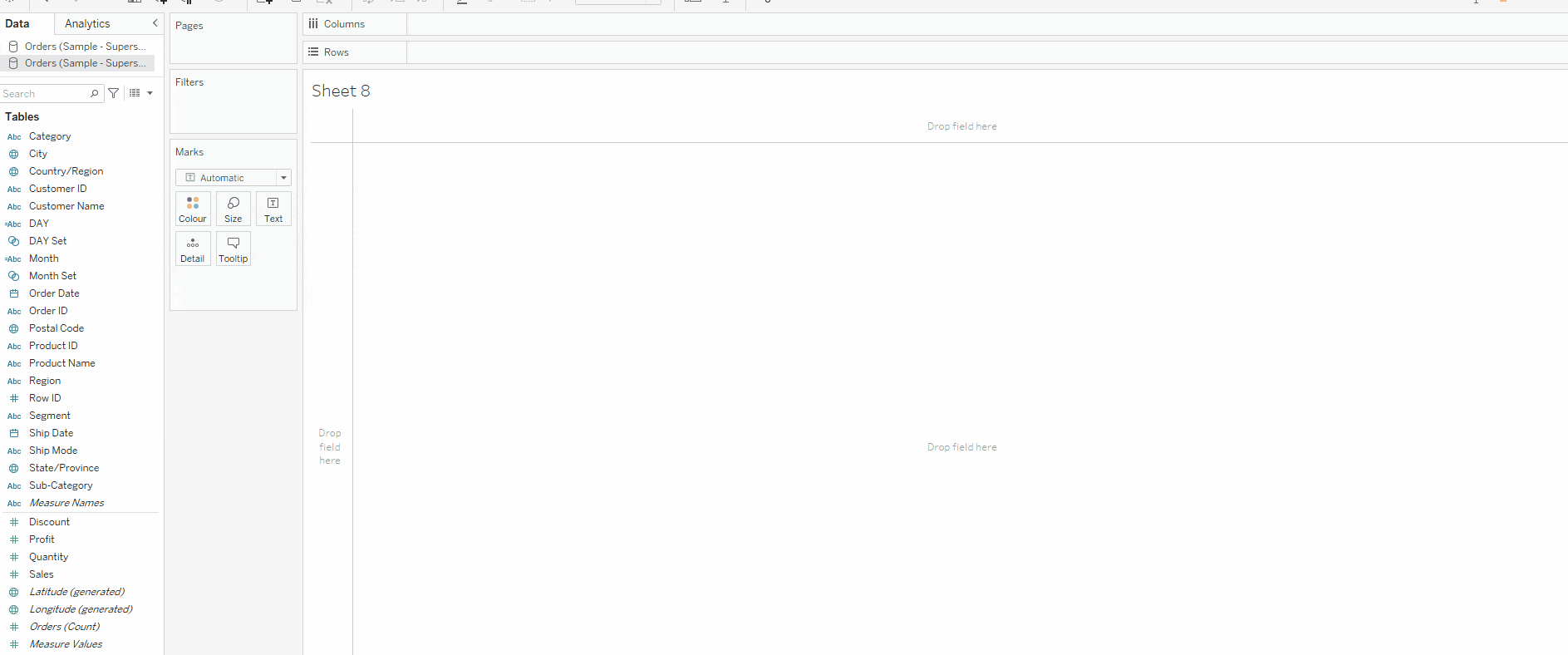
Drag Order Date to the Columns section. Right-click on Order Date, go to More, and choose Weekdays from the options. Next, drag Order Date again to the Rows section, select Weeknumber, and make the field discrete.
Defining the calendar time period
At this point, you will see values for all the years in the dataset. To filter, drag Order Date to Filters and select the desired year and month, for example, January 2023. Right-click on the filter and choose Show Filters.
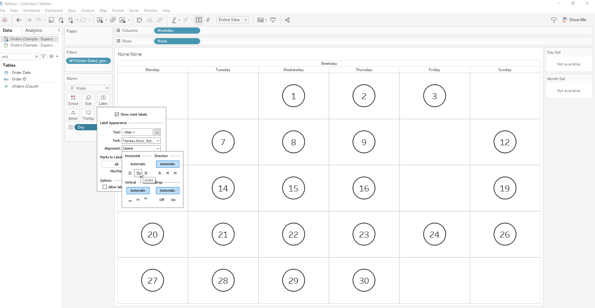
Add Order Date to the label and select Day.
Finally, drag Profit to color and change the Marks Card to Square, so each day is colored based on the profit. To complete, hide the Week of Order Date by right-clicking the pill in rows and deselecting Show Header.
Can the Calendar in Tableau Be Made Interactive?
Yes, the calendar can be used to filter other elements within the dashboard, making the visualization more interactive. To do this, start by making a copy of the calendar you just created, removing Profit from color, and changing the Marks Card to Shape. Adjust the alignment of the day on the label and center it within the shape.
Adjusting the alignment of the day label
Next, create two calculated fields based on Order Date: one to extract the day and another for the month. The formula to obtain the day is DATENAME(‘day’, [Order Date]), while for the month, use DATENAME(‘month’, [Order Date]).
Now, create a set for each field. Right-click the field, select Create Set, and choose all values for both sets.
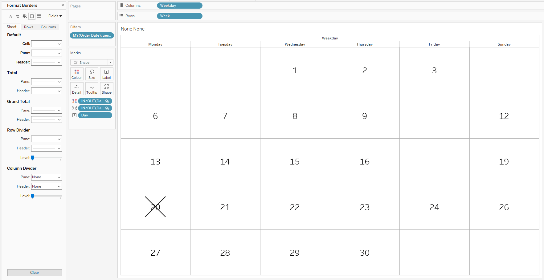
Remove the previously added filter and add Order Date (Year), selecting 2020. Add the created month set to the filters and choose January. Then, add the created day set to the shape and color sections, selecting the day you wish to display. Change the shape from a circle to an “X.”
Change the set color: assign black for In and transparent for Out. (To learn how to add a transparent color, check out the tutorial “How to Add a ‘Transparent’ Colour into Tableau and Use Cases – The Data School“). Finally, right-click on the calendar and add gridlines for each square to make it graphically resemble a calendar.
Graphic modifications to enhance the calendar appearance
Dashboard Creation and Interactive Linking
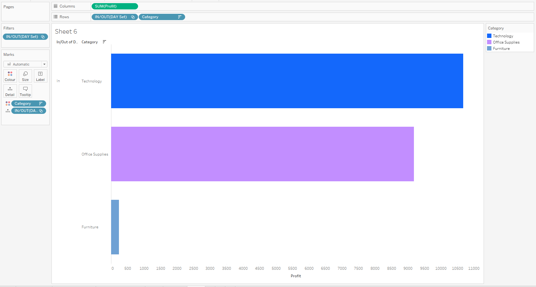
Open a new sheet and create a bar chart to display the Profit value for each Category. Drag Category to Rows, Profit to Columns, and add Category to color.
To make this chart filterable by the calendar, add the Day Set to Rows before Category, then to Detail, and finally to Filters, keeping only the In values visible.
Creating a bar chart to display the Profit value in each Category
Hide the set added to Rows by right-clicking the pill and deselecting Show Header. Finally, add Order Date (Year) to Filters and select 2020.
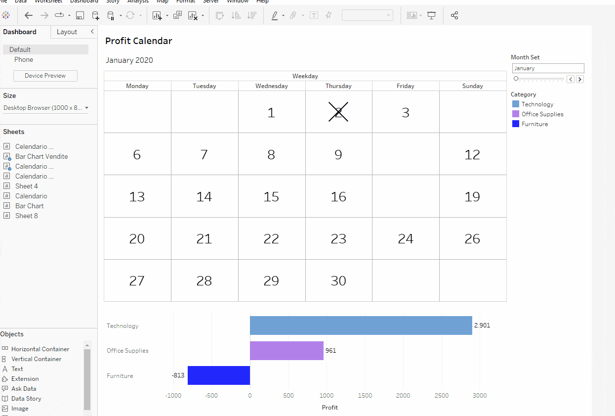
Now, let’s build the dashboard. Drag the calendar and bar chart sheets into the view, along with the Month Set and the color legend. Add a set action so that, by clicking on the calendar, the underlying bar chart is automatically filtered. Go to Dashboard (top left) and select Action. In the pop-up menu, choose Change Set Values from the dropdown on the bottom left. Configure the action properly and click OK.
Configuring the action
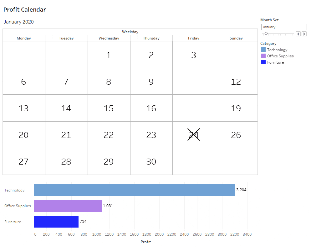
The result will be an interactive calendar that filters the underlying bar chart based on the selected day.
Interactive Tableau Calendar
Conclusion
A calendar is a familiar visualization for everyone and easy to interpret, making it particularly useful for displaying daily data in a simple and immediate way. However, it does have limitations: if the goal is to create a more complex or in-depth visualization, it might be better to choose another type of representation better suited to the data needs and insights to be communicated.
Read all our articles on Tableau
Do you want to discover the latest features or delve into certain functions to become an expert?