In the first part of our data visualization series, we covered the fundamental concepts: setting clear objectives, understanding the audience, and balancing design with functionality. In this second part, we will delve deeper into these principles, applying them to build sector-specific dashboard. Customizing visualizations for each field allows data to be transformed into concrete insights, supporting more informed decision-making.
Sector-Specific Dashboard Examples: from Sales Analysis to Sports
1. Human Resources Dashboard: Monitoring and managing personnel and space utilization
HR dashboards focus on workforce data, providing insights on employee attendance, performance, and office utilization. These dashboards help HR teams manage resources effectively, monitor trends in employee engagement, and make data-driven decisions on workspace and workforce management.

This HR dashboard offers a comprehensive view of office utilization and employee presence. It tracks key metrics like Presences, Smart Working, and Absences, providing weekly trends and global comparisons. The layout is structured and color-coded, highlighting usage peaks and workstation buffers for quick insights. Detailed breakdowns by building and business unit enable HR teams to identify trends and optimize resources. With meaningful data segmentation, the dashboard provides an intuitive interface that supports space management and effective workforce monitoring across multiple locations.
2. Political Dashboard: tracking electoral trends and real-time results visualization
Political dashboards are designed to inform the public and analysts on key election metrics, trends, and processes. These often include visualizations of polling data, candidate comparisons, and significant events. By presenting political data visually, these dashboards make complex election processes easier to understand and provide real-time insights during election periods.

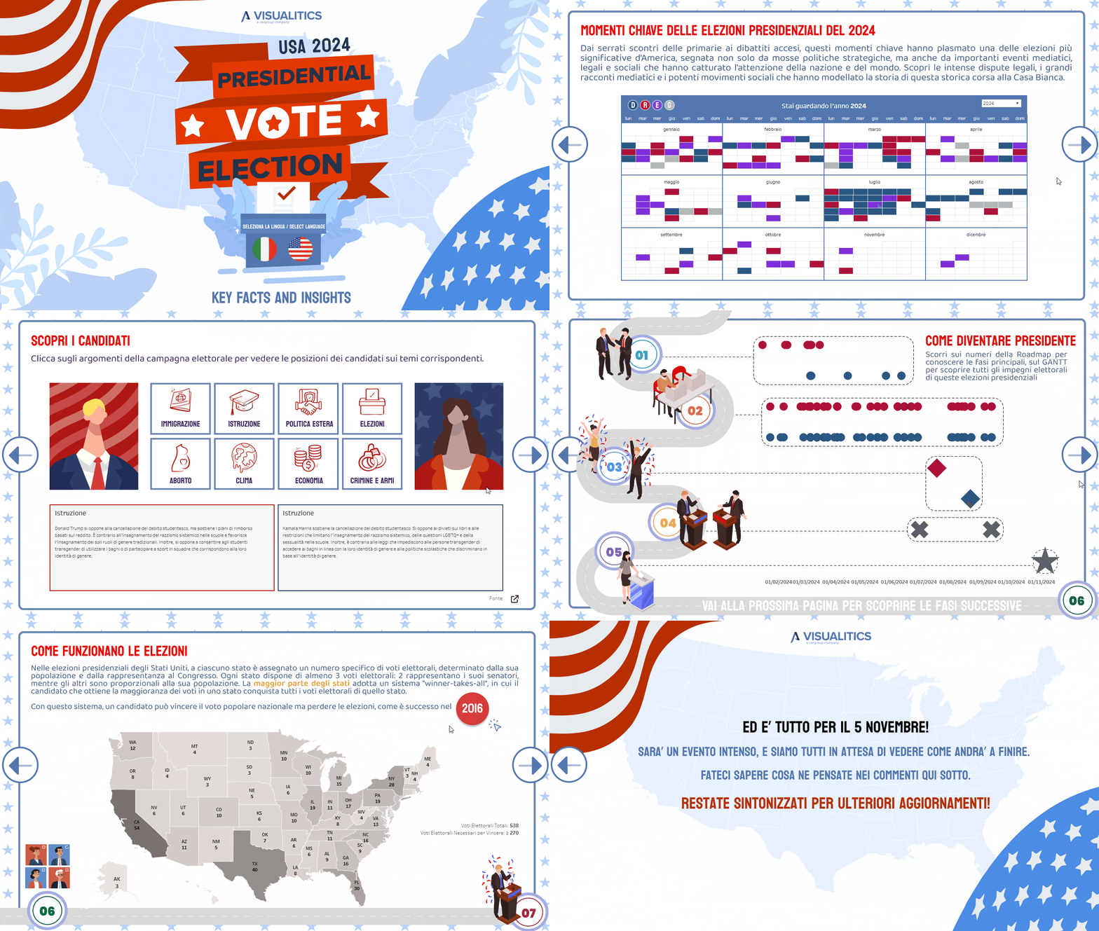
The politics dashboard for the 2024 U.S. Presidential Election uses a timeline of key events alongside an interactive Electoral College map to illustrate each state’s contribution to the final outcome. Color-coded events and icons emphasize critical election moments, while hover interactions reveal further details without cluttering the main view. This design enhances UX by allowing users to explore specifics as desired, creating an engaging, informative, and accessible experience that mirrors the electoral process.
3. Sports Dashboard: analyzing athletic performance and training load monitoring
In the sports sector, dashboards are widely used for performance analysis, training load monitoring, and overall athlete metrics. These dashboards provide an overview of physical and technical aspects of athlete performance, assisting coaches and trainers in optimizing training regimens and tracking improvement over time.

This sports dashboard monitors athlete performance metrics, such as energy usage, endurance, and training load, using radar charts and scatter plots to provide clear, at-a-glance insights. Color contrasts highlight different performance levels, helping coaches easily distinguish between adequate and high loads. This minimalist, focused design emphasizes essential data without clutter, allowing coaches to swiftly assess stats and make informed adjustments to training plans based on real-time metrics.
4. Sales Dashboard: tracking performance metrics
Sales sector dashboards provides insights into performance metrics like revenue, profit margins, and sales volume across various products, regions, or time frames. These dashboards support decision-makers in tracking trends, setting targets, and identifying growth opportunities, enabling a strategic approach to sales management.

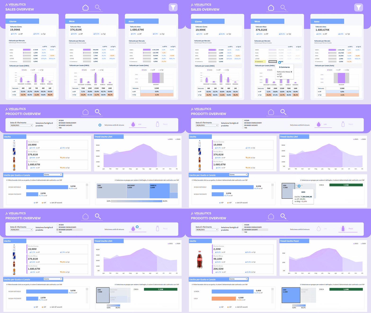
The sales dashboard offers a comprehensive view of sales performance across daily, monthly, and yearly metrics, broken down by region and channel, and compared against targets and historical results. Regional color gradients and trend lines make performance patterns easily understandable, while interactive filters allow users to isolate specific regions, time periods, or product types for deeper analysis. This intuitive layout is designed to give sales teams rapid access to insights, supporting strategic decision-making by organizing data in a way that minimizes time spent searching for relevant information and highlights key trends and growth opportunities.
Best Practices for Effective Dashboard Design
Across sectors, these best practices enhance any dashboard’s impact:
- Logical Layout: Position key data prominently, grouping related metrics.
- Consistent Colors: Stick to a unified palette, using color purposefully (e.g., green for positive trends).
- Interactive Elements: Add filters or drill-downs for deeper data exploration.
- Responsive Design: Ensure dashboards are readable across various screen sizes.
Conclusion: Visualizing Data with Purpose
Whether in finance, healthcare, or e-commerce, effective data visualization turns data into actionable insights. With the right design, dashboards can empower users to make decisions that drive real impact.
Read all our articles on Data Visualization
Would you like to learn more about Data Viz and view the world through data?
Visualitics Team
This article was written and edited by one of our consultants.
Share now on your social channels or via email: