A bar chart is perfect for visualizing your data according to different categories or subgroups. To construct a bar graph, one variable must be quantitative and the other qualitative.
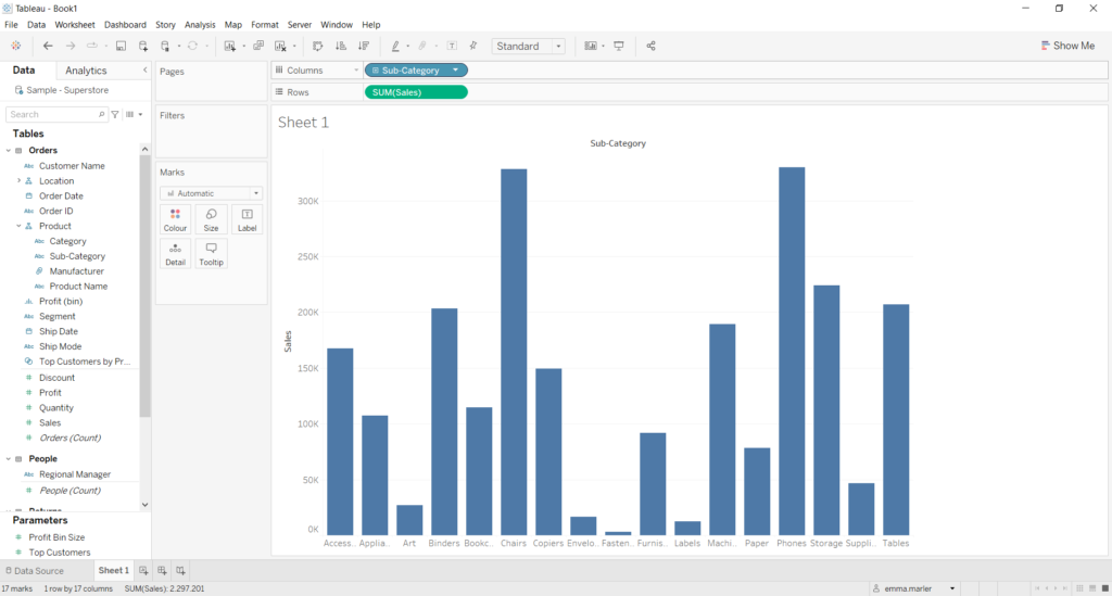
Let us then see how to build step-by-step bar graph on Tableau. Our goal is to create a graph showing sales for each sales category from Sample Superstore data.
Step 1. Create the chart
- Connect to the data source Sample – Superstore.
- Drag the dimension Sub-Category (that can be found under Product) to the Columns.
- Drag Sales to Rows.
Now you’ll have a bar chart that you can edit as you prefer.
Step 2. Personalize your chart
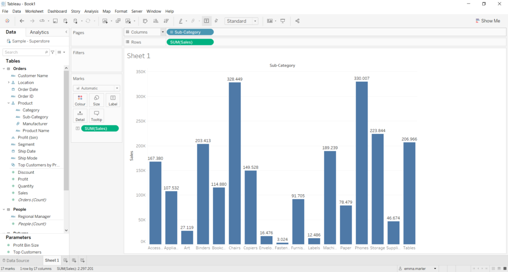
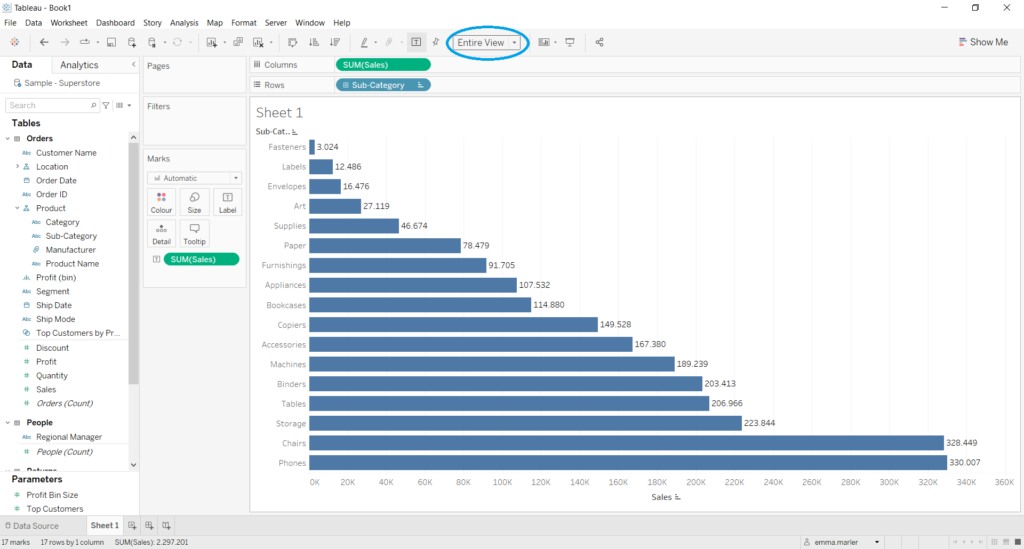
- Drag Sales on Label in the Marks card to add the number of sales per sub-category on each bar.
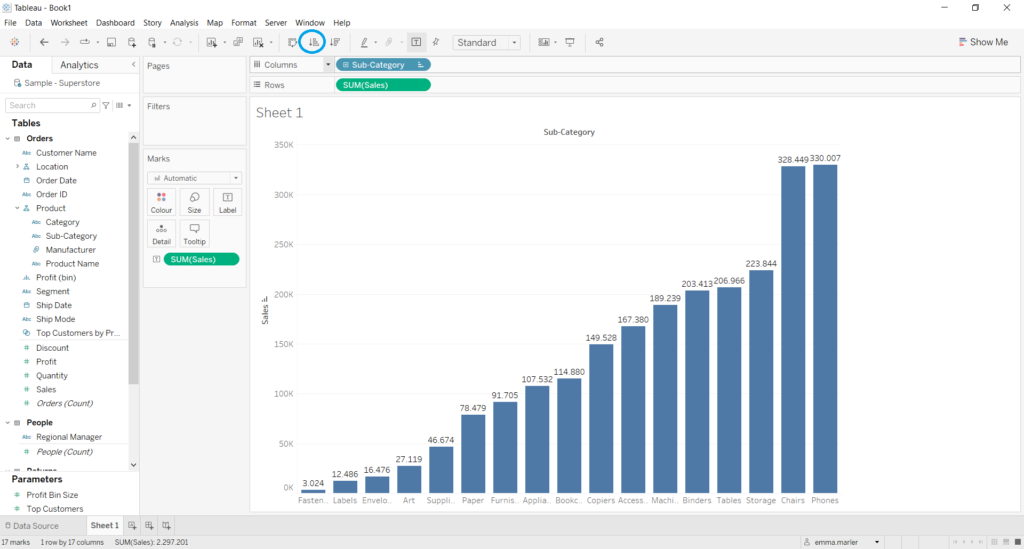
- You can sort the data in the bar chart in ascending order in the toolbar as shown by the blue circle.
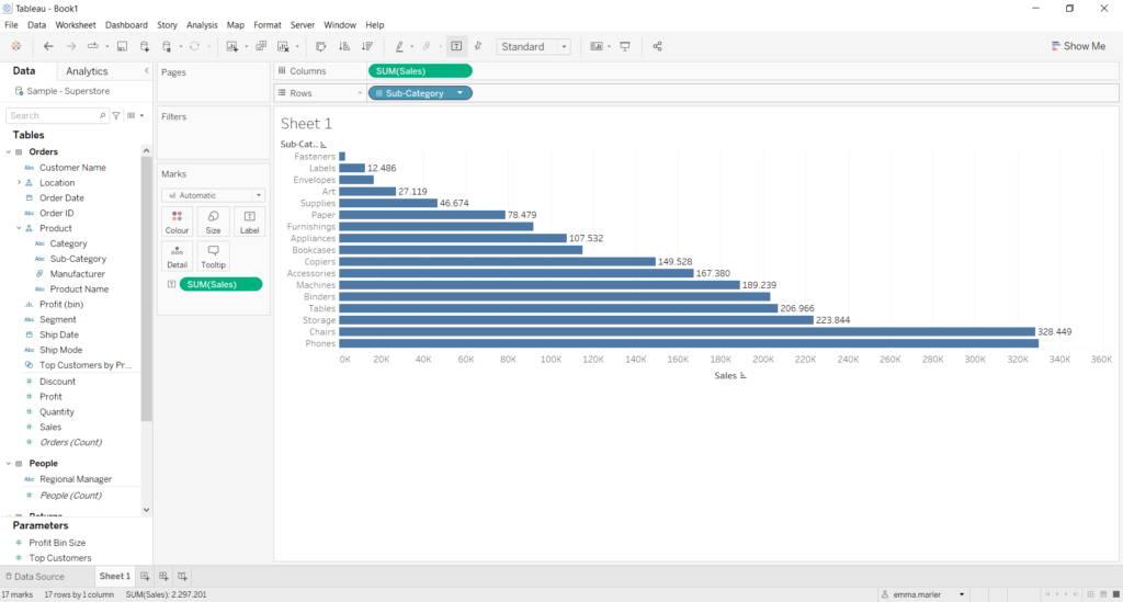
- You can swap Rows and Columns in the toolbar as shown by the blue circle.
- You can adapt the chart to fit the screen by selecting Entire View in the toolbar as shown by the blue circle.
Don’t wait! Contact us to learn more and continue to follow upcoming news on our website and LinkedIn channel.