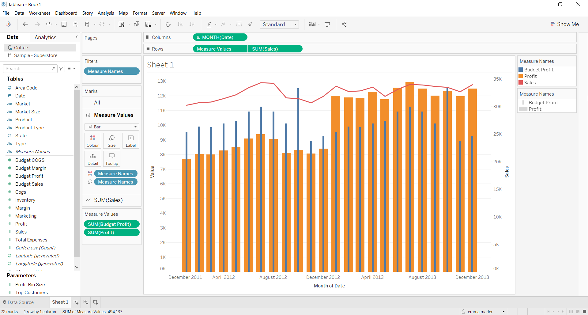
A bar-in-bar with a line chart is perfect for visualizing your data according to different categories or subgroups. To construct a bar graph, one variable must be quantitative and the other qualitative.
Let us then see how to build step-by-step bar graph on Tableau. Our goal is to create a graph showing profit and budget profit values below the sales line.
Step 1. Create the chart
- Connect to the data source (in this case we are not using Sample Superstore).
- Drag Date to Columns. Click on it and select Month May 2015.
- Drag Budget Profit to Rows.
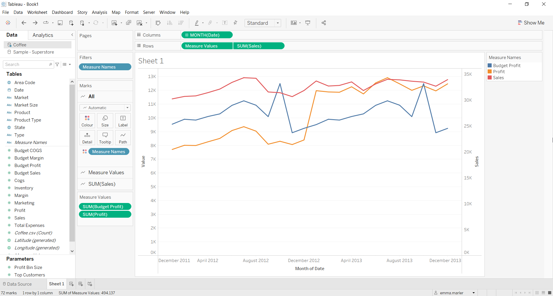
- Drag Profit on the y-axis. You’ll now get a multiple line chart.
- Drag Sales to Rows. Right click on it and select Dual Axis to show all the lines in one quadrant.

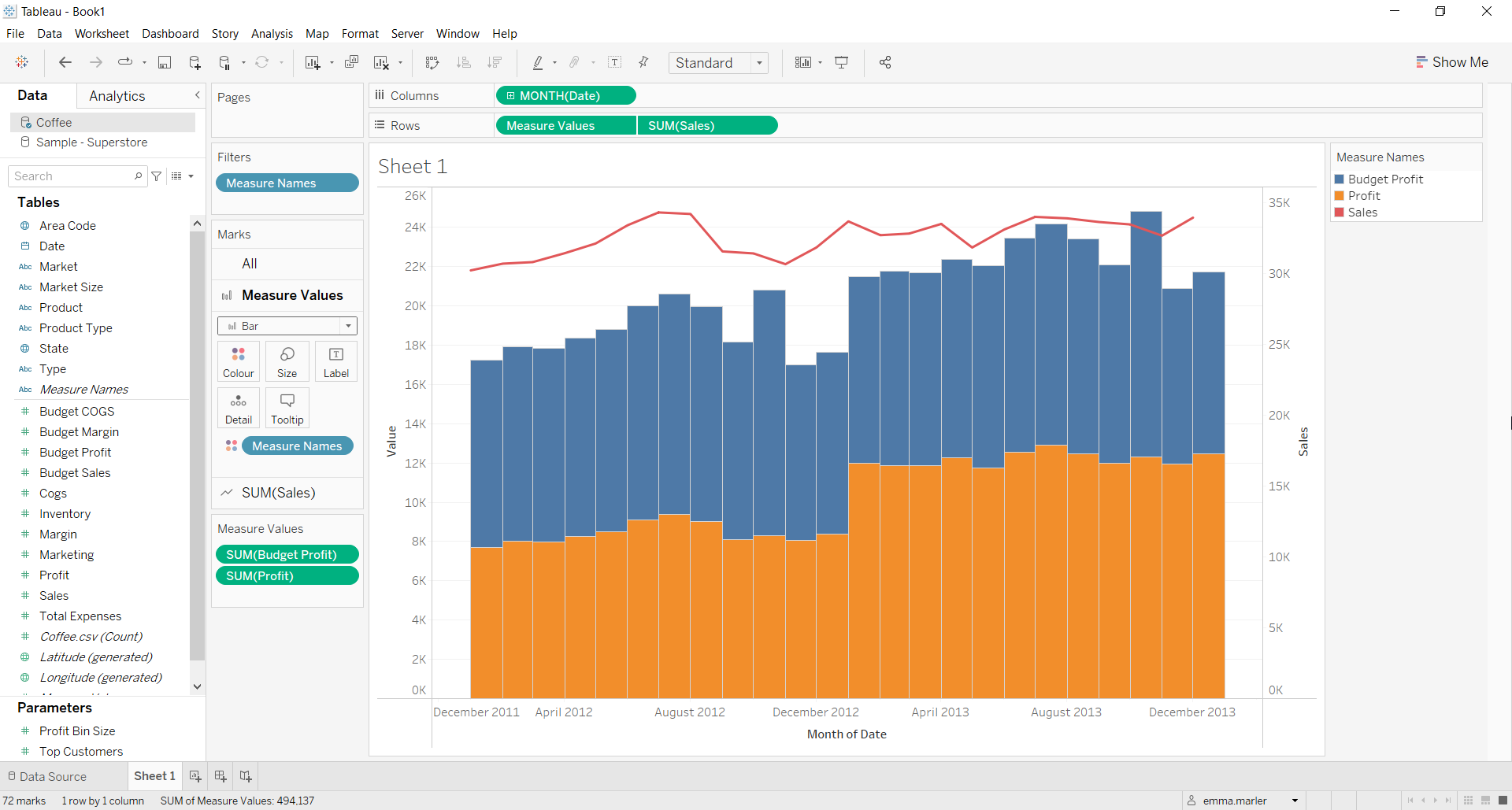
- You might have noticed that you have different Marks card. Click on the first individual one (in our case called Measure Values) and select Bar from the dropdown menu.

- Click on Analysis at the top, select Stack Marks and click Off.
- Drag Measure Names onto Size in the Measure Values Marks card and adjust it as you wish. You can edit the opacity of the colors and colors itself from the Marks cards. There you go!

Don’t wait! Contact us to learn more and continue to follow upcoming news on our website and LinkedIn channel.