In this article, we will explain what a box plot is, what it is used for, and why it is useful. Additionally, we will provide a step-by-step guide on how to create it in Tableau. It’s a chart used to represent the distribution of a set of continuous data along an axis in a compact manner, summarizing the main statistical measures. It is very well-suited for comparing multiple groups of data on the same scale.
What is a Box Plot?
A box plot (also known as a box and whiskers plot, or in Italian, “diagramma a scatola e baffi”) is a chart used to represent the distribution of a set of data along an axis in a visual, concise, and informative way. It applies to continuous quantitative variables and makes sense to use when the data range is sufficiently wide; otherwise, it would be difficult to read and therefore not very useful. In general, it is a very powerful tool for interpreting the key characteristics of the data and is useful for comparing multiple groups of data on the same scale.
Anatomy
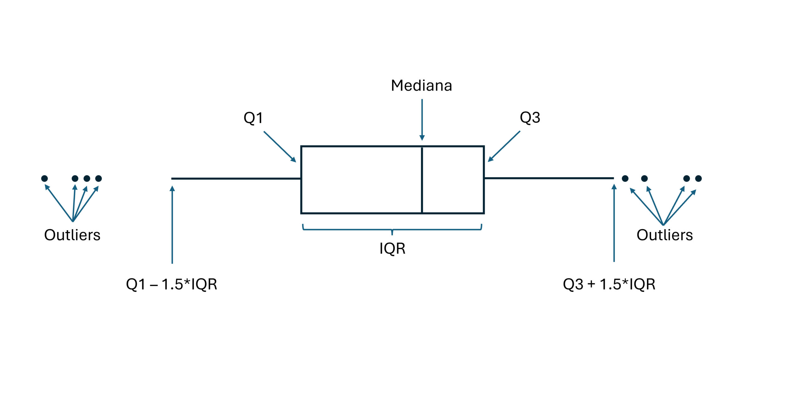
As the name suggests, a box plot resembles a box, which we can imagine as a true container of data, and it can be represented either vertically or horizontally. Below, let’s analyze its main elements:
Box: where 50% of the data falls, consisting of various elements:
- Q1: the lower edge of the box indicates the first quartile, which is the value below which 25% of the data falls.
- Q3: the upper edge of the box indicates the third quartile, which is the value below which 75% of the data falls.
- IQR: the Interquartile Range represents the length of the box (Q3 – Q1). This value provides indications about the dispersion of the data: a lower IQR indicates a more compact distribution around the central value, while a higher IQR suggests a more dispersed distribution. In practice, the IQR indicates the range of values within which 50% of the data falls.
- Median Line: the line that divides the box into two (it may coincide with one or both ends of the box). This represents the median of the data, which is the value that splits the distribution in half, with 25% of the data falling below and 25% falling above this line within the box.
- Whiskers: these extend from the edges of the box to the data points that are not considered outliers (typically 1.5 * IQR), allowing for the visualization of data dispersion.
- Outliers: if present, these are extreme values represented as individual points beyond the whiskers. They are significantly larger or smaller than most of the data and provide an indication of how much they deviate from the rest of the data.
Utility of the Box Plot
A box plot allows for the summarization of a dataset into a set of values that help us understand where the majority of the data lies. It can be used as a visual tool for:
- Visualizing Distribution: thanks to its visual representation, a box plot allows the study of the symmetry of a distribution, the central position, and the dispersion of data.
- Comparison Between Groups: the advantage of a box plot is its ability to represent a large number of data points in a compact and explicit manner. This makes it very useful for comparing groups of data or categories without creating visual overload.
- Identification of Outliers: it facilitates the identification of anomalous values that may require further investigation.
- Data Summary: it concisely represents the main characteristics of a dataset (distribution, variability, extreme values) without the need to examine all individual values.
How to create a Box Plot in Tableau
Let’s now go through the different steps to create a box plot in Tableau, using the World Indicators dataset integrated into Tableau Desktop. We will analyze the distribution of average female life expectancy for different geographic areas in a specific year.
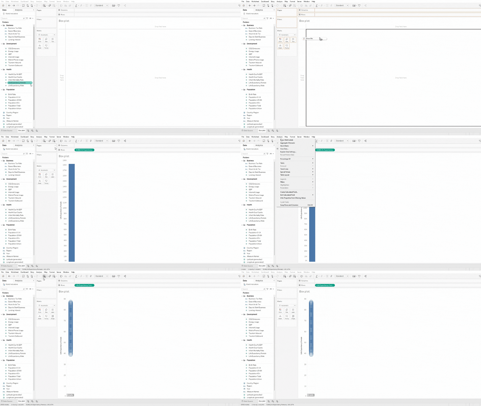
Step 1: Select the Measure of Interest
- Connect to the World Indicators data source (Connect Data Pane -> Saved Data Sources) and create a new Sheet.
- Drag (or double-click) the measure Life Expectancy Female onto the Rows shelf.
- Select Analysis from the top tab, click Aggregate Measures, and ensure that the selection flag disappears from the just-selected item.
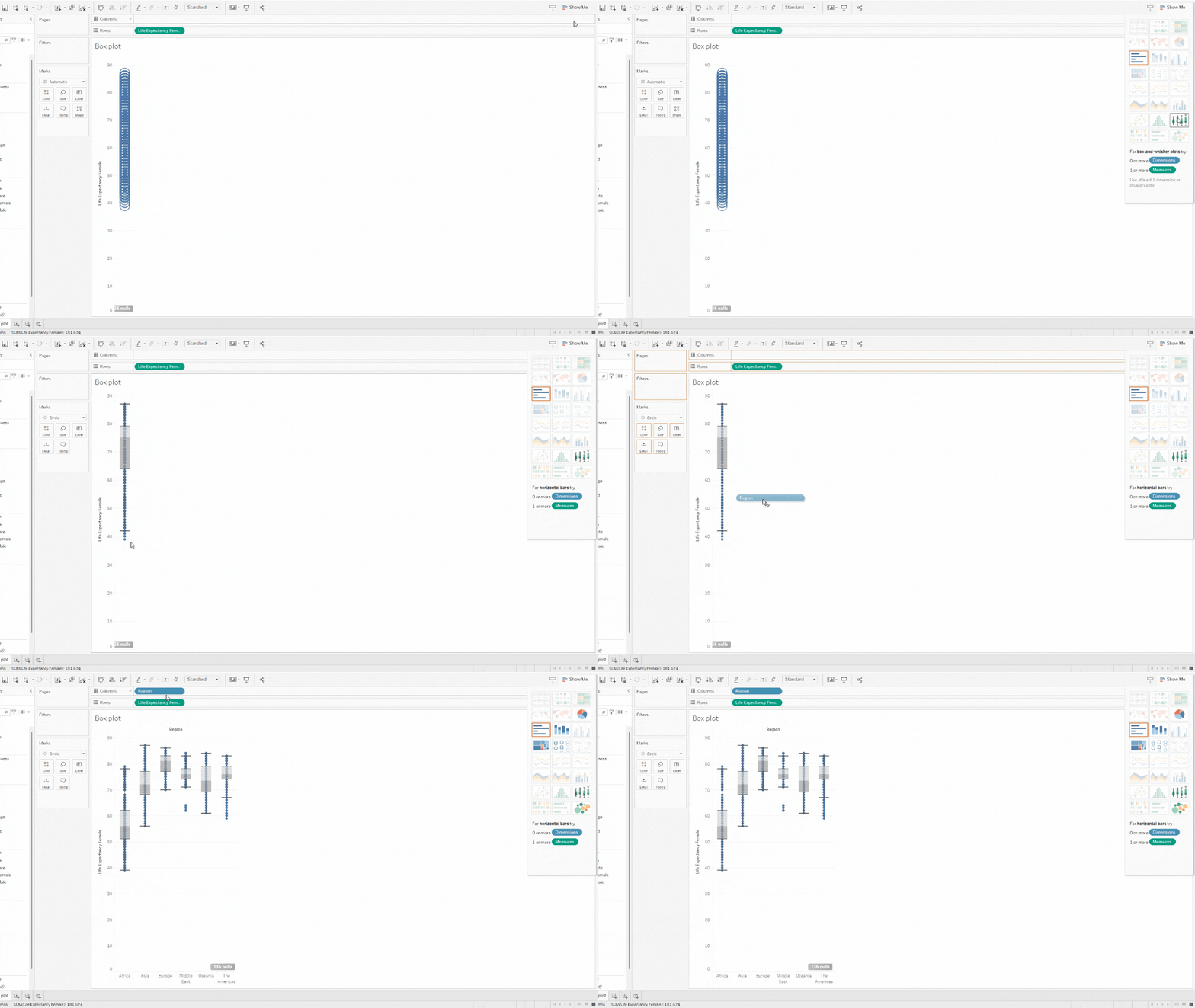
Step 2: Create the Box Plot (Show Me)
- From the Show Me tab, select the box-and-whisker plot option.
- Drag (or double-click) the dimension Region onto the Columns shelf.
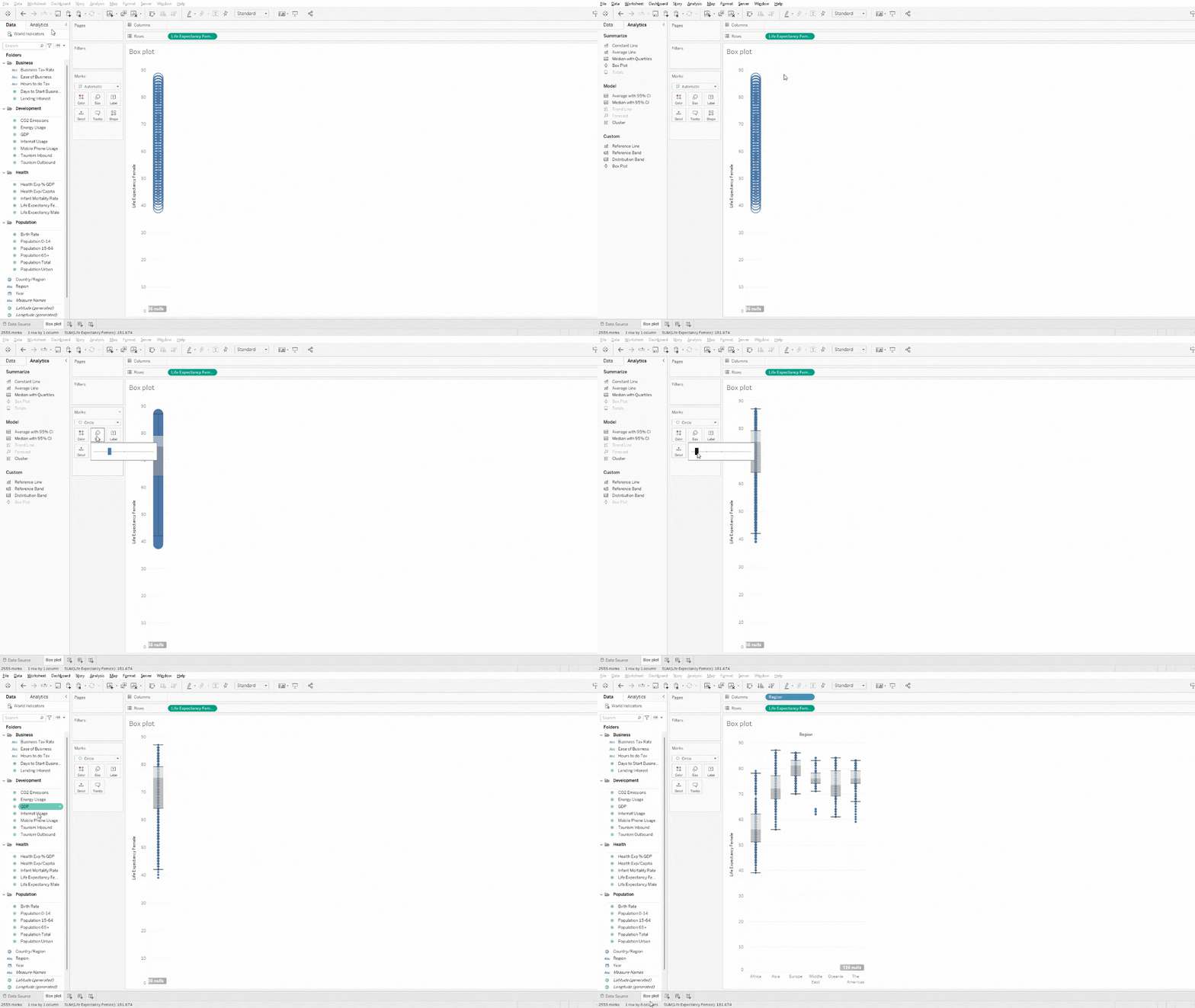
Step 2 (Bonus): Create the Box Plot (Analytics)
- From the Analytics pane, drag (or double-click) the Box Plot option into the view.
- Change the mark type to Circle and adjust the size of the dots.
Drag (or double-click) the dimension Region onto the Columns shelf.
Step 3: Filter and Customize the View
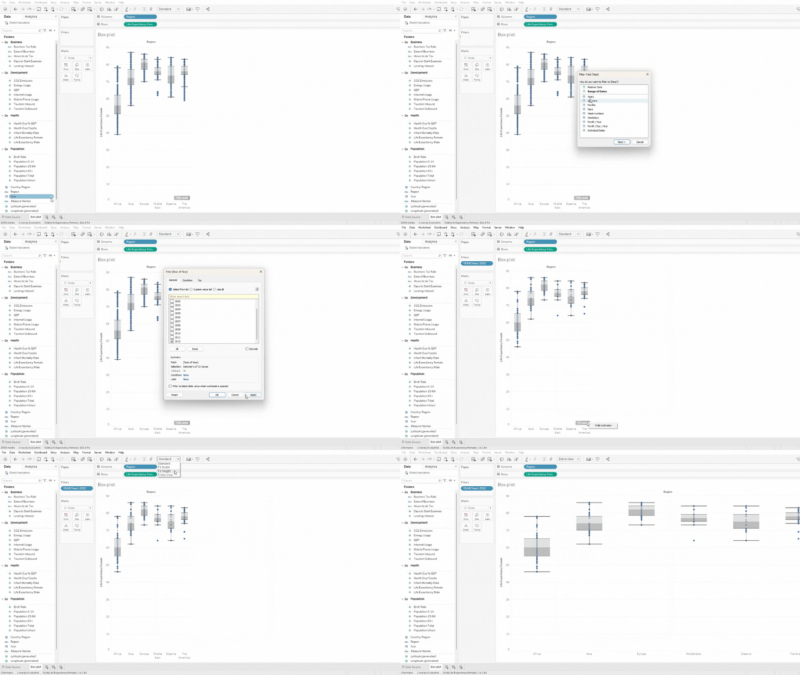
- Drag the Year field into the Filters shelf and select the year of interest.
- Right-click on the number of null values that appear at the bottom right of the view and select Hide Indicator.
- To better visualize the created chart, select Entire View from the dropdown menu in the toolbar.
As mentioned earlier, box plots are represented along an axis. Therefore, it is possible to display them either vertically or horizontally, and switching between views is very simple. Just select the Swap Rows and Columns icon from the toolbar, as shown below:
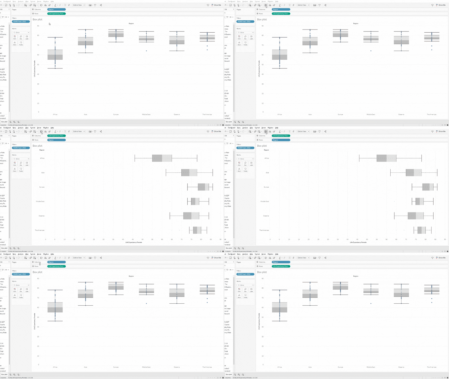
That’s it! You have just created a box plot that, for a given year, shows the distribution of average female life expectancy across different geographic areas. Now you can analyze which regions have higher values or compare them with each other.
Conclusioni
We have seen what a box plot is, what it is used for, and why it is useful, along with creating a practical example in Tableau.
A box plot is an effective tool for obtaining a compact and informative view of the key characteristics of a dataset. Its summarizing ability is its strength, making it an excellent candidate for comparing groups of data or categories on a common scale.
Read all our articles on Tableau
Do you want to discover the latest features or delve into certain functions to become an expert?

Visualitics Team
This article was written and edited by one of our consultants.
Sources:
Box Plots – openstax.org
Box Plot – www.jmp.com
Build a Box Plot – www.help.salesforce.com
whisker of boxplot – www.r-bloggers.com
Share now on your social channels or via email: