A packed bubble chart is an easy and fun way to show and compare the numerical importance of one or more variables. Dimensions define the individual bubbles, and measures define the size and color of the individual bubbles.
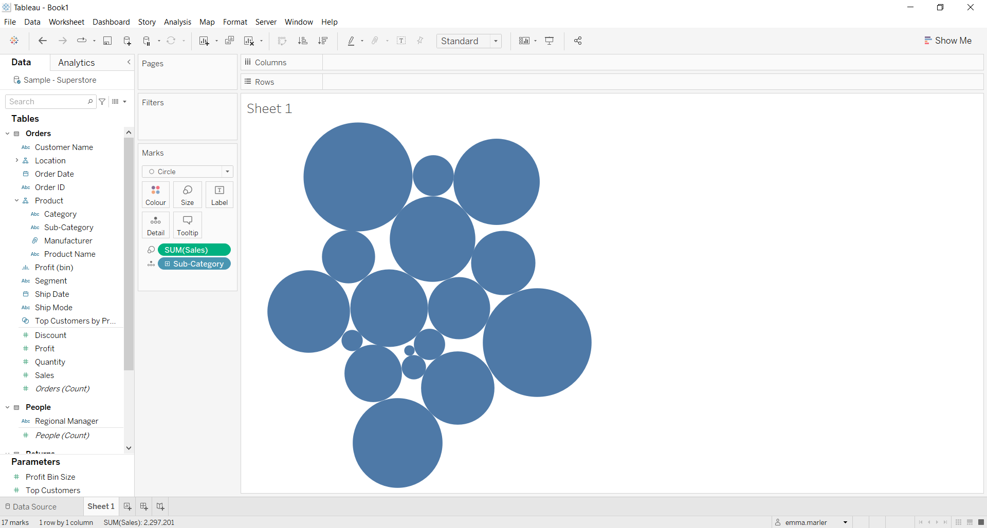
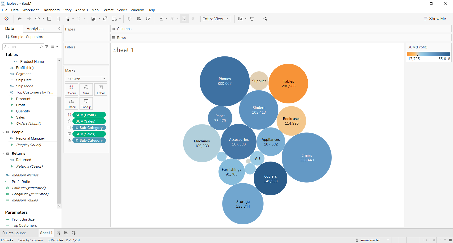
Let’s see then how to build a Bubble Chart on Tableau step-by-step. Our goal is to create a chart showing sales and profit by product sub-category with the Sample Superstore data.
Step 1. Create a bubble chart
- Connect to the data source Sample – Superstore.
- Select Circle from the dropdown list in the Marks card.
- Drag Subcategory and drop it on Detail on the Marks card.
- Drag Sales to Size on the Marks card. You have your first bubble chart!

Step 2. Customize it
- Drag Sales to Label on the Marks card to show the number of sales for each bubble representing a sub-category.
- Drag Sub-category to Label on the Marks card to show which sub-category corresponds to each bubble.
- Click on Label in the Marks card to edit font, size, order, etc. of the written information on the bubbles.

- Drag Profit on Color on the Marks card to show which sub-category generates the most profits.
- Fit to Entire View, and it’s done!

Don’t wait! Contact us to learn more and continue to follow upcoming news on our website and LinkedIn channel.