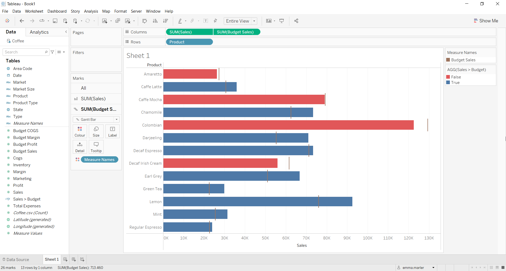
A bullet chart is useful to visually track performance against a target, displaying results in a single column. The chart can display one or many columns that can be color-coded
Let us then see how to build step-by-step bullet graph on Tableau. Our goal is to create a graph showing whether sales of different product categories have outperformed budget sales.
Step 1. Create the bullet chart
- Connect to a data source (in this case we are not using Sample – Superstore).
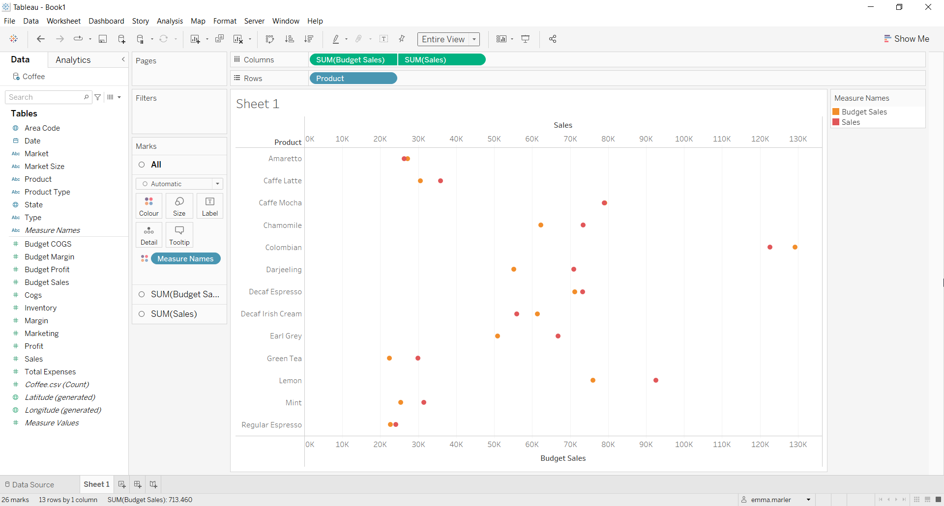
- Drag Budget Sales and Sales to the Columns.
- Drag Product to Rows.
- Right click on Sales in the Columns and select Dual Axis.
- Select the x-axis Budget Sales and click on Synchronize axis. Fit to Entire view.

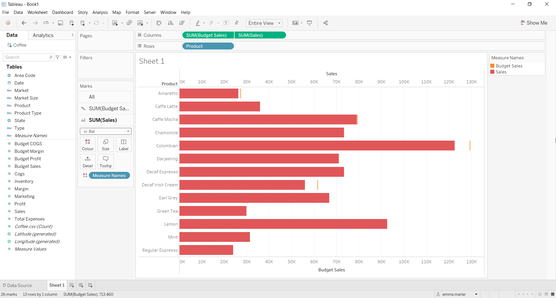
- Click on the SUM (Budget Sales) Marks card and select Gantt bar from the dropdown menu.
- Click on the SUM (Sales) Marks card and select Bar from the dropdown menu.

- Create a Calculated field. Let’s call it Sales > Budget and type sum([Sales])>sum([Budget Sales]).
- Click on the SUM (Sales) Marks card and drag the calculated field Sales>Budget on Color.
Step 2. Personalize the chart
- Change the color and size for the Budget Sales lines from its Marks card if you want to make it more effective.
- Change the colors for True and False in the top right corner next to the view if you want.
- Move Budget Sales to the right of Sales in the Columns.
- Hide the Budget Sales axis by clicking on it and select Show indicator. Done!

Don’t wait! Contact us to learn more and continue to follow upcoming news on our website and LinkedIn channel.