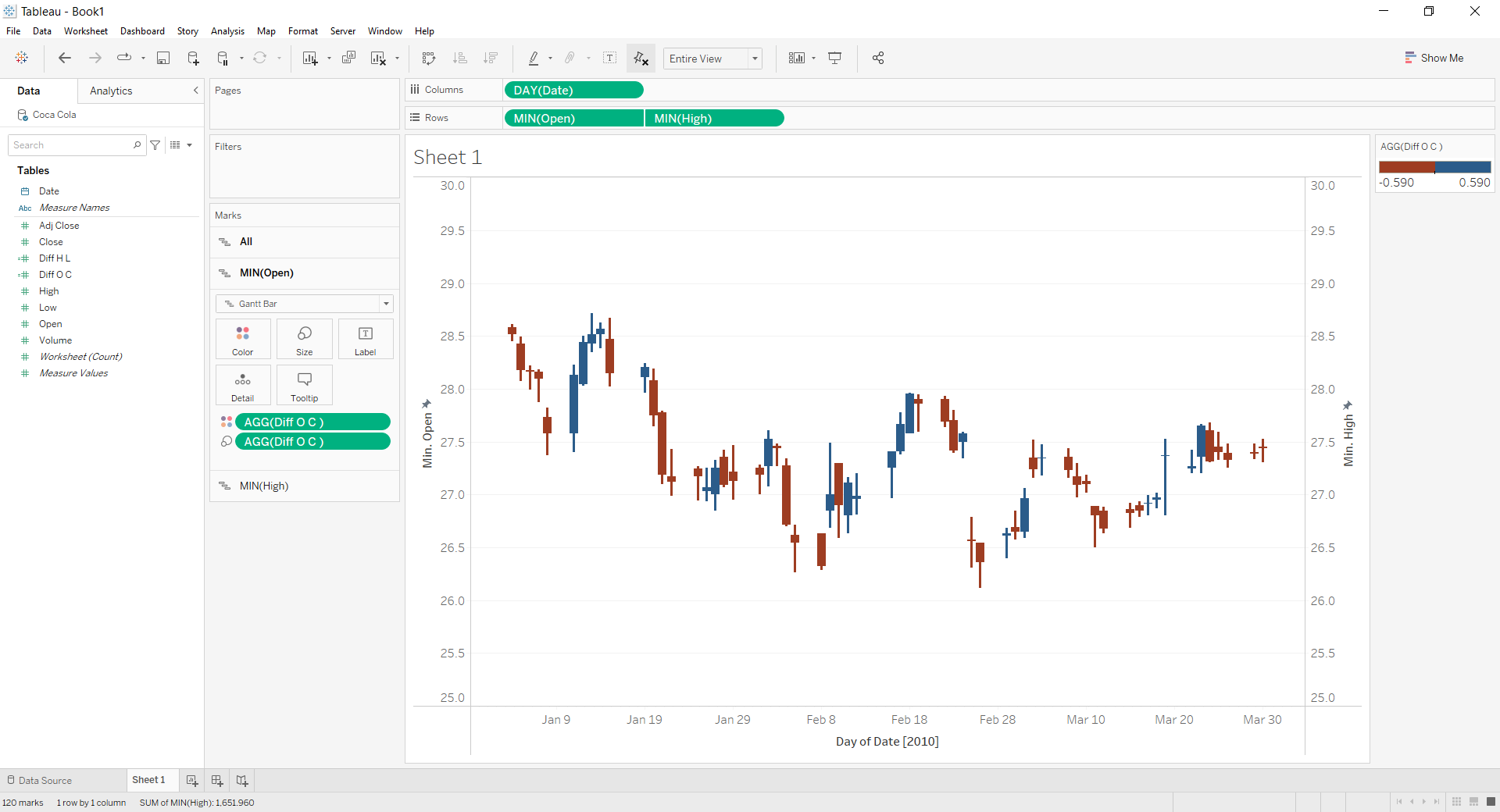
Candlestick charts are often used in finance to analyse price movements over time. Let us then see how to build step-by-step progress a candlestick chart on Tableau.
Step 1. Create the candlestick chart
- Connect to the data source (in this case we are not using Sample Superstore).
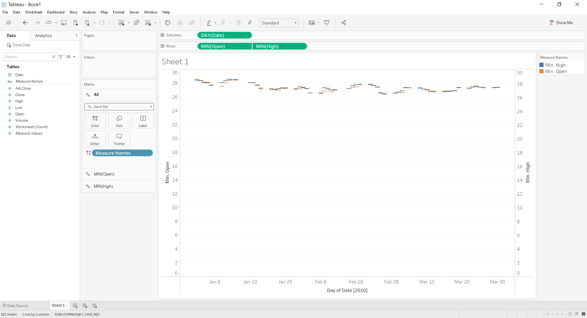
- Drag Open on Rows. Right click on it and select Measure (sum) > Minimum.
- Repeat point 2 with High.
- Right click on Date in the data pane. Select Change data type > Date.
- Drag Date on Columns and select Day May 8 2015.
- Click on MIN(High) in the Rows and select Dual axis.
- Click on the All Marks card and select Gantt Bar from the dropdown menu.

- Create a Calculated field. Let’s call it “Diff HL” and type (min([High])-min([Low]))*-1 .
- Create another Calculated field. Let’s call it “Diff OC” and type (min([Open])-min([Close]))*-1 .
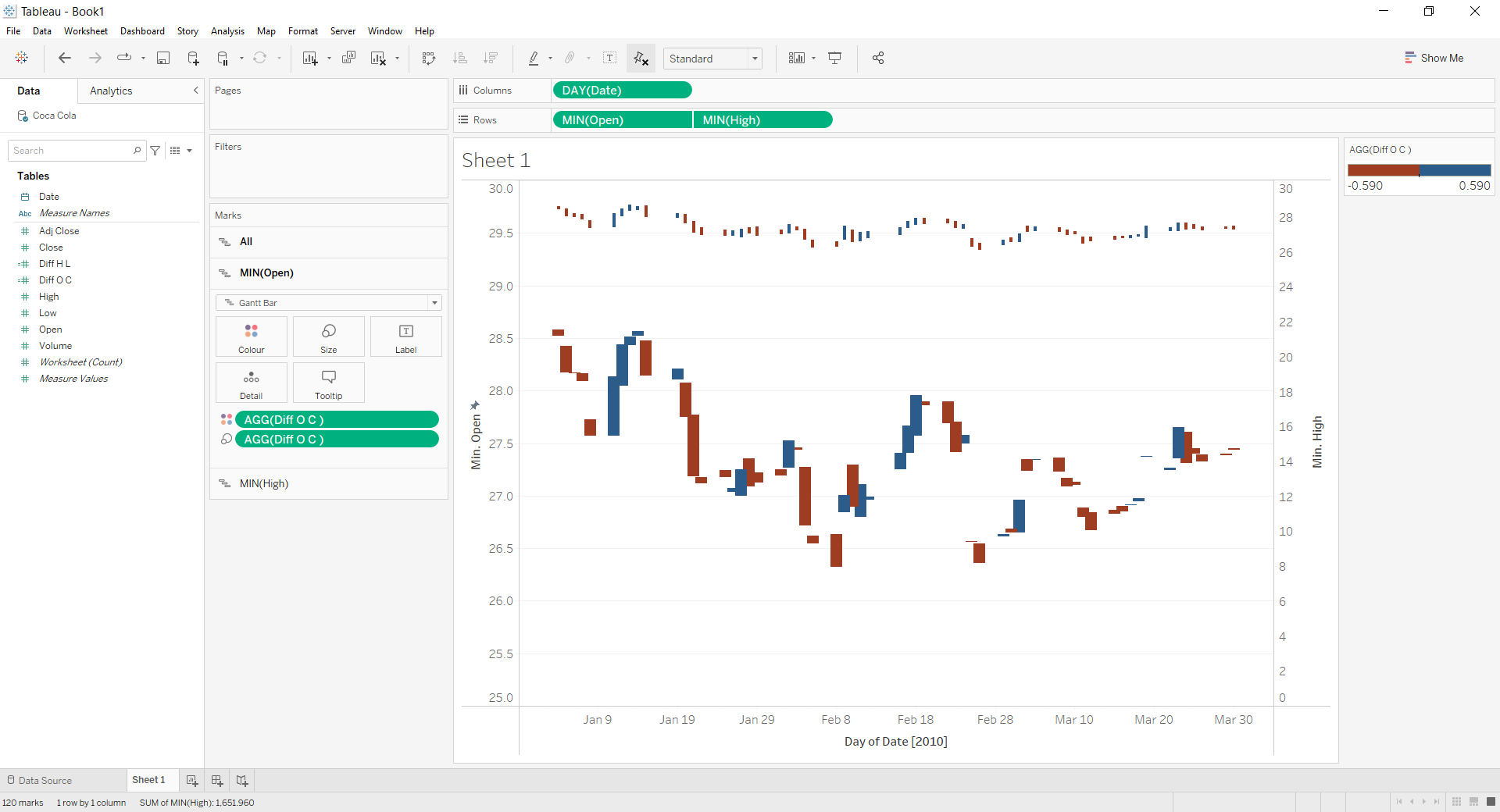
- Select the Marks card MIN (Open). Drag Diff OC on Size.
- Select the Marks card MIN (High). Drag Diff HL on Size. Reduce the size.
- Select the Marks card All. Drag Diff OC on Color. Select two stepped colors like blue and red.
- Right click on the y axis on the left “Min Open”. Choose Range > Fixed > and insert 25 as a Fixed start.

- Select the y axis on the right “Min High” and select Synchronize axis. Done!

Don’t wait! Contact us to learn more and continue to follow upcoming news on our website and LinkedIn channel.