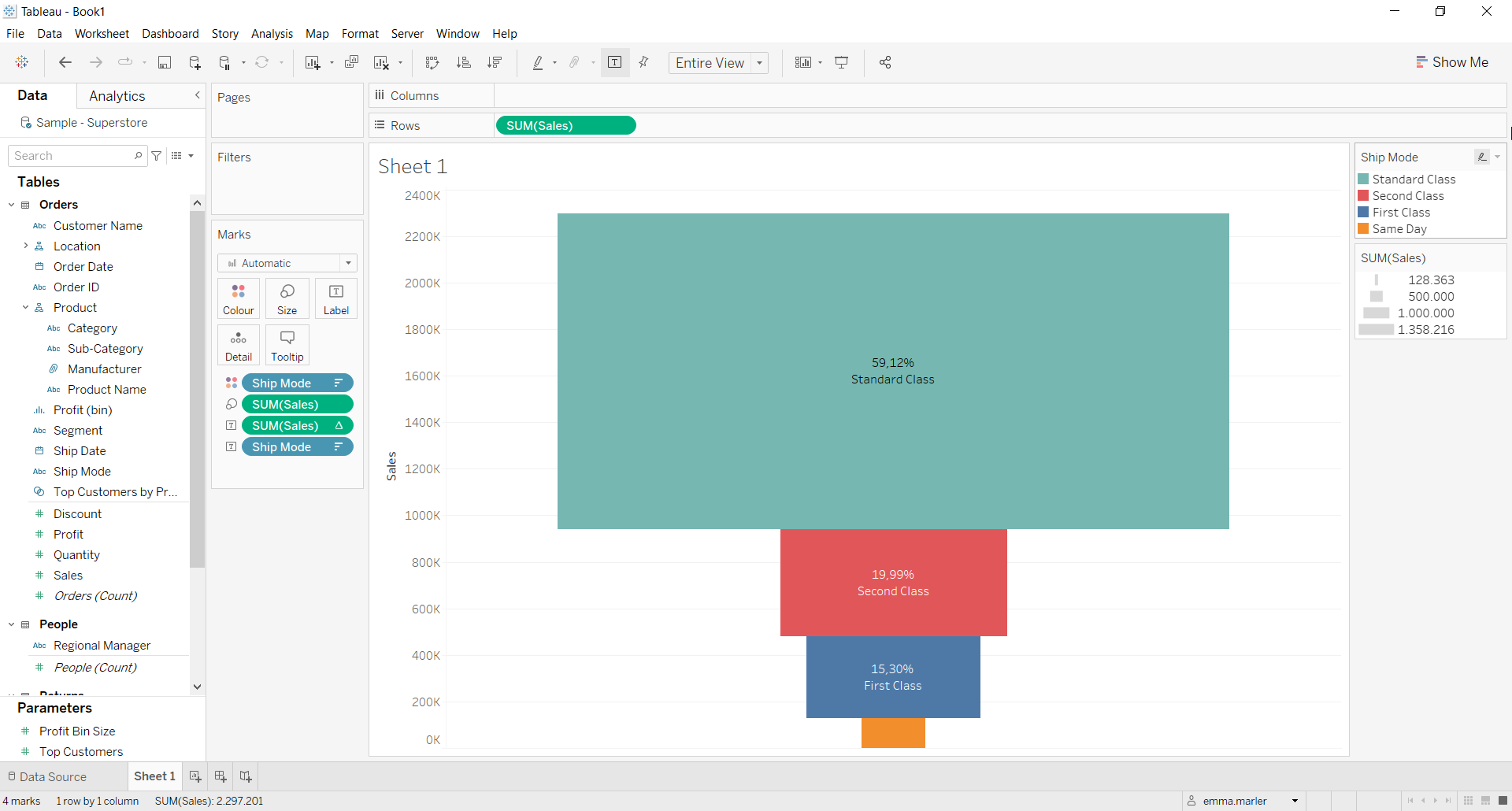
A funnel chart is generally used to visualize how data moves through a process. The chart takes its name from its shape, which starts from a broad head and ends in a narrow neck.
Let us then see how to build step-by-step funnel chart on Tableau. Our goal is to create a graph showing sales per ship mode from Sample Superstore data.
Step 1. Create the chart
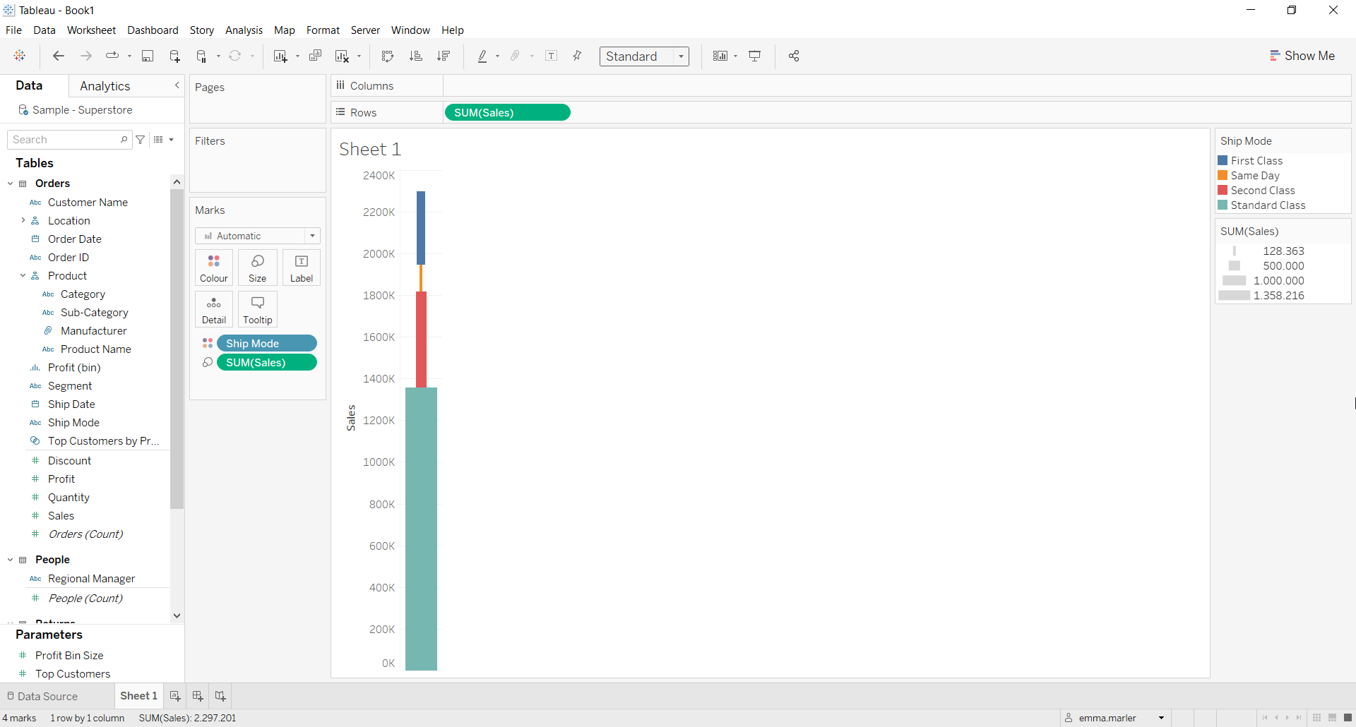
- Connect to the data source Sample – Superstore.
- Drag Sales to Rows.
- Drag Sales on Size in the Marks card.
- Drag Ship mode to Color in the Marks card.

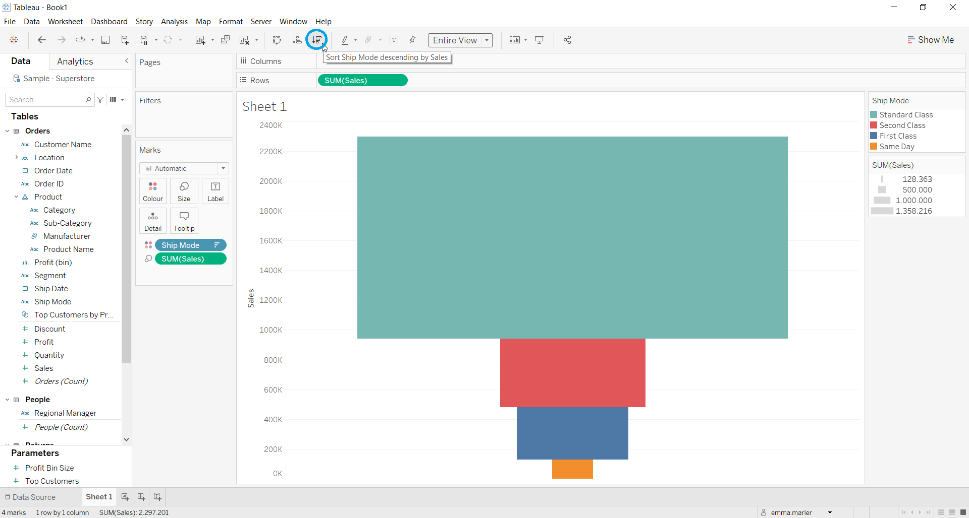
- Click where the blue circle is to apply a descending order. And Fit to entire view.

- Drag Sales and Ship mode on Label in the Marks card.
- Right click on Sales in the Marks card, select Quick Table calculation > percent of total.

Don’t wait! Contact us to learn more and continue to follow upcoming news on our website and LinkedIn channel.