The Gantt chart is a graph used primarily to show the duration of certain activities and to plan and/or observe the evolution of a project on a time scale. It consists of a horizontal axis, which represents the total time frame of an event/project, and a vertical axis, which shows the activities that make up the project itself.
Let us then see how to build step-by-step a Gantt chart on Tableau. Our goal is to create a graph showing the different ship modes per date from the Sample Superstore data source.
Step 1. Create a Gantt chart
- Connect to the data source Sample Superstore).
- Drag Order ID on Rows. Select Add all members.
- Drag Order Date to Columns. Right click on it and select Day 8 May 2015.
- Drag Order Date to Filters and select Range of Dates. Add a range of values you like, for example we chose 5/24/2019 – 6/29/2019.
- Drag Category to Filters. Select Technology.
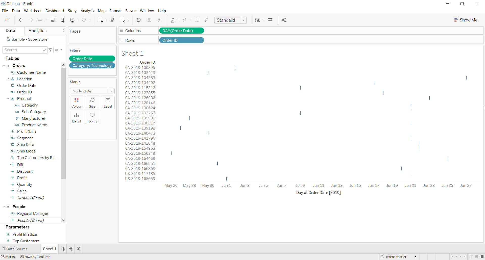
- Select Gantt bar from the dropdown menu in the Marks card. At this point your screen should look like this.

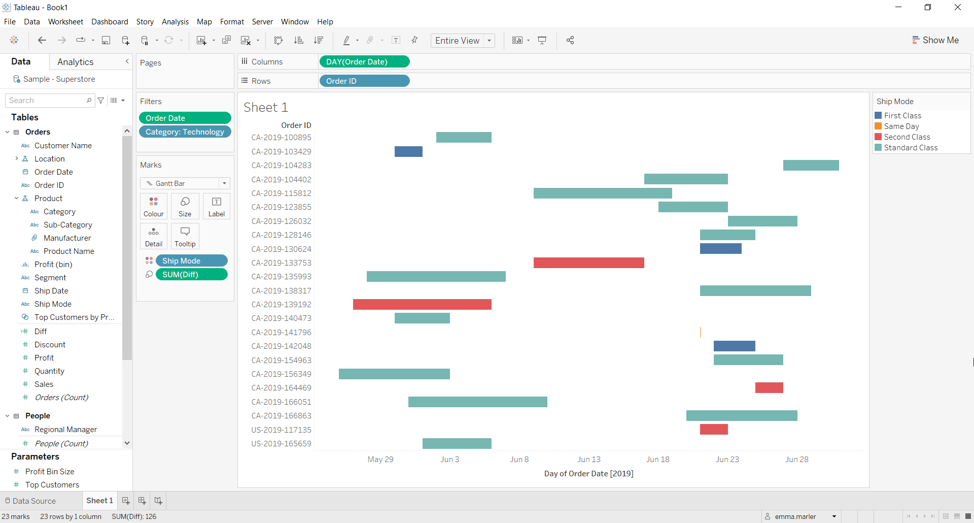
- Create a calculated field. Let’s call it “Diff” and type [Ship Date]-[Order Date].
- Drag Diff on Size in the Marks card.
- Drag Ship Mode on Color in the Marks card.

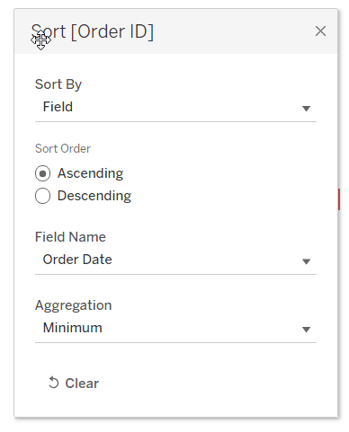
- Right click on Order ID in the Rows and select Sort. Fill out the window as below.

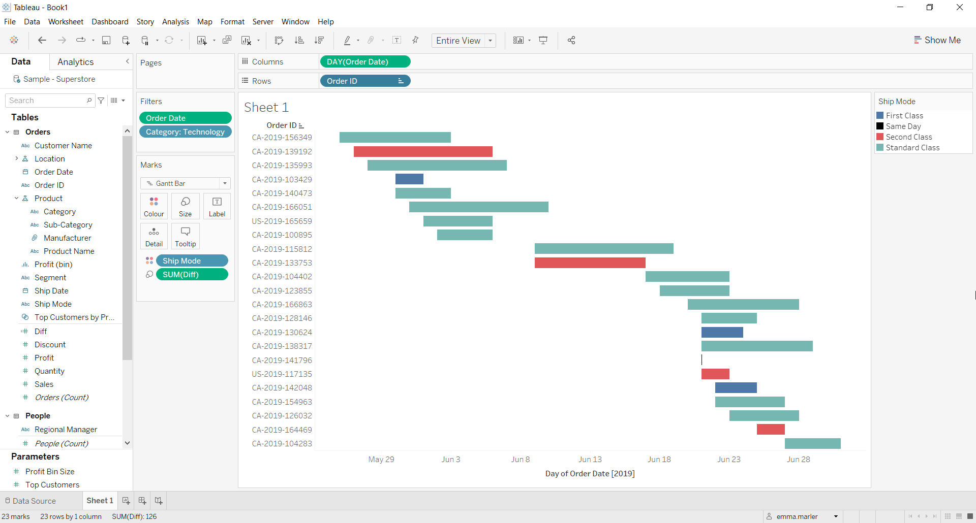
- Fit to Entire view and edit the colors if you want. Done!

Don’t wait! Contact us to learn more and continue to follow upcoming news on our website and LinkedIn channel.