A histogram is used to summarize discrete or continuous data that are measured on an interval scale. It has the purpose of showing the distribution of your data.
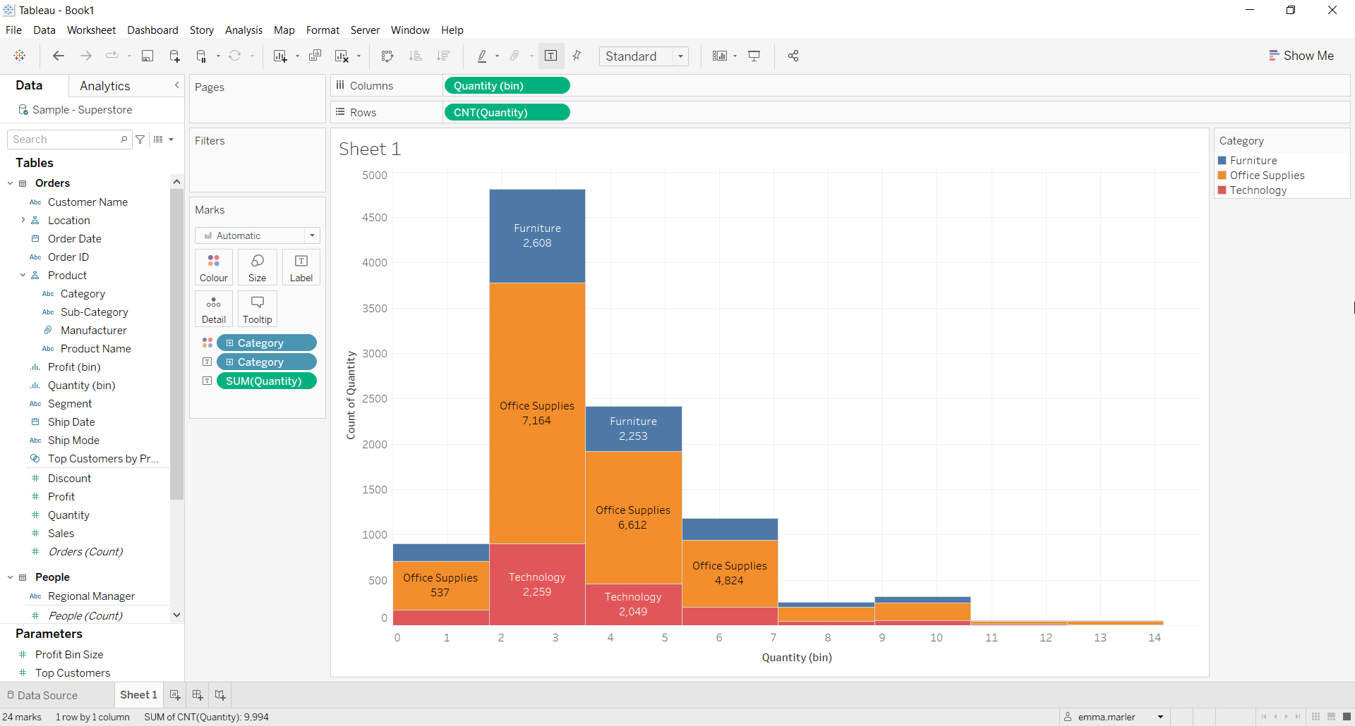
Let us then see how to build step-by-step a histogram in Tableau. Our goal is to create a graph showing quantity per product category from Sample Superstore data.
Step 1. Create a histogram
- Connect to the data source Sample – Superstore.
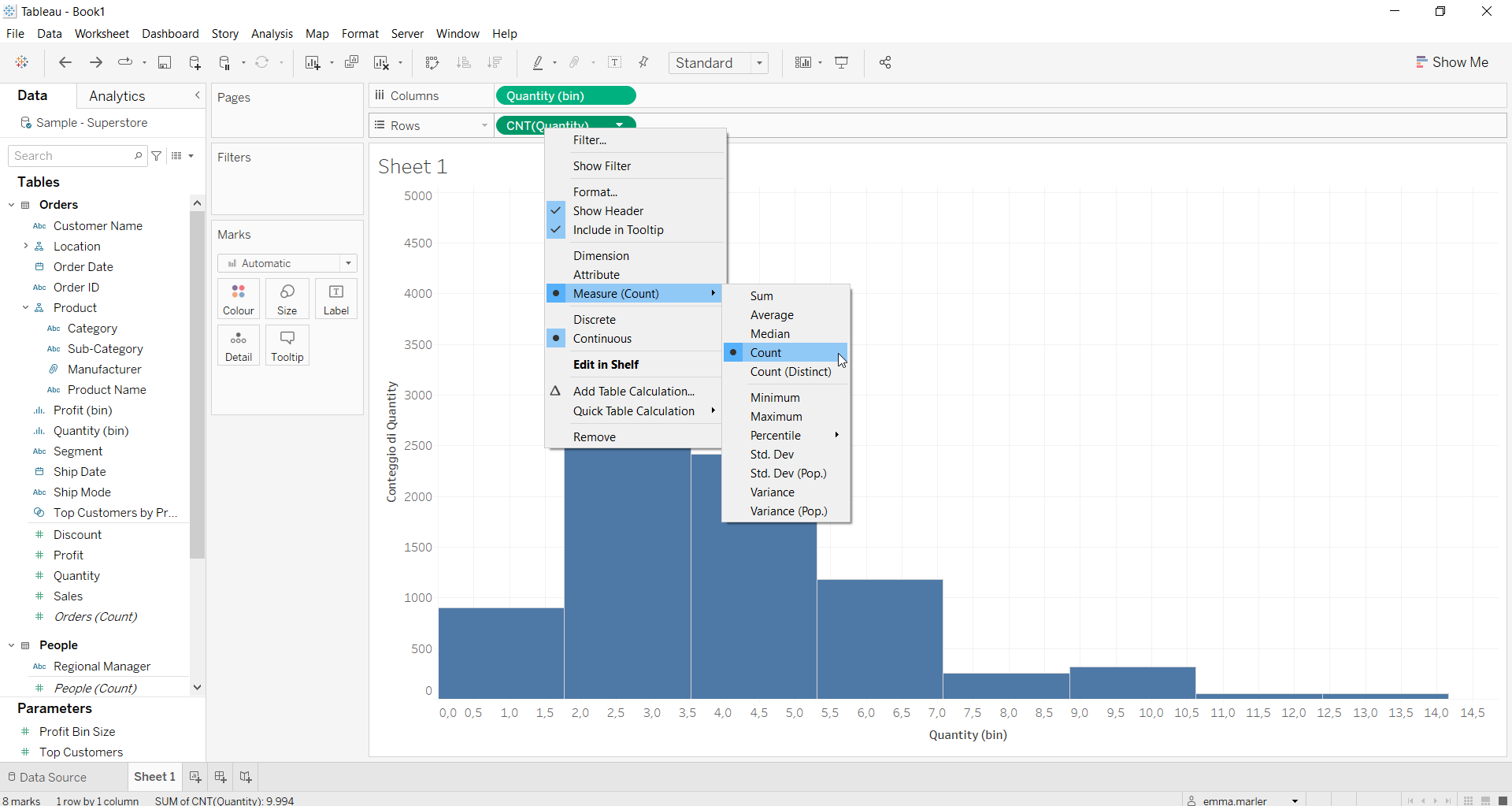
- Right click on Quantity in the list of dimensions and measures. Select Create > Bins and when the window opens up press OK.
- Drag Quantity (bin), which Tableau has just created, onto Columns. Right click on it and select Continuous.
- Drag Quantity to Rows. Right click on it, and select Measure > Count.

- Drag Category on Color in the Marks card.
- Drag Category and Quantity on Label in the Marks card.

- Right click on SUM (Quantity) in the Marks card. Select Quick Table Calculation > Percent of total.
- Right click on SUM (Quantity) again, select Compute using > Category. Done!

Don’t wait! Contact us to learn more and continue to follow upcoming news on our website and LinkedIn channel.