In this article, we will explain what a line chart with dots is and why it’s useful. We will also guide you step by step on how to create one in Tableau.
A line chart with dots consists of a series of data points connected by lines, useful for showing the progression of a variable over time or another continuous interval.
What is a Line Chart with Dots and What is it Used For?
A line chart with dots is a chart where each data point represents a value associated with a specific time point, connected to the next value by a line.
With a line chart with dots, you can provide a dynamic representation of data that helps us understand their temporal evolution. It can be used as a visual tool to:
Visualize trends: visually, it’s possible to identify trends in the data, such as increases or decreases in values over time.
Visualize fluctuations and relationships: it can highlight possible relationships or fluctuations in the data, which may be random or not, such as seasonal fluctuations.
Identify anomalies: anomalies can be identified directly from the visual representation, such as outliers due to incorrect data.
How to Create a Line Chart with dots in Tableau
Let’s see how to create a line chart with dots. We will use the Sample Superstore dataset integrated into Tableau Desktop to analyze monthly sales from the last two years.
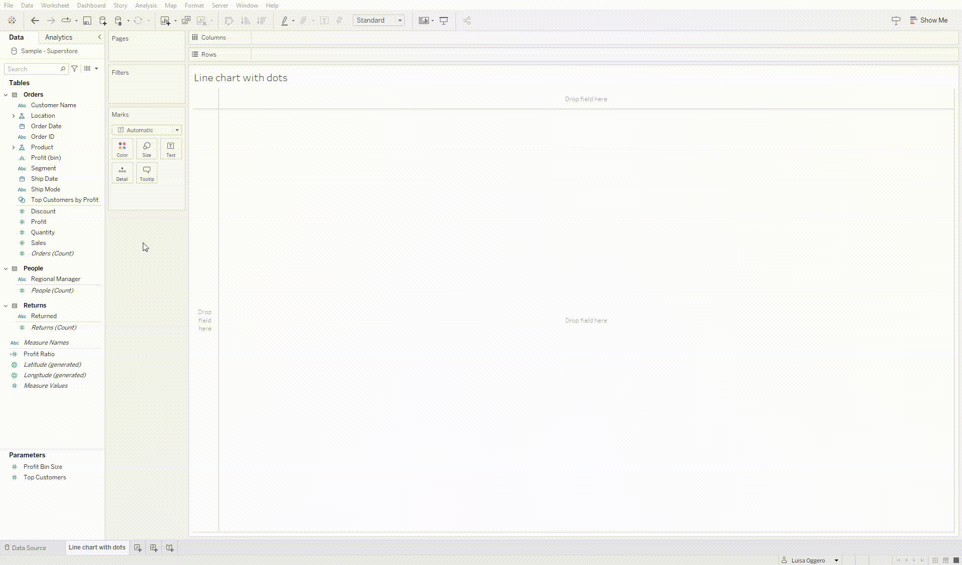
Step 1: Create a Line Chart
Connect to the Sample – Superstore data source.
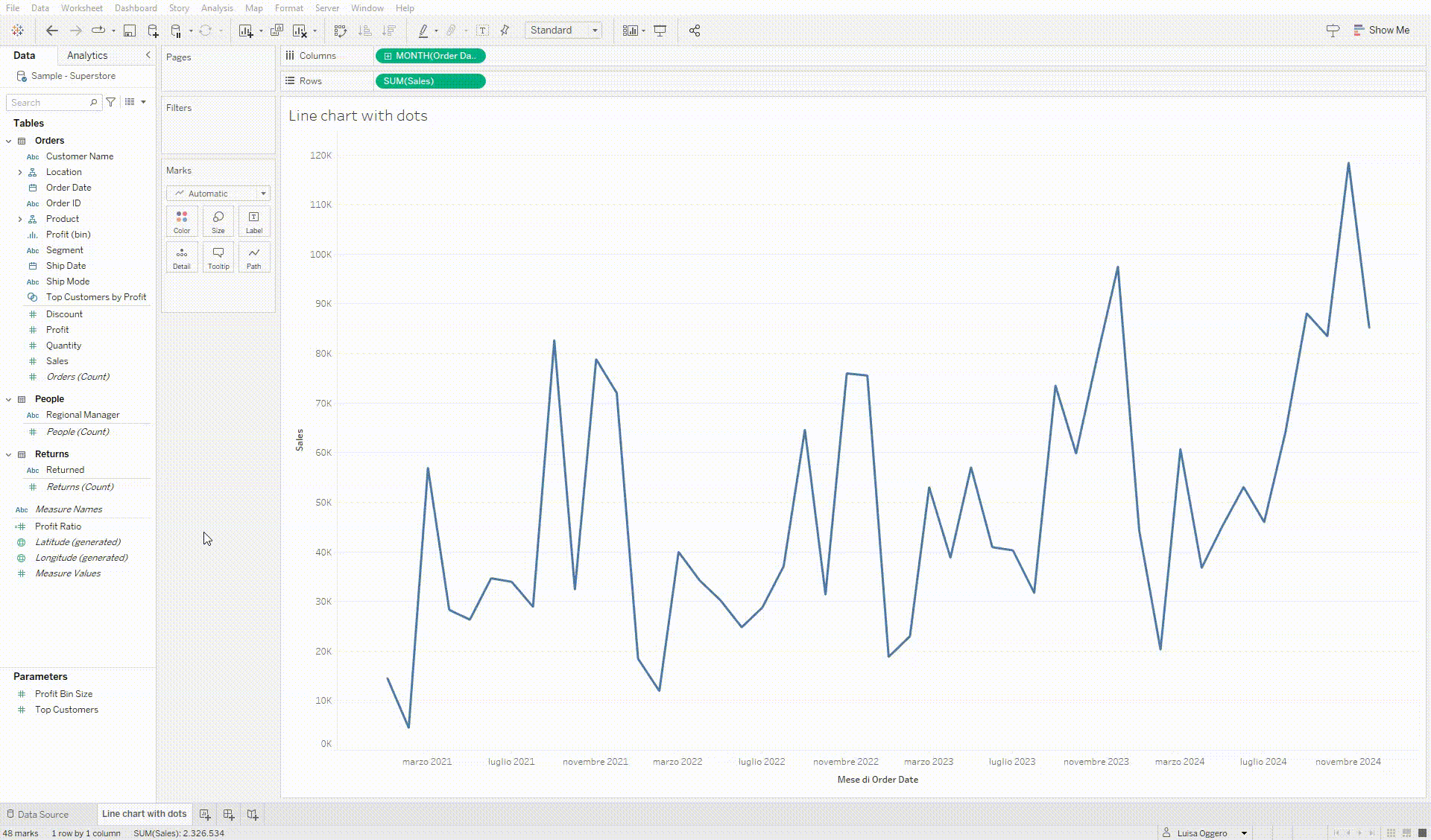
Drag the Order Date field to Columns. Right-click on it and select the continuous month option – Month: May 2015.
Drag Sales to Rows. You will see a standard line chart.
Create a Line Chart
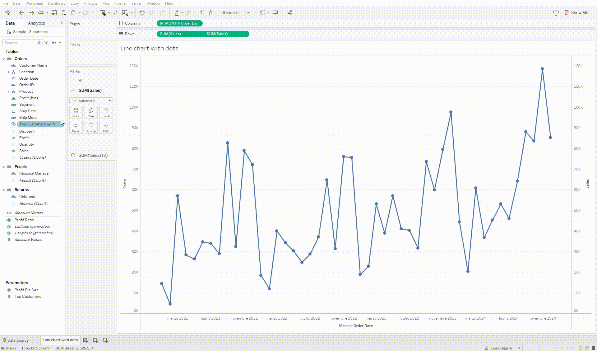
Step 2: Create a Circle Chart and Build a Dual-Axis
Drag Sales to Rows again.
Change the chart type of the second graph from a line to a circle.
Right-click on the y-axis of the second graph and select Dual-Axis.
Right-click again on the y-axis of the second graph and select Synchronize Axis.
Create a Circle Chart and Build a Dual-Axis
Step 3: Filter and Customize the Visualization
Drag the Order Date field into the Filters section, select Date Range, and choose the last two years.
Right-click on the y-axis on the right and deselect Show Header to hide it.
Click on the second chart’s marker to change the color of the points.
Drag the Sales field to the first chart’s label section to add value labels.
Click on Analysis and drag the Trend Line to Linear to visualize the data trend over time.
Filter and Customize the Visualization
And there you have it! Your line chart with dots in Tableau is ready. You can now see the sales trend over the last two years, read the values for individual months, and observe the upward trend in the data.
Read all our articles on Tableau
Do you want to discover the latest features or delve into certain functions to become an expert?