A lollipop chart is a variation of a bar chart where the bar is replaced with a line and a dot at the end. Similarly to bar graphs, lollipop charts are used to make comparisons between different categories, as well as ranking or for showing trends over time. The most common use is when the bar charts have all similar heights and so the graph results in just a bit too much colour. In this case, a lollipop chart would make for a more appealing data visualisation.
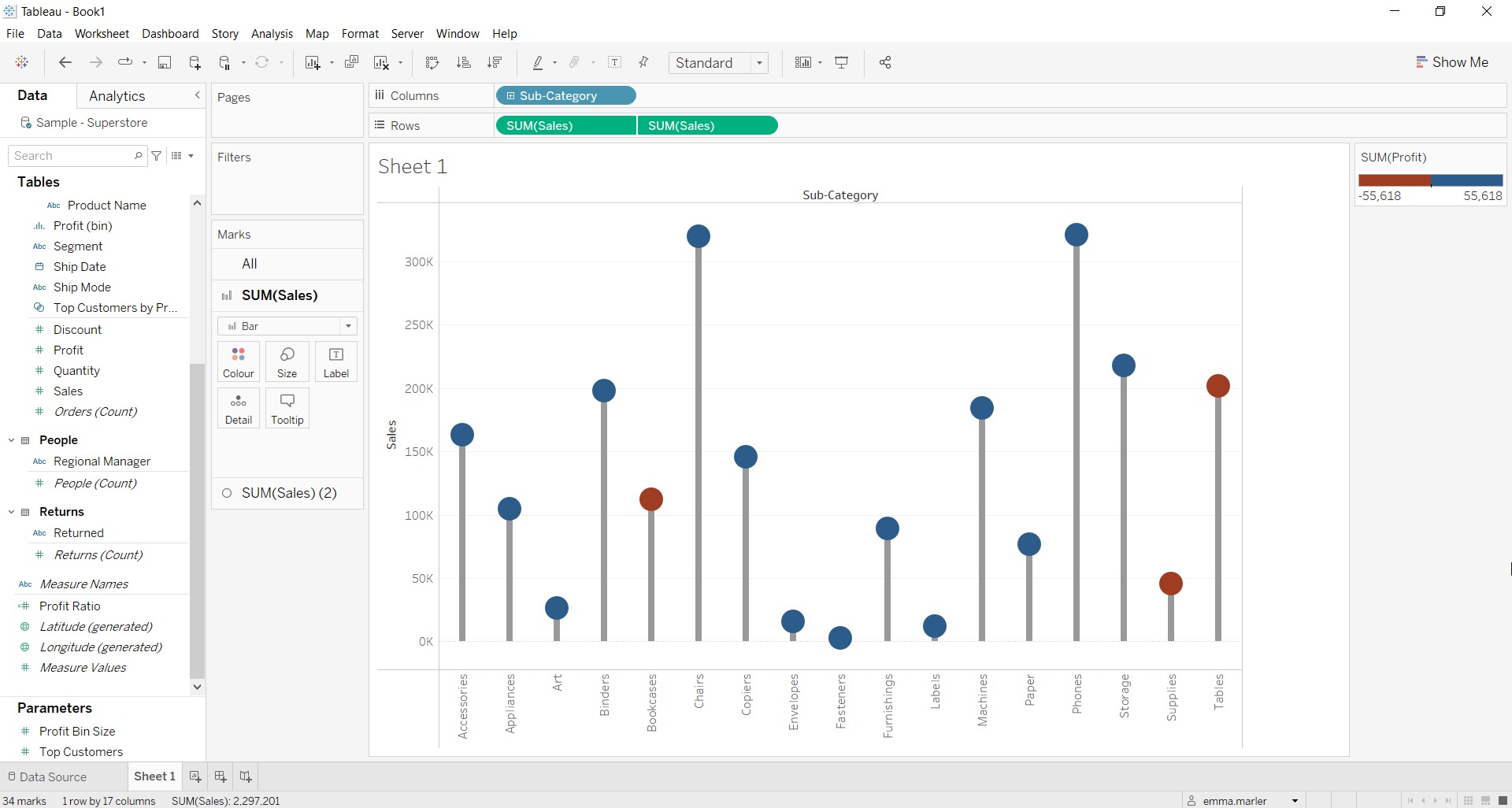
Let us then see how to build step-by-step a lollipop chart on Tableau. Our goal is to create a graph showing sales and profits for each sales category from Sample Superstore data.
Step 1. Create the chart
- Connect to the data source Sample – Superstore.
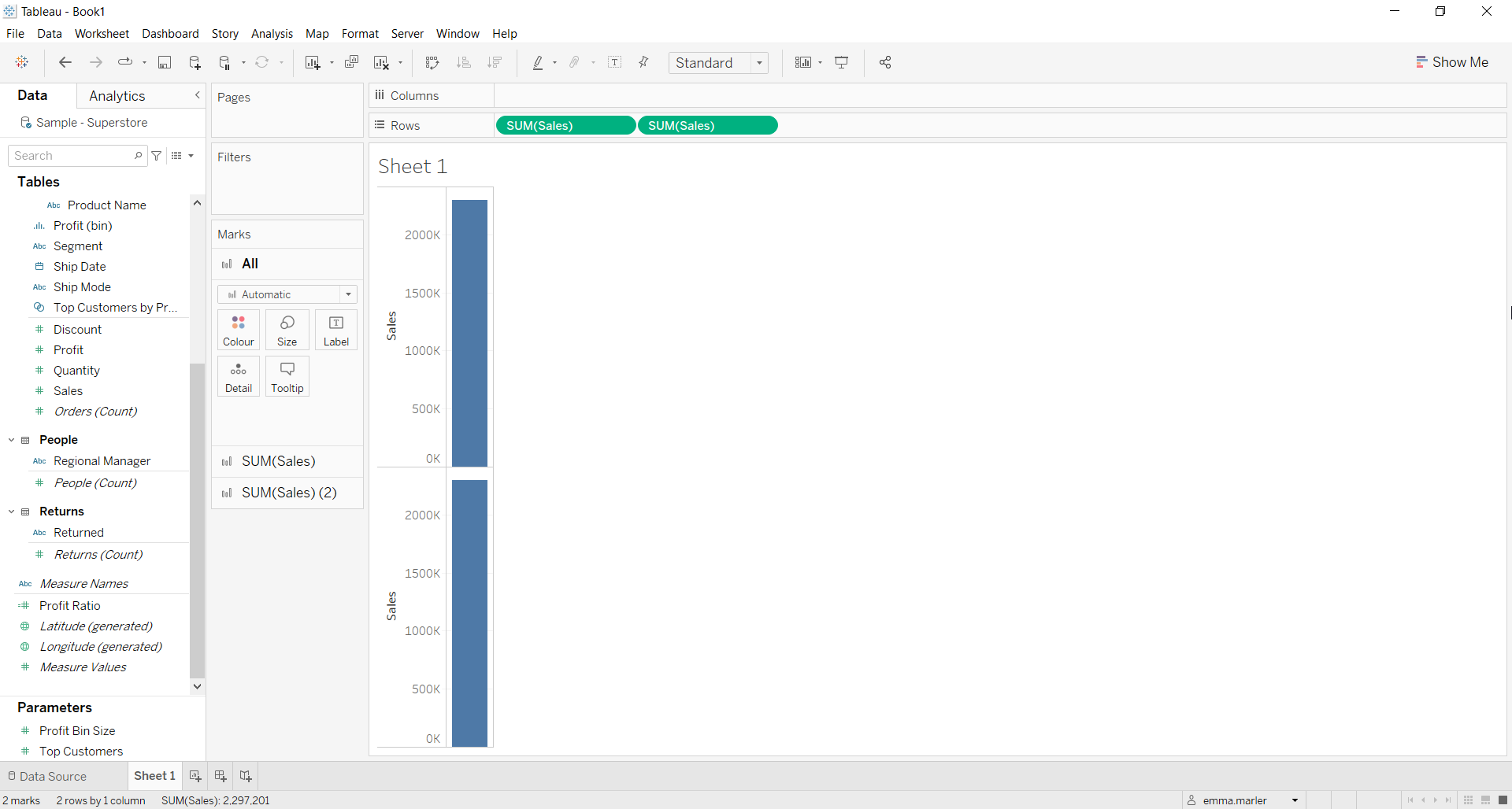
- Drag Sales to Rows twice. This way you will get two separate Marks cards for Sales.
- Right click on the second Sales tab in rows and select Dual axis.
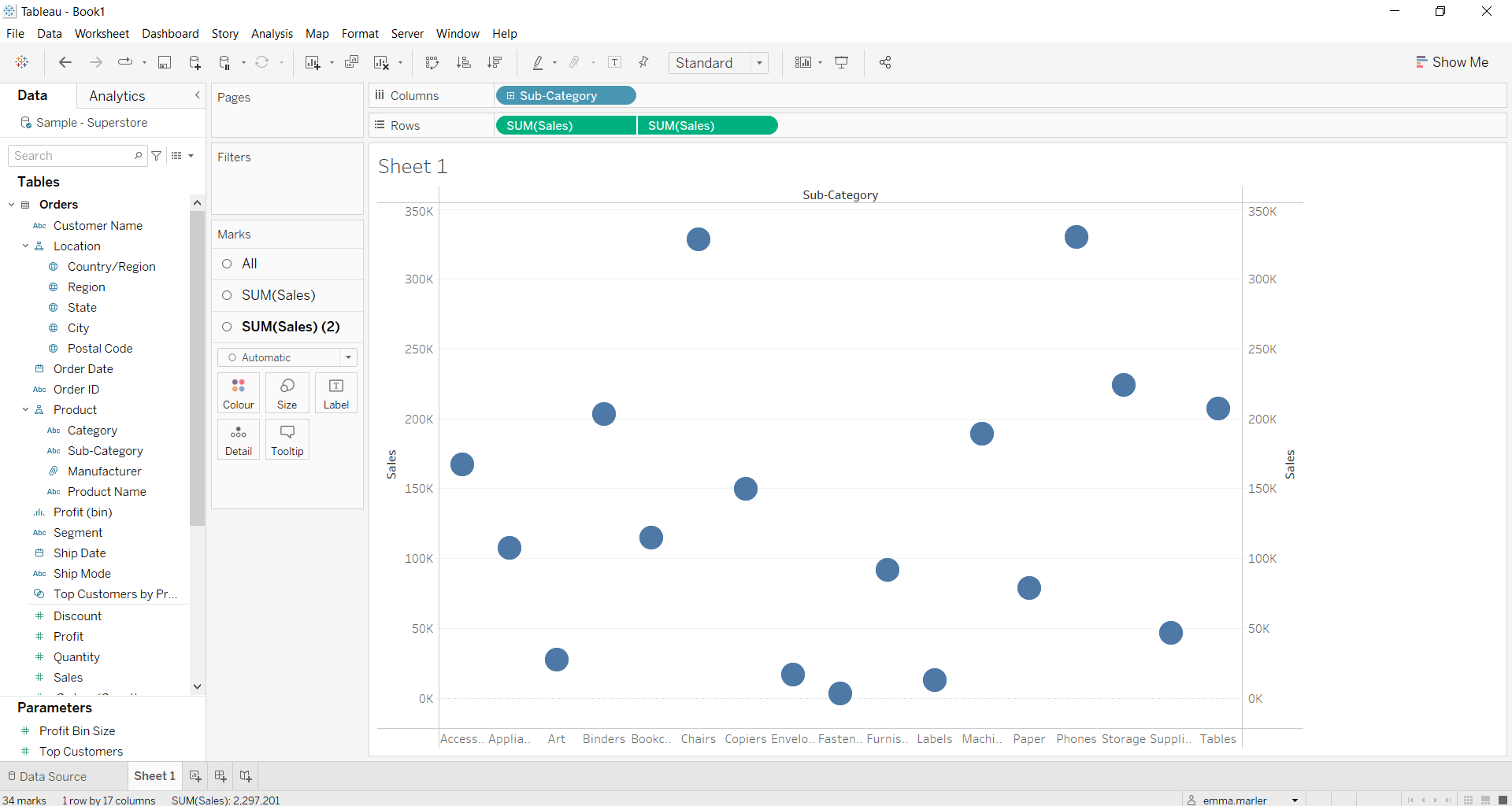
- Drag Sub-Category (under Product) to the Columns.
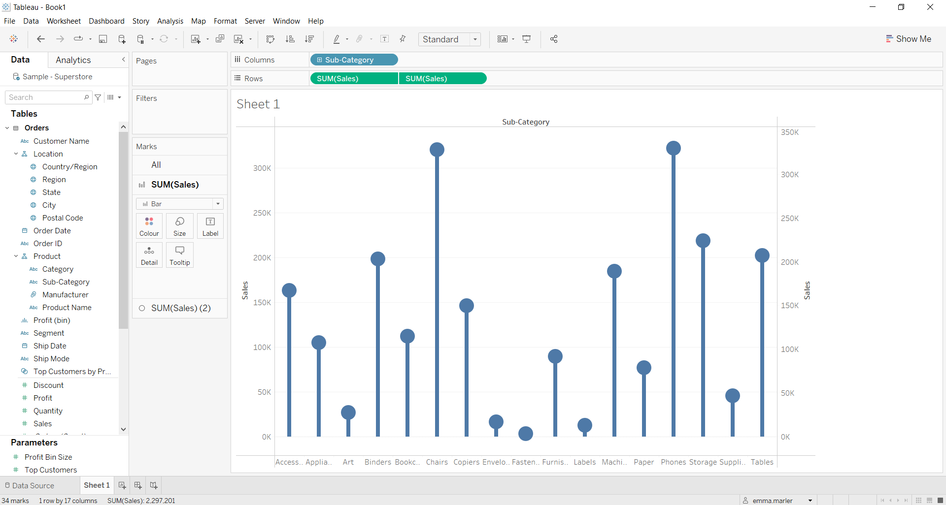
- Select Bar from the dropdown menu in the first Sales Marks card (which should be called SUM(Sales)). Reduce the width of the bars on Size in the Marks card to create lollipop shapes.
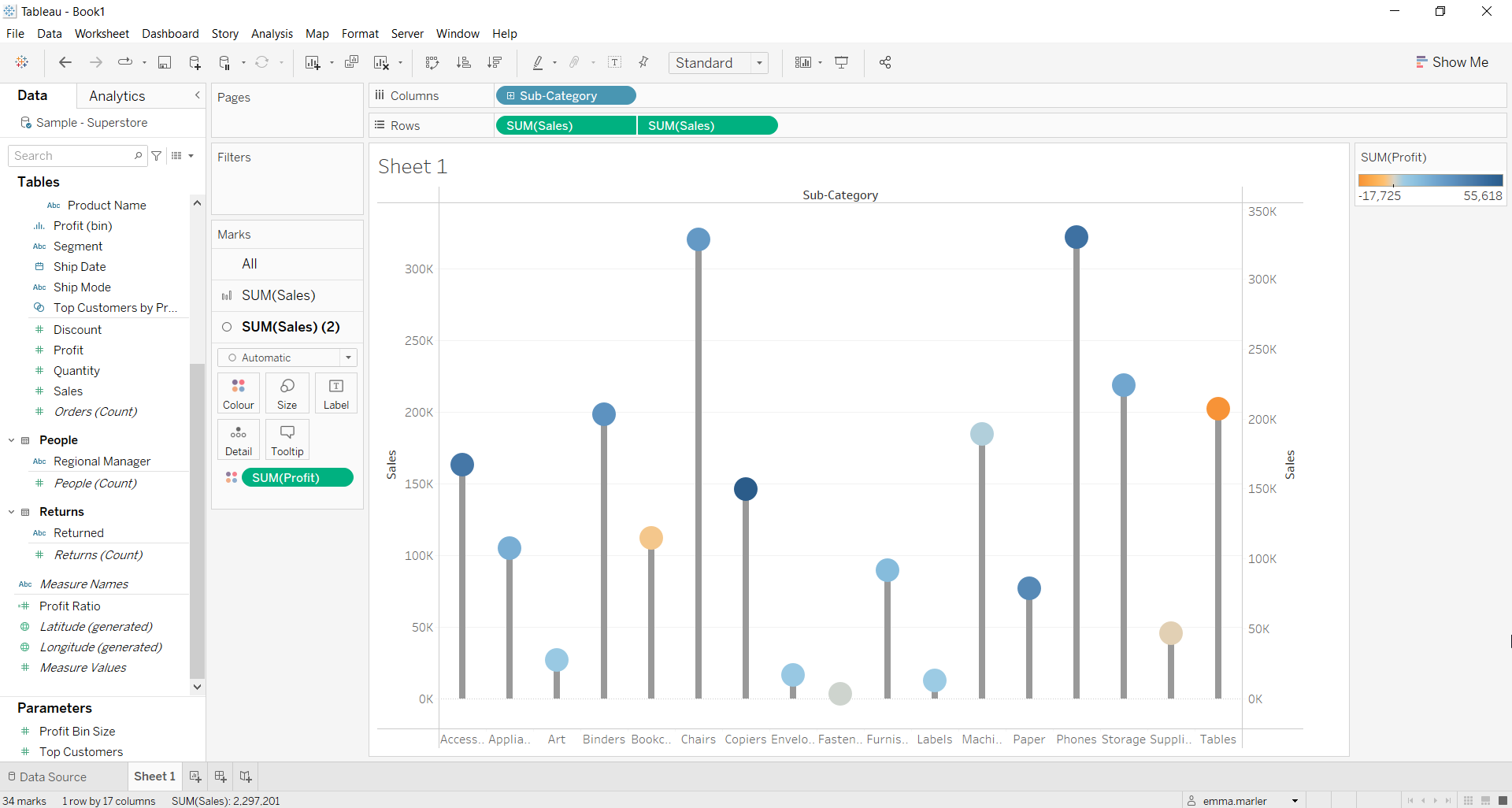
- Drag Profit on Color in the second Marks card (SUM(Sales) (2)) to add Profit values to your lollipop chart.
Step 2. Personalize your chart
- Click on Color in the second Marks card, on Edit Colors you can choose due colors from Stepped Color so to have one color for positive values and one for negative values.
- Right click on the Sales axis on the right, and untick Show header so that just the Sales axis on the left is visible. You can also on the sub-categories axis and select rotate so that the single categories are more visible on the axis. All done!
Don’t wait! Contact us to learn more and continue to follow upcoming news on our website and LinkedIn channel.