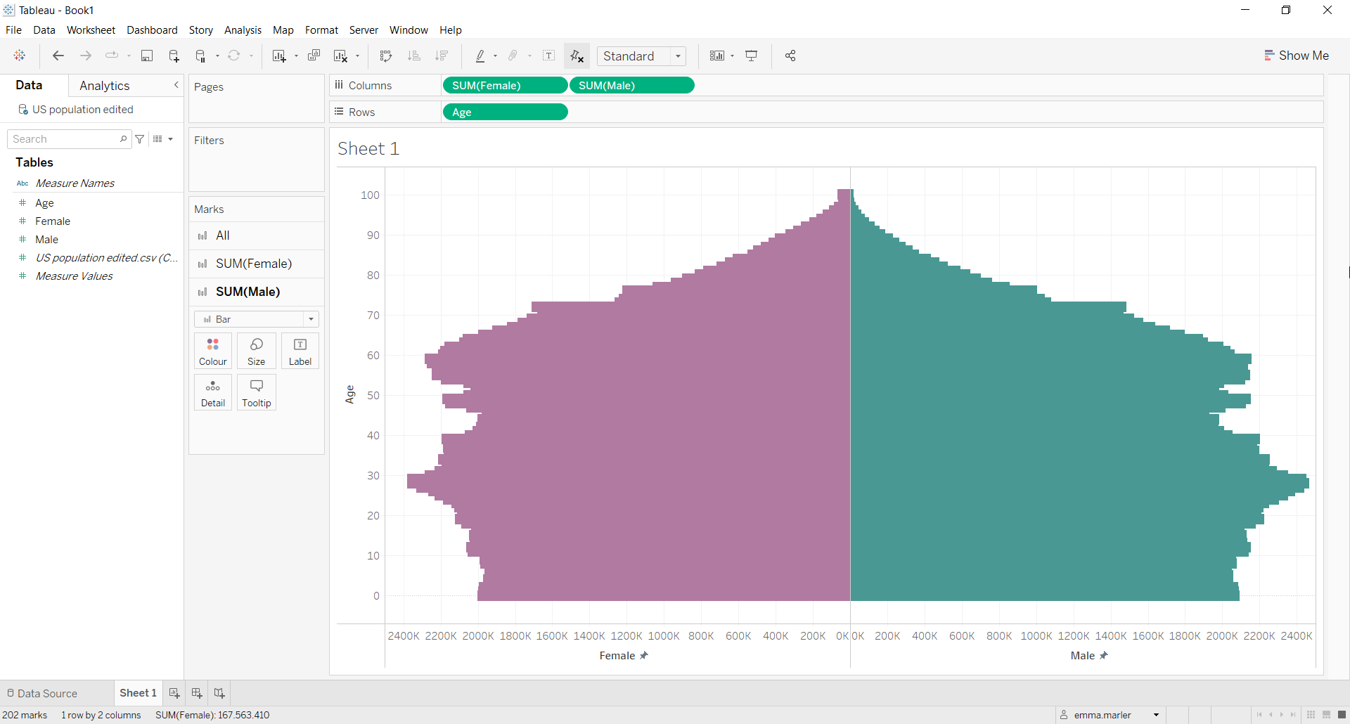
A population pyramid graph shows the distribution of a population by age groups and sex, and it is widely used in demography studies.
Let us then see how to build step-by-step a population pyramid on Tableau.
Step 1. Create the chart
- Connect to a population data source (in our case US population data).
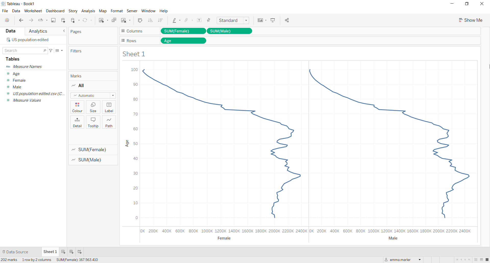
- Drag Female and Male to the Columns.
- Drag Age to Rows.
- Right click on the Age tab in Rows and select Dimension.

- Select the All Marks card and choose Bar from the dropdown menu.
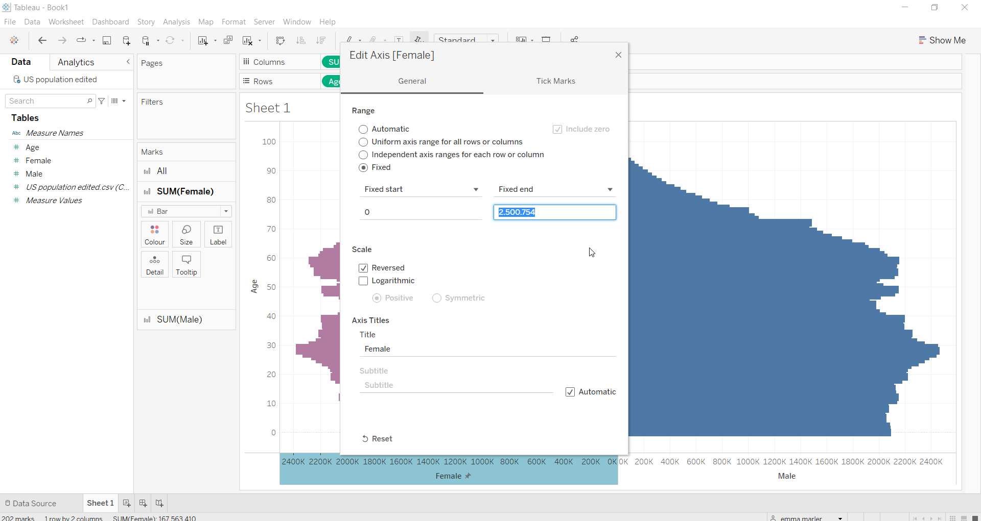
- Click on the x-axis for Female and click Edit axis > tick Reversed. Always in the Edit axis window that opens up, select Fixed and copy the Fixed end value (highlighted in the following picture).

- Now click on the x-axis for Male, select Fixed and paste that value in the Fixed end value space.
- Choose different colors in the respective Marks cards.

Don’t wait! Contact us to learn more and continue to follow upcoming news on our website and LinkedIn channel.