In this article, we will explore the Progress Bar Chart in Tableau, a powerful visualization that allows for the representation of progress towards a specific goal. You will discover how to construct a bar chart that represents an indicator from 0 to 1, how to compare a value with the maximum in the dataset, and how to create a Rounded Progress Bar Chart.
What is a Progress Bar Chart?
The Progress Bar Chart is a chart that describes the progress made towards a certain goal. It can be useful within a project to check the progress made by the team. Alternatively, it is used to assess how a percentage or an indicator is positioned.
To create the Progress Bar Charts, two data sources will be used: life expectancy vs liberal democracy index and the superstore dataset provided by Tableau.
How to Build a Progress Bar Chart Representing an Indicator from 0 to 1?
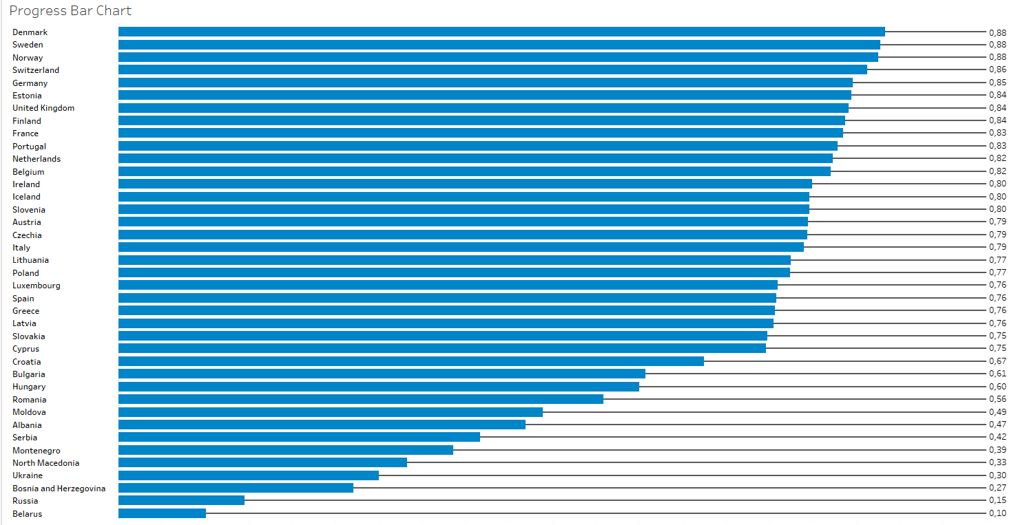
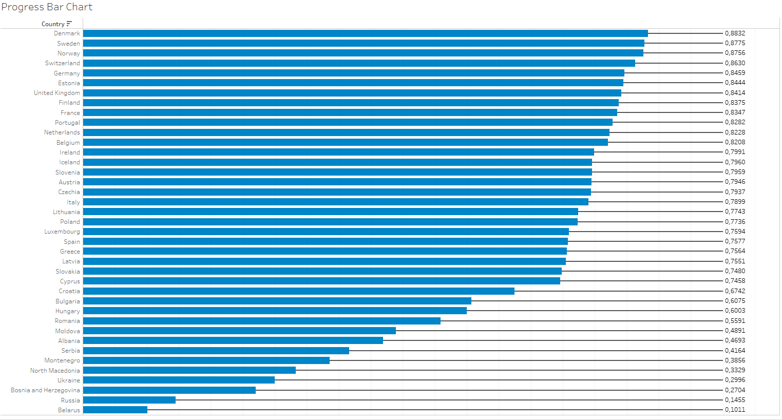
To construct the first progress bar chart, we will use the first data source, which represents the liberal democracy index ranging from 0 to 1. Our goal is to understand how various countries in Europe position themselves relative to the maximum value, which is 1.
Here is the result we will achieve:
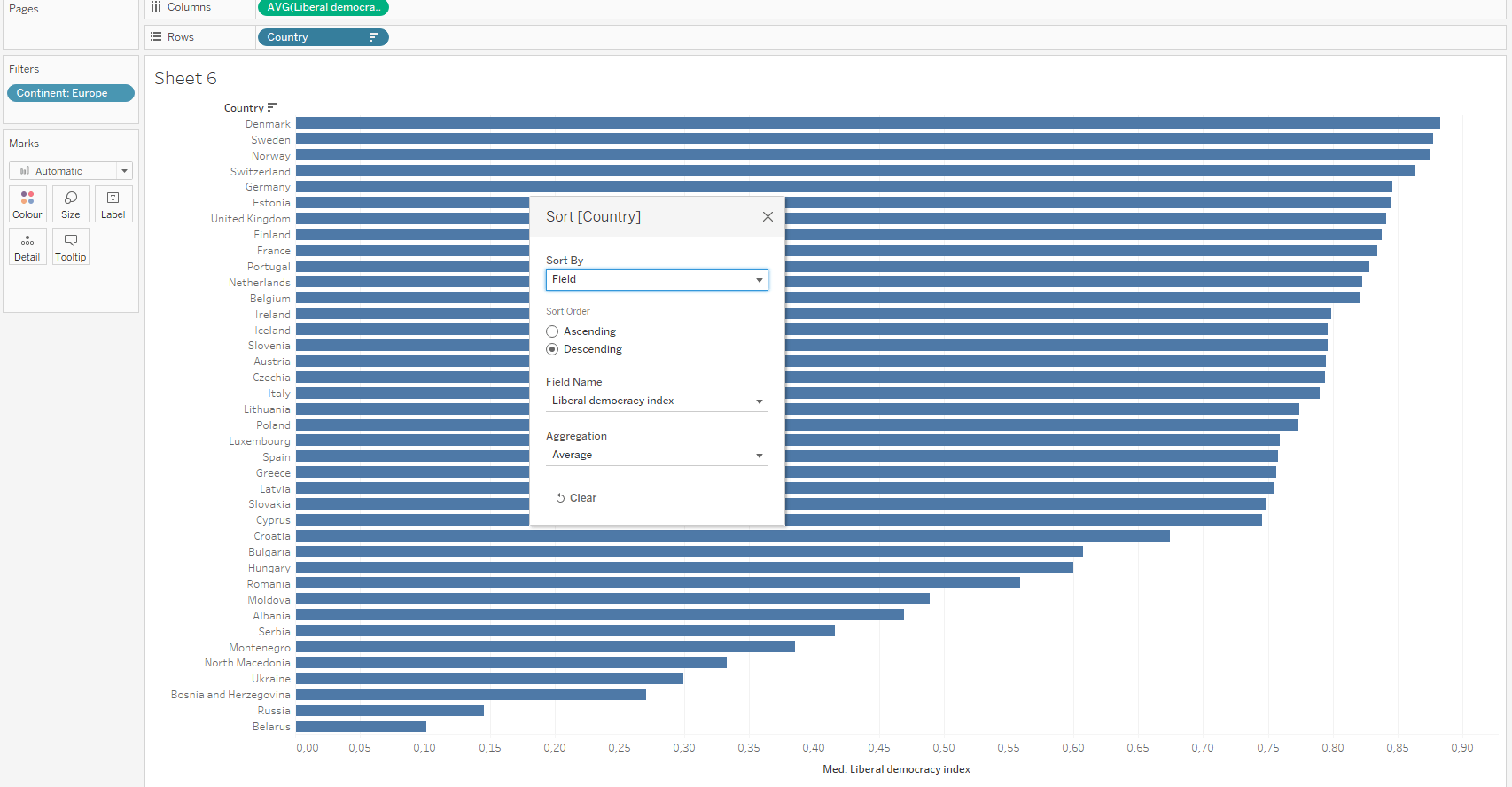
To build a standard horizontal bar chart, we start by inserting the “Country” field into the rows and the average of the “Liberal Democracy Index” into the columns. Next, we modify the sorting of the countries: right-click on “Country” and select descending order based on the average of the “Liberal Democracy Index”. Then, drag “Continent” into the filters and select “Europe”.
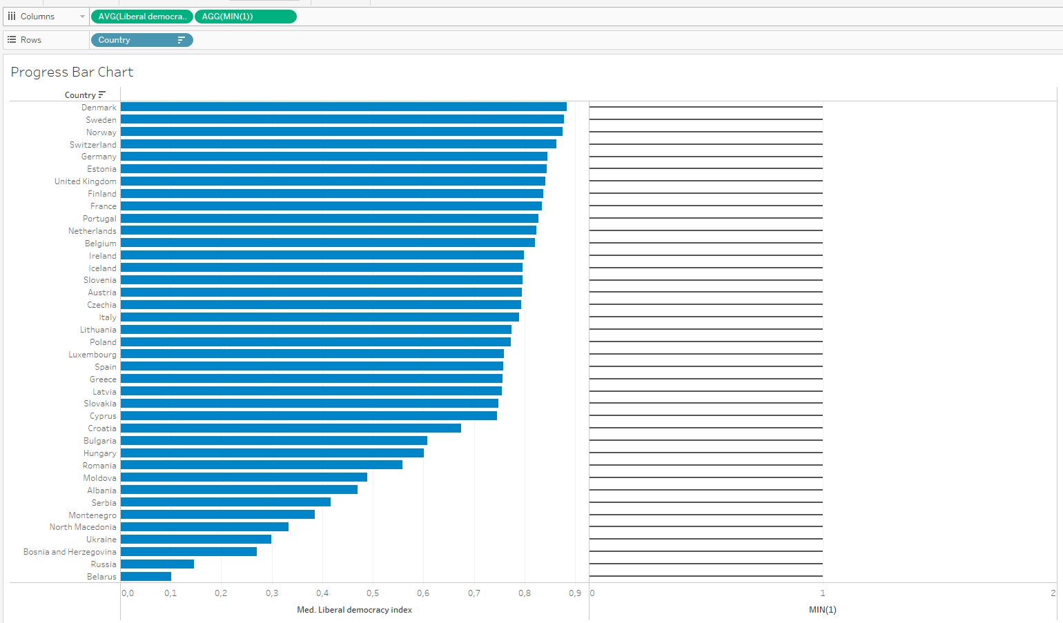
Add to the rows the calculation MIN(1) to obtain another marks card, increasing the flexibility in creating the chart, since the maximum value of the index is 1. Then, reduce the size of the bars created by MIN(1) by clicking on “size” and assign a color to this line.
After that, click on the second axis and select “dual axis” from the options, changing the mark type from automatic to bars. It’s important to remove “measure names” from all colors. Synchronize the axes by right-clicking on the second axis and selecting the “Synchronize Axis” option; choose “Move Marks to the Back” to prevent the second bar from covering the first and deselect “Show Header” on the second pill.
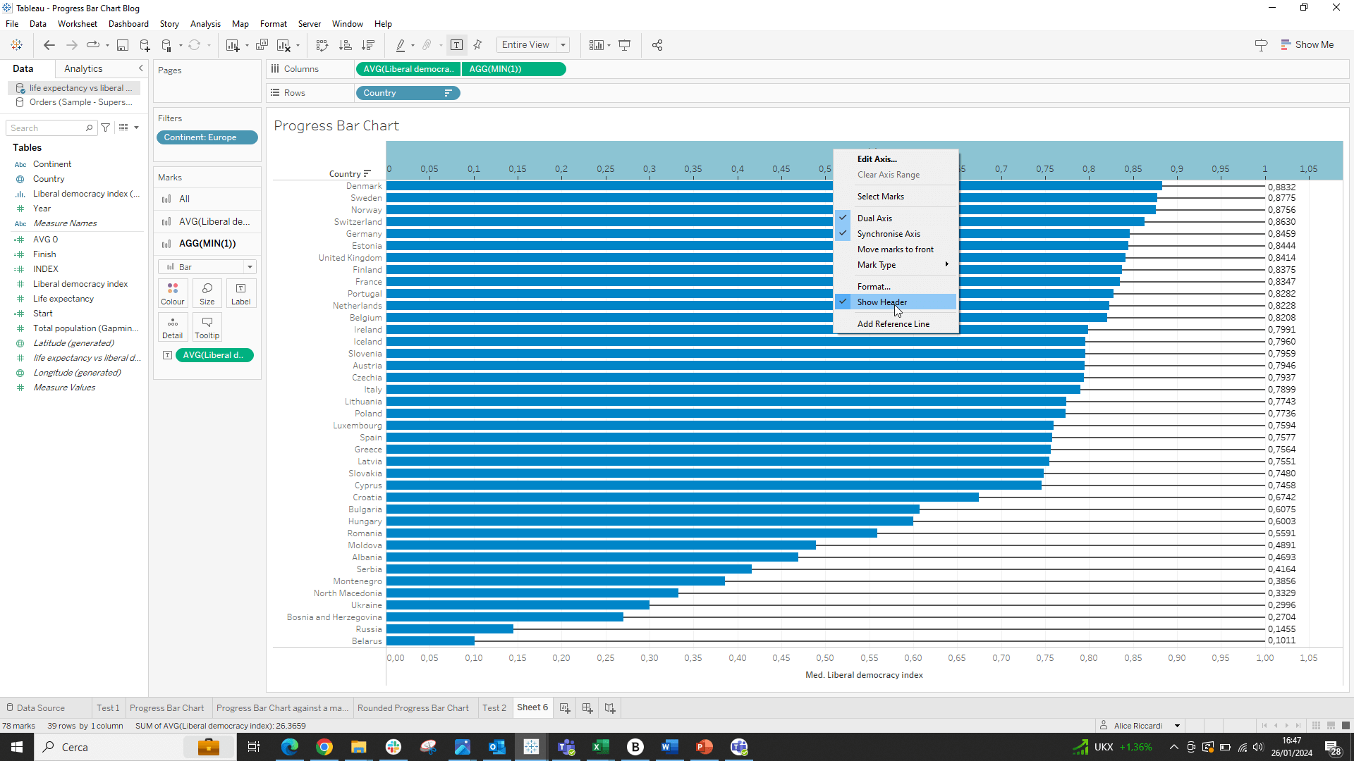
Finally, we can choose to add as text in the second pill the value of the first pill.
How to Build a Progress Bar Chart Comparing a Value with the Maximum Value in the Dataset?
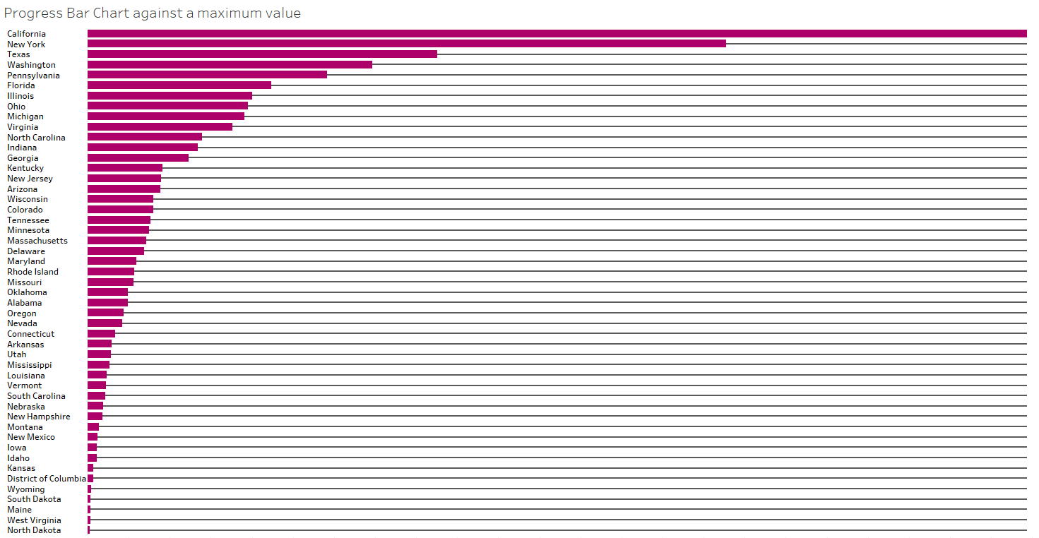
To build this Progress Bar Chart, I will use the Superstore dataset, aiming to analyze how sales in the US states compare to the highest sales value recorded by a state.
The construction of the chart will be similar to the previous one, with the only difference being the value to insert to create the second axis. To calculate the maximum value recorded by a state, we will use the window_max() function.
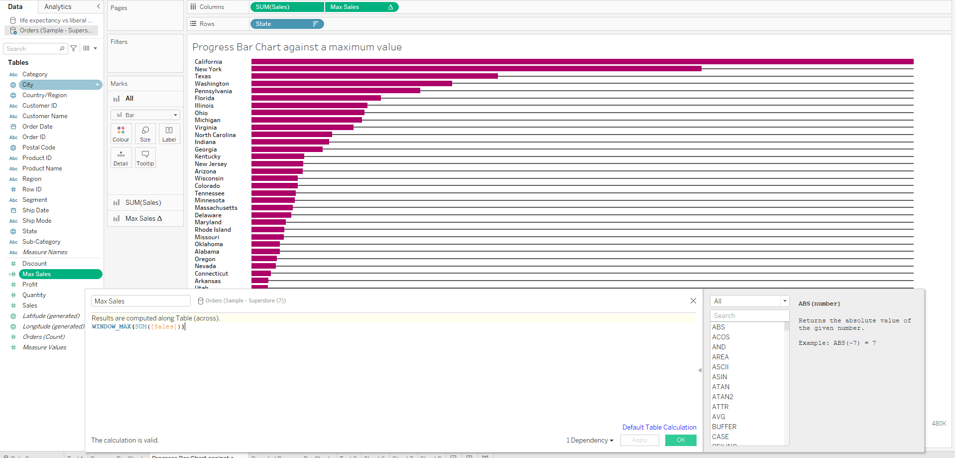
Here is the final result we will achieve:
How to Build a Rounded Progress Bar Chart?
The progress bar charts we have built so far are quite simple from an aesthetic point of view. It is possible to create a progress bar chart with rounded bars in Tableau. We will try to replicate the first chart we created, aiming to achieve this result:
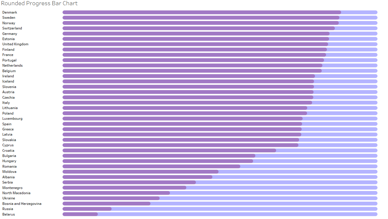
For a tutorial on how to build a Rounded Bar Chart in Tableau, read our article here.
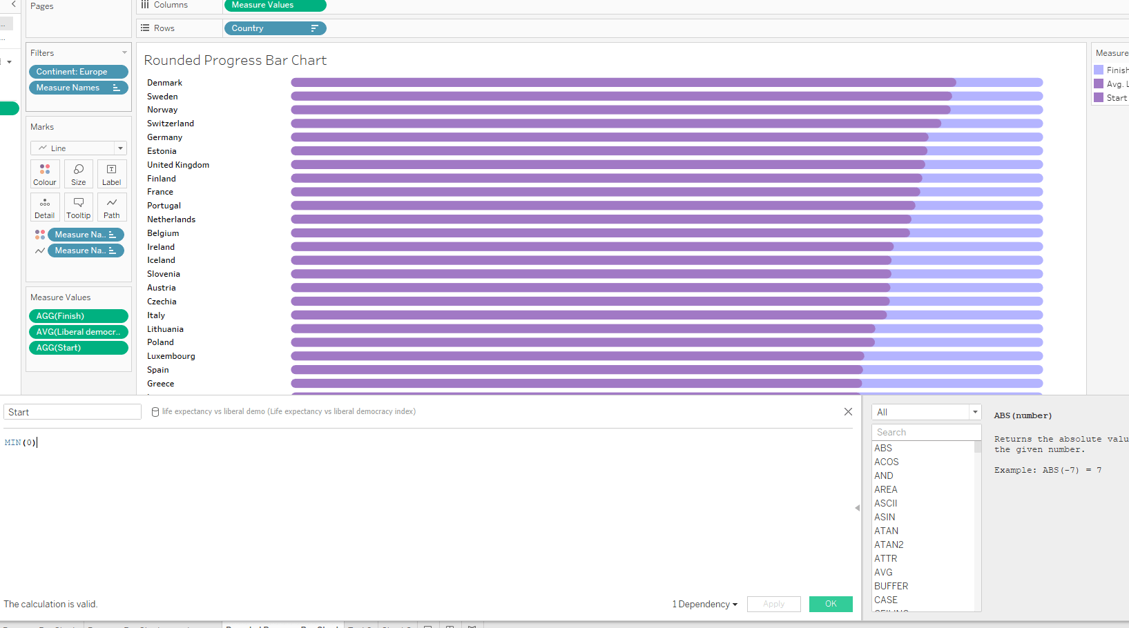
Let’s start by creating two calculations to define the start and the end. The calculation for “Start” is as follows:
The “End” field is calculated like this:
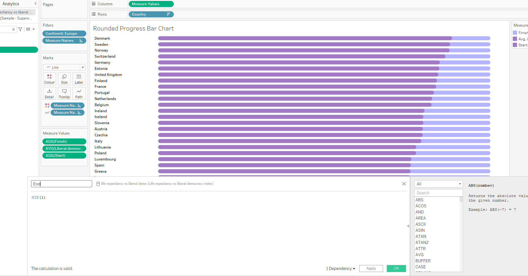
Now, we insert “Country” into the rows, adjusting the sorting, and “measure values” into the columns, which will include the fields AVG (Liberal Democracy Index), Start, and End. We change the mark type from automatic to line and insert “measure names” into the line path.
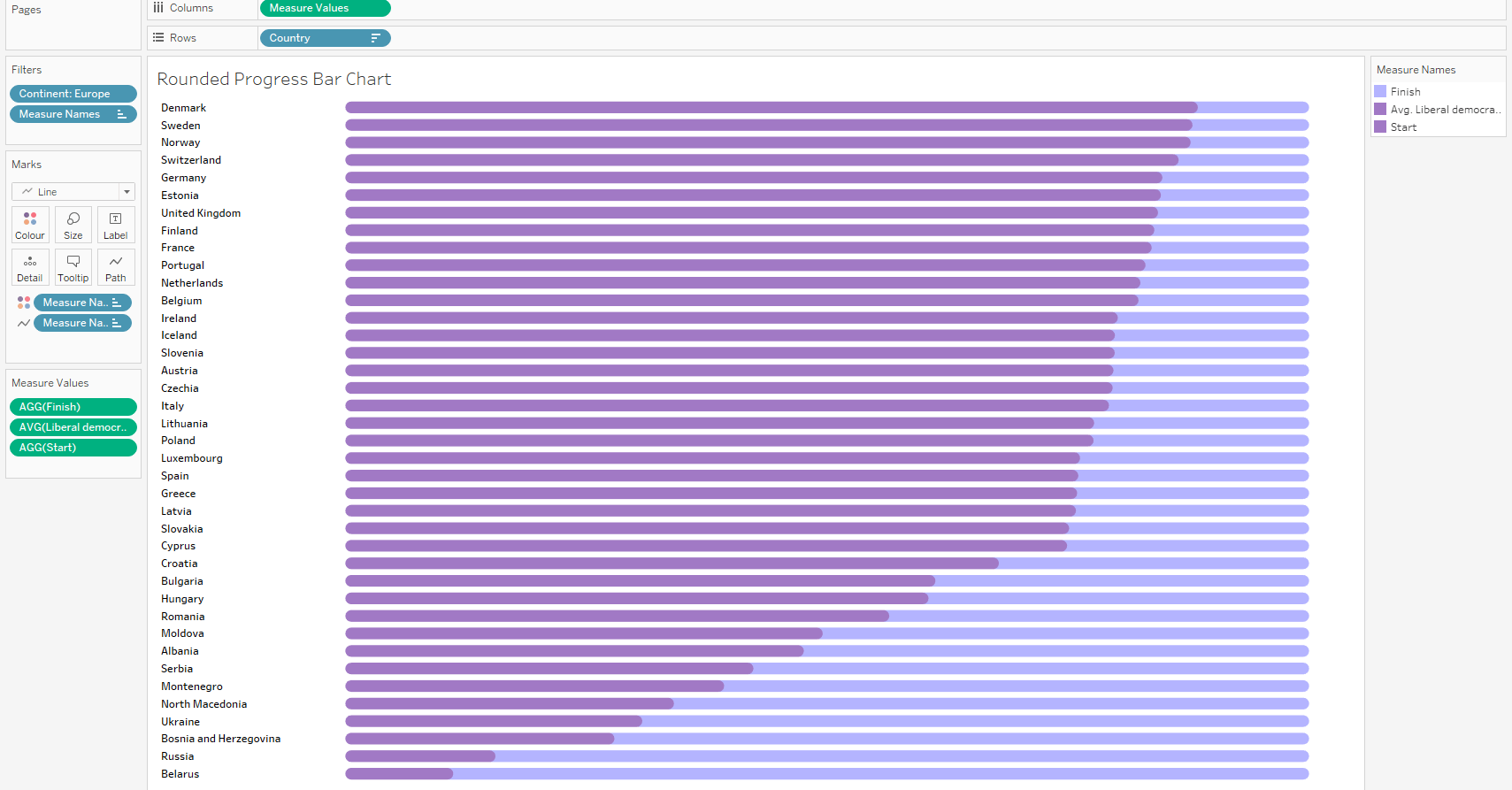
Next, we increase the size of the bars in “Size”. Ensure that the stacked mark option under the “Analysis” dropdown is turned off.
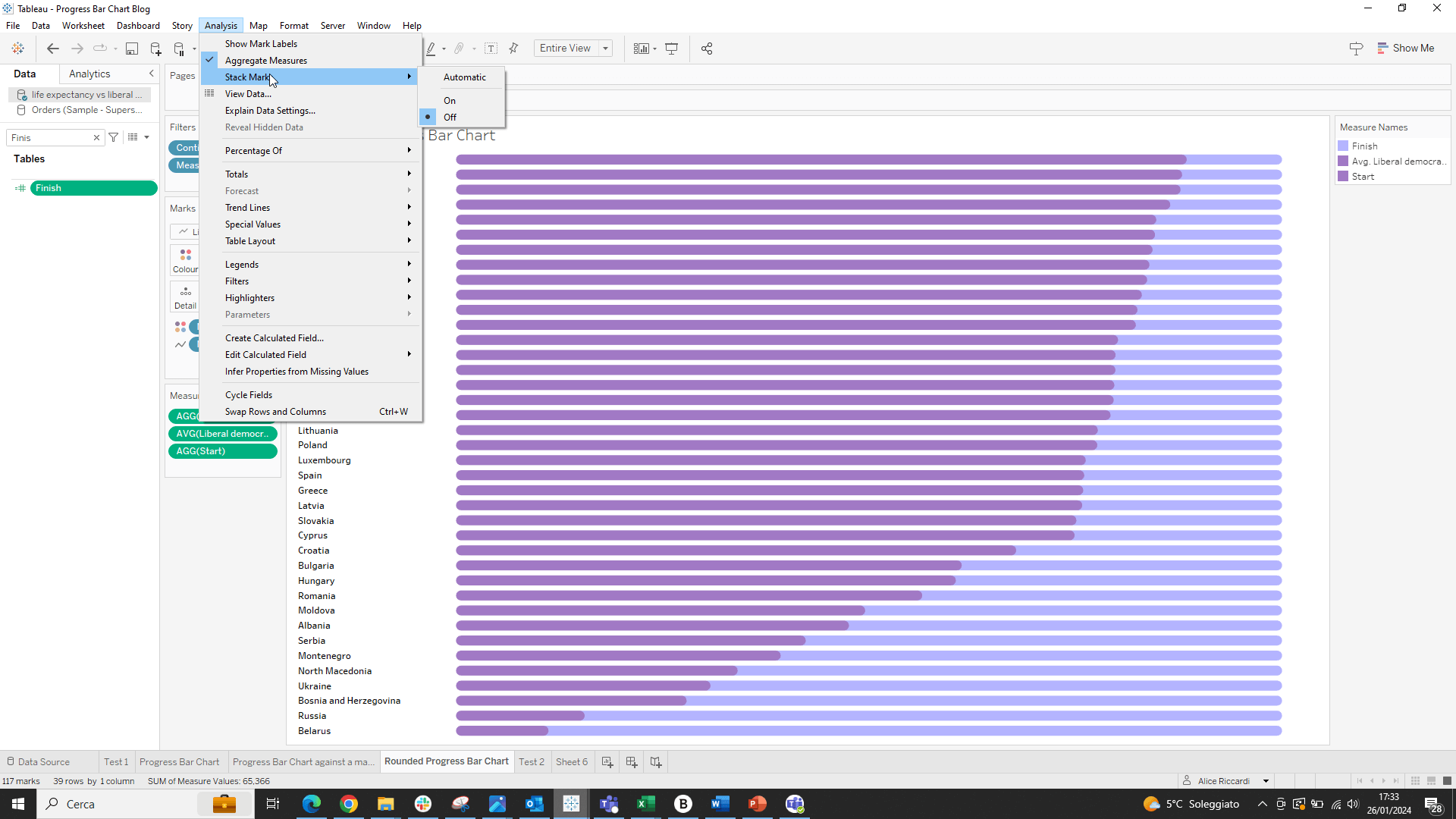
The fields in “measure values” should be ordered as follows: End, AVG(Liberal Democracy Index), Start.
Then, we bring “measure names” into the color card, setting the opacity to less than 100%. We assign the same color to both Start and Liberal Democracy Index and set the line type to “stepped”.
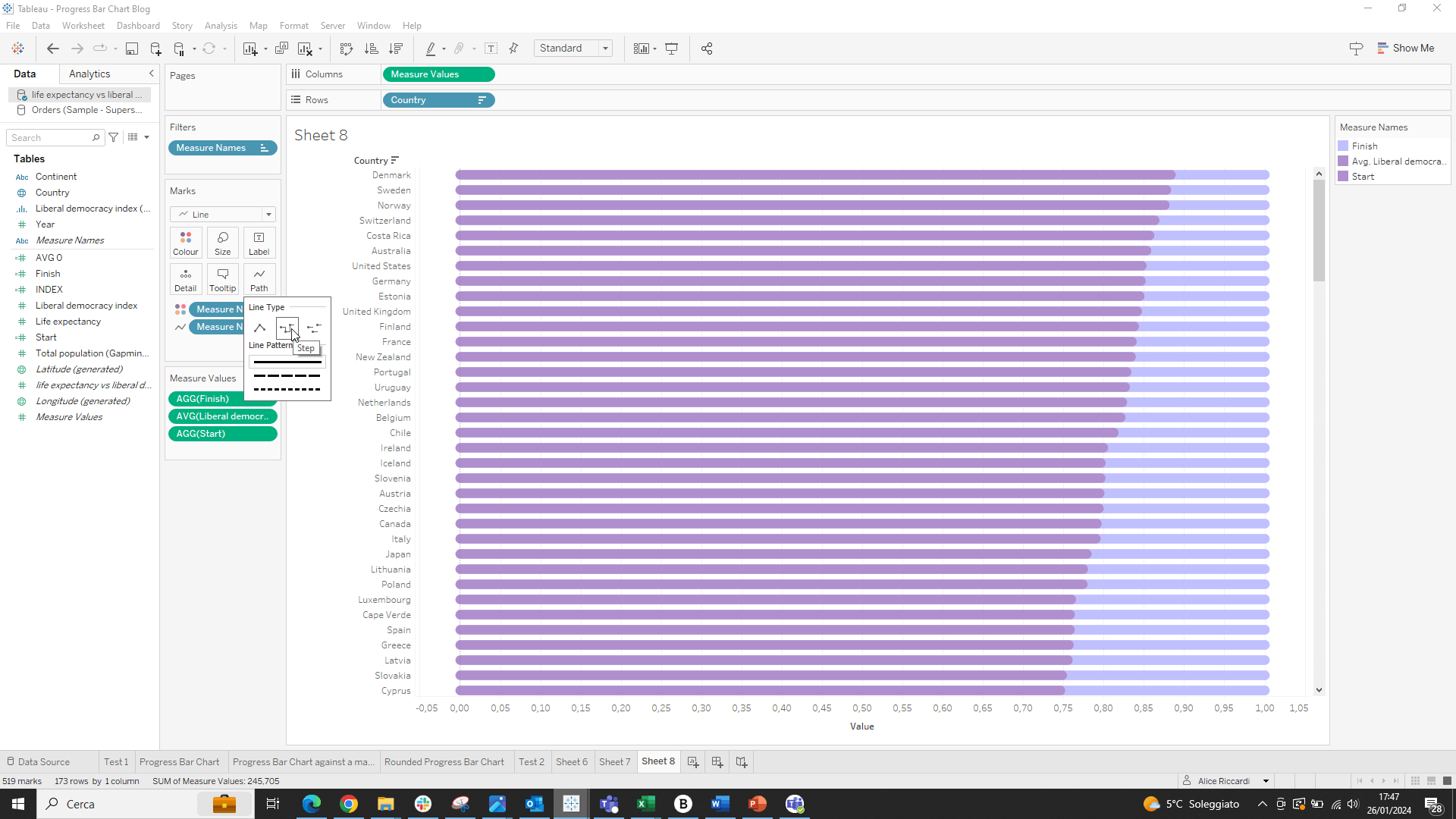
Thus, we will obtain our rounded progress bar chart without too much difficulty!
Conclusions
We have seen that creating a Progress Bar Chart in Tableau can be a simple and incredibly useful process for our visual analyses. These charts not only provide a clear and immediate representation of progress towards a goal, but they can also be aesthetically pleasing and easily customizable. To learn more, you can find other articles on our site, such as How to Make a Progress Bar Donut Chart in Tableau.
Read all our articles on Tableau
Do you want to discover the latest features or delve into certain functions to become an expert?

Visualitics Team
This article was written and edited by one of our consultants.
Sources:
How to Build a Progress Bar Chart in Tableau – www.sarahlovesdata.co.uk
How to create a progress bar chart in Tableau – www.rigordatasolutions.com
How to create a rounded bar chart in Tableau – www.visualitics.it
Rounded Progress Bar Tutorial – www.tableau.toanhoang.com
Tableau: Rounded Progress Bar Chart – www.linkedin.com
Share now on your social channels or via email: