The scatter plot, or scatter graph, is one of the most commonly used tools as it allows for analyzing relationships between two numerical variables.
In this article, we’ll walk you through a few simple steps to create a scatter plot and its variations in Tableau.
How to Build a Simple Scatterplot in Tableau
First, connect to the Superstore data source provided by Tableau. Then, select the two measures you want to analyze — in this example, we’ll use Profit and Sales. Drag Sales to rows and Profit to columns. Add Customer Name to detail and Quantity to color.
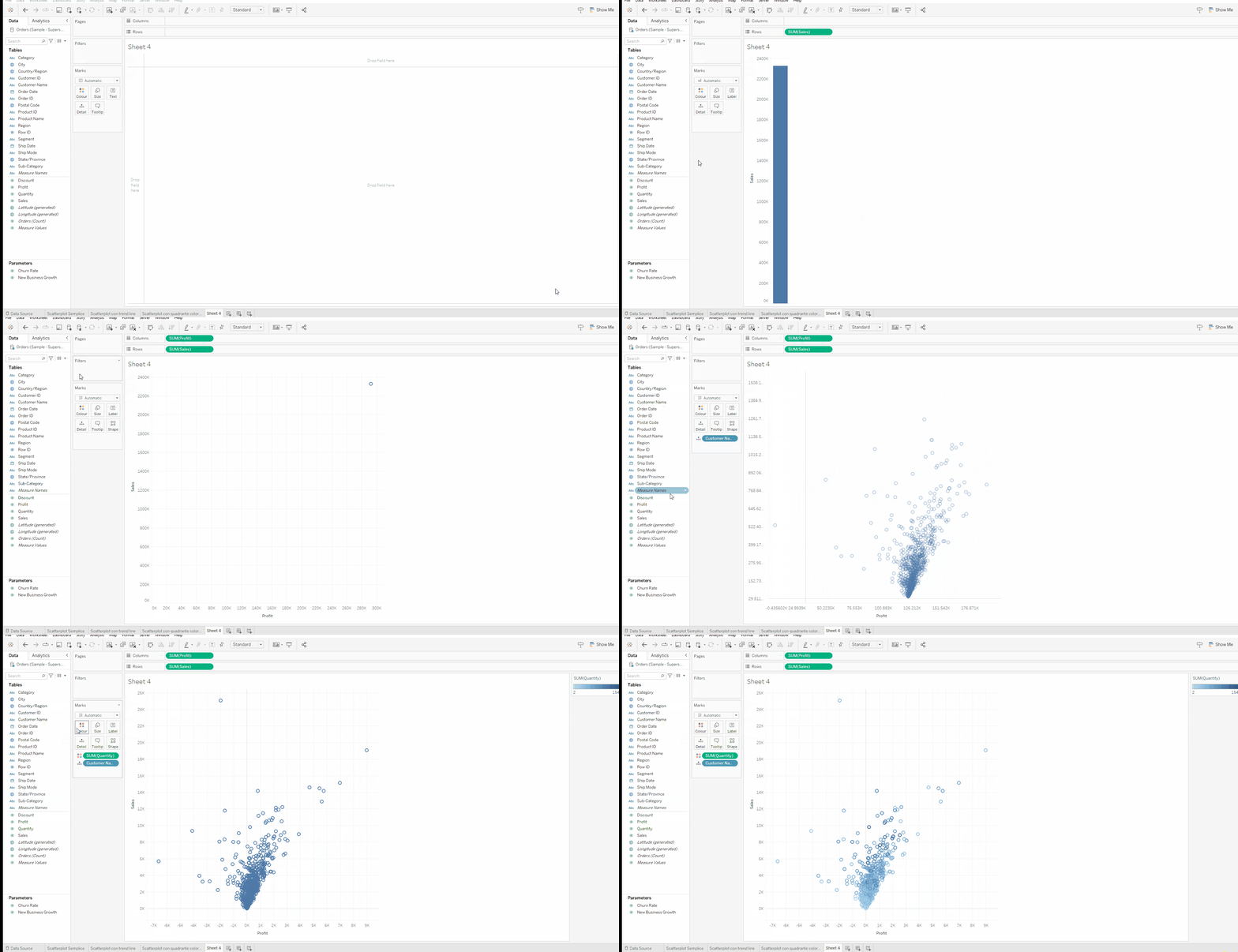
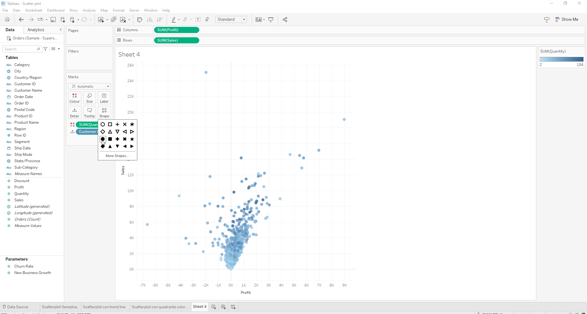
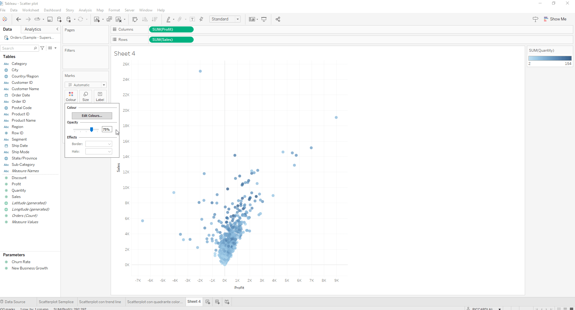
To make the chart more visually appealing, change the shape in the Marks Card to a circle and reduce the opacity slightly.
How to Create a Scatterplot with a Trend Line in Tableau
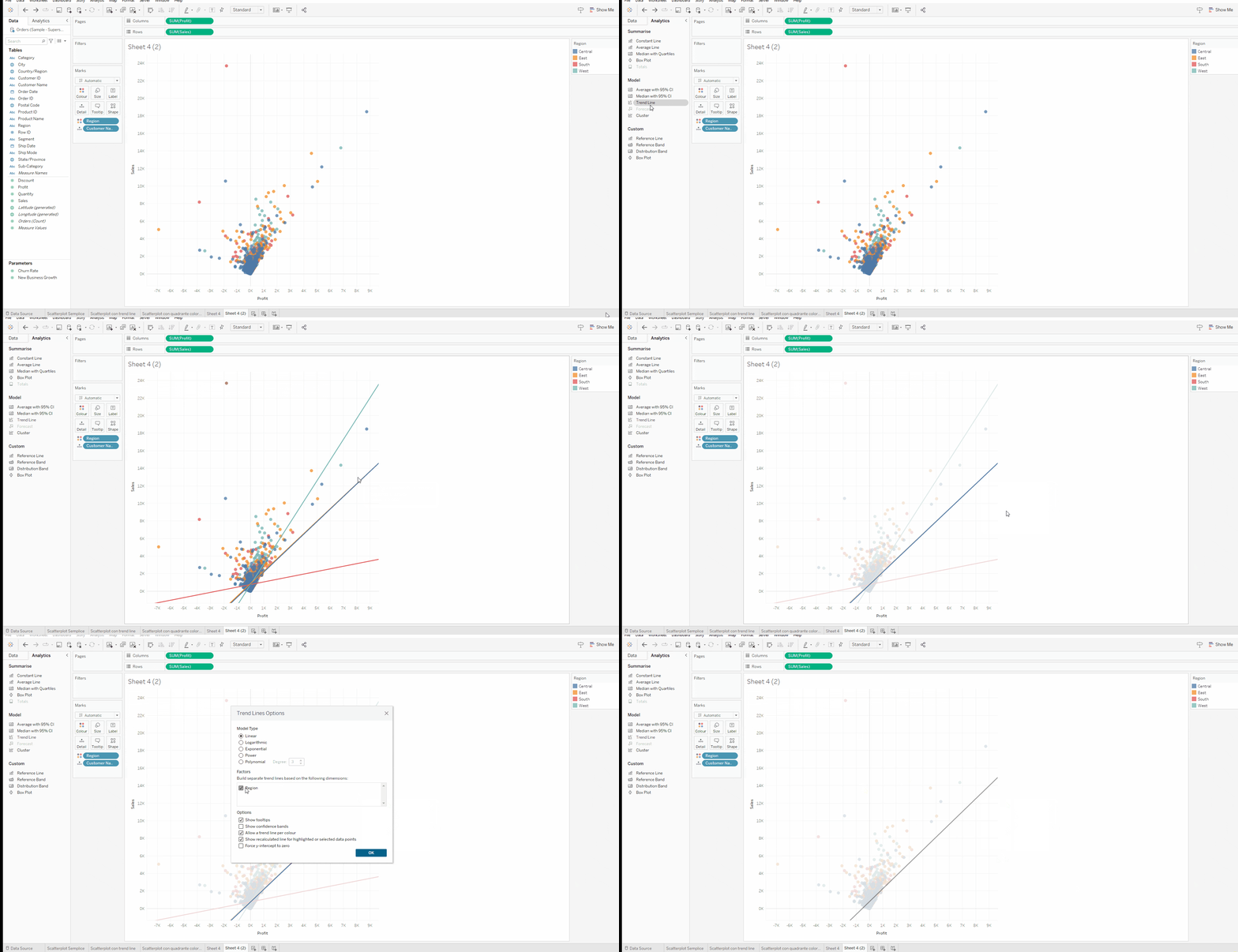
Duplicate the scatter plot sheet you just created, remove Quantity from color, and replace it with Region. In the Analytics panel on the top left, drag a trend line into the sheet and select the Linear option. Right-click on the trend line and deselect Region to remove it.
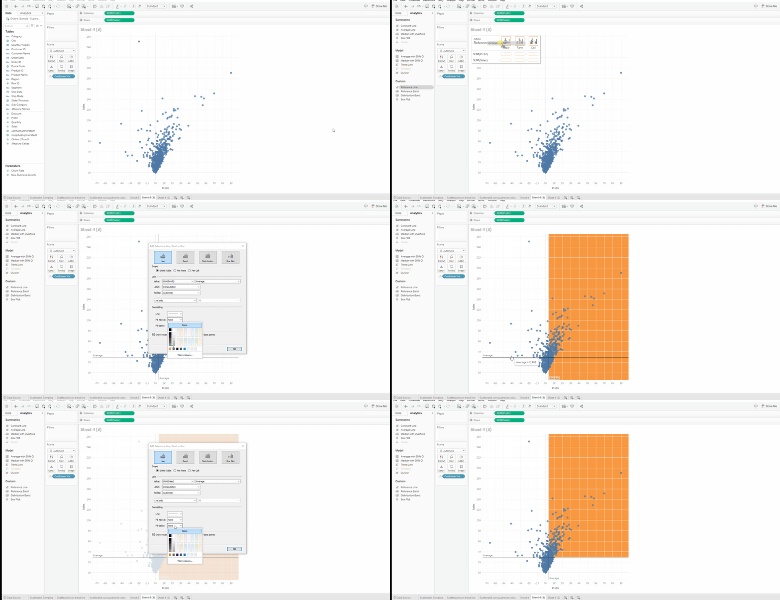
How to Create a Scatterplot with a Colored Quadrant in Tableau
Make a copy of the sheet with the initial scatter plot and use it as the starting point. Remove Quantity from colors and, from the Analytics panel, drag a Reference Line onto the table. Right-click on the reference line and add a color to Fill Above. This highlights the quadrant that contains customers above average for both profit and sales.
Read all our articles on Tableau
Do you want to discover the latest features or delve into certain functions to become an expert?
Visualitics Team
This article was written and edited by one of our consultants.
Share now on your social channels or via email: