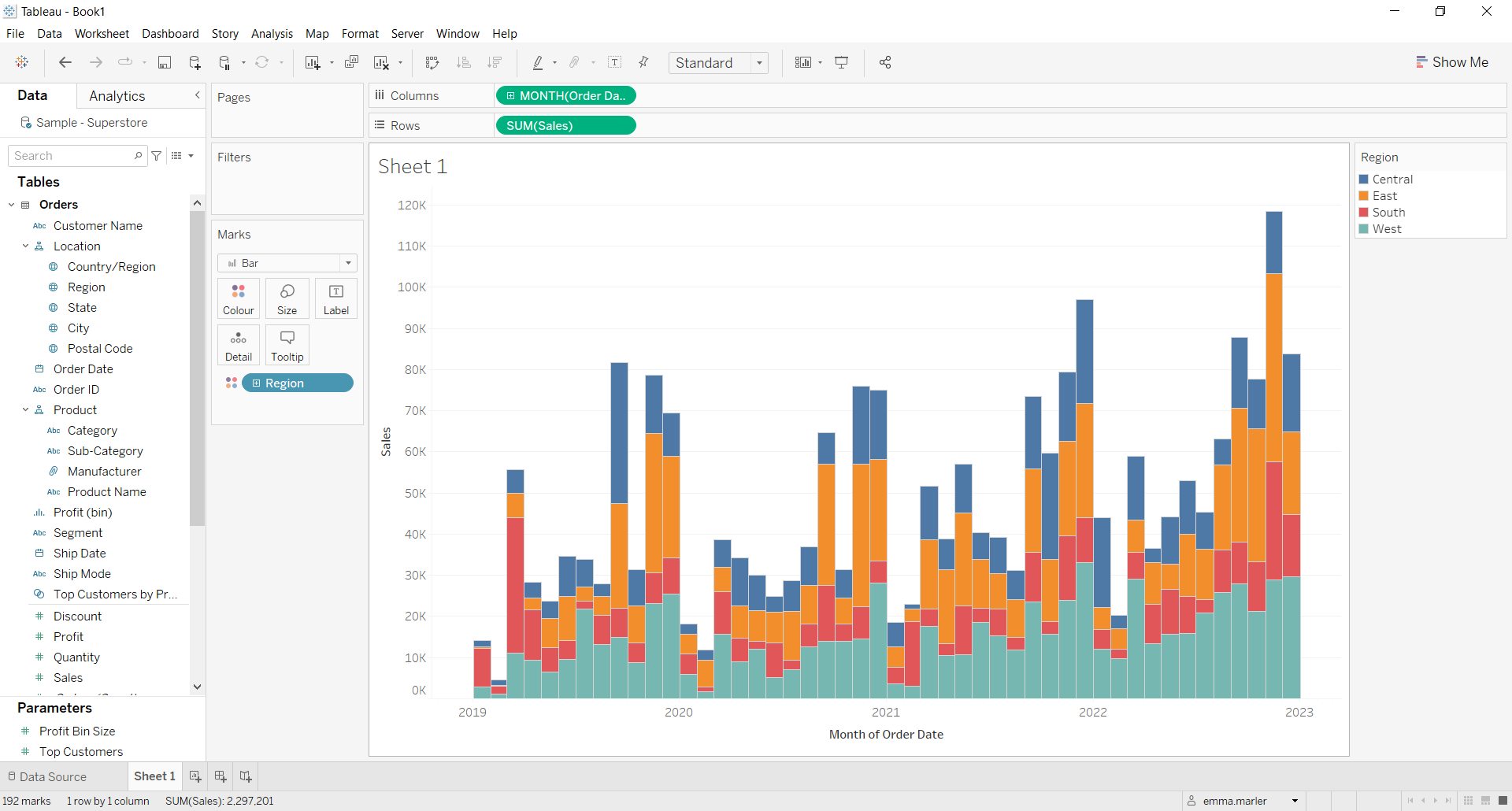
A stacked bar chart is an extension of the standard bar chart. In a stacked bar chart each bar contains information of an additional categorical variable. It is useful when we want to see and compare the composition of the primary bars based on the levels of a second categorical/qualitative variable.
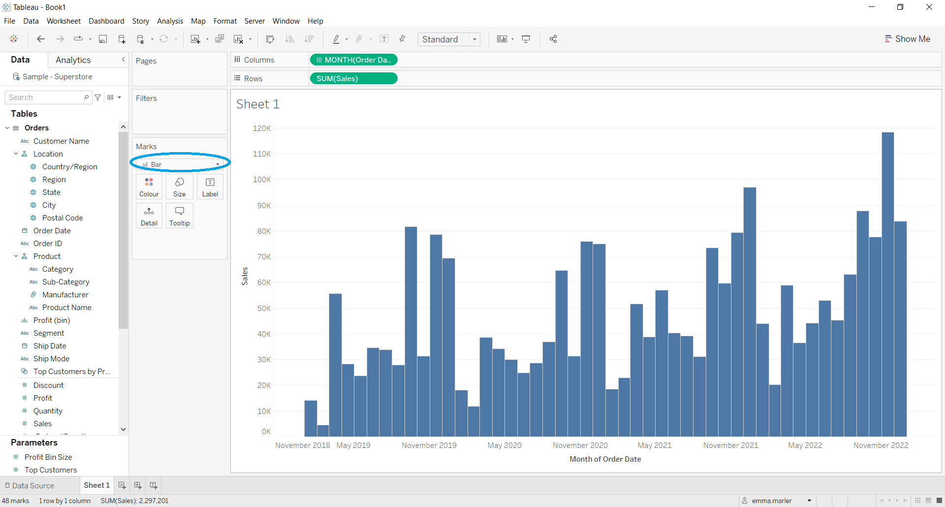
Let’s now see how to build step-by-step a stacked bar chart on Tableau. Our goal is to create a chart showing sales for each month of the selected years and by region from Sample Superstore data.
Step 1. Create a bar chart
- Connect to the data source Sample – Superstore.
- Drag Order Date to the Columns, then right click on Order Date on Columns and select the option Month May 2015.
- Drag Sales to Rows. Tableau will automatically create a line chart.

- Select Bar in the dropdown list in the Marks card as shown by the blue circle.

Now you’ll have a classic bar chart that we can edit further.
Step 2. Create a stacked bar chart
- Drag the dimension Region (under Location) on Color in the Marks card.

Don’t wait! Contact us to learn more and continue to follow upcoming news on our website and LinkedIn channel.