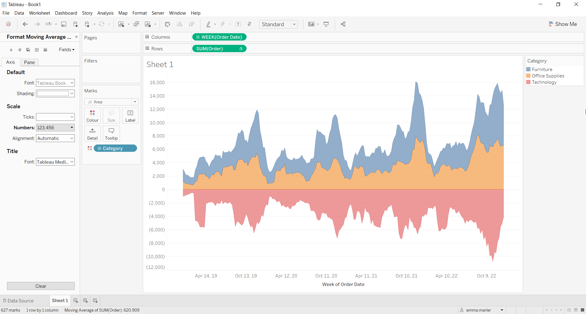
Stream graphs are often used to show changes of different categories over time. The height of each individual stream shape shows how the value of that stream has changed over time. The length of the stream shape shows its duration.
Let us then see how to build step-by-step a stream graph on Tableau.
Step 1. Create the chart
- Connect to the data source Sample Superstore.
- Drag Order Date on Columns. Right click on it and select Week number Week 5 2015.
- Create a Calculated field. Let’s call it “Order” and type:
CASE [Category]
when “Furniture” then [Sales]
when “Office Supplies” then [Sales]
else – [Sales]
END
- Drag the calculated field Order to Rows. You will get a line chart.
- Select Area from the Marks card.

- Drag Category on Color in the Marks card.
- Right click on Order in the Rows, select Quick table calculation > Moving average.
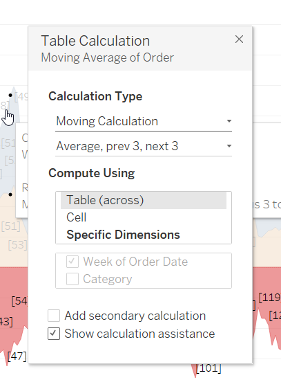
- Right click on Order in the Rows again, select Edit table calculation > and edit according to the image below.

- Right click on the y-axis, select Edit axis and delete the Title. This way just the numbers will remain on the axis.
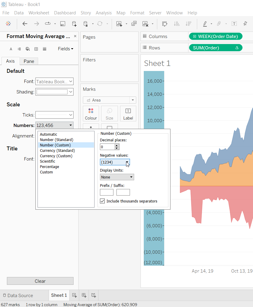
- Right click on the y-axis again, select Format > Scale > Numbers and then as the picture below shows.

- Done!

Don’t wait! Contact us to learn more and continue to follow upcoming news on our website and LinkedIn channel.