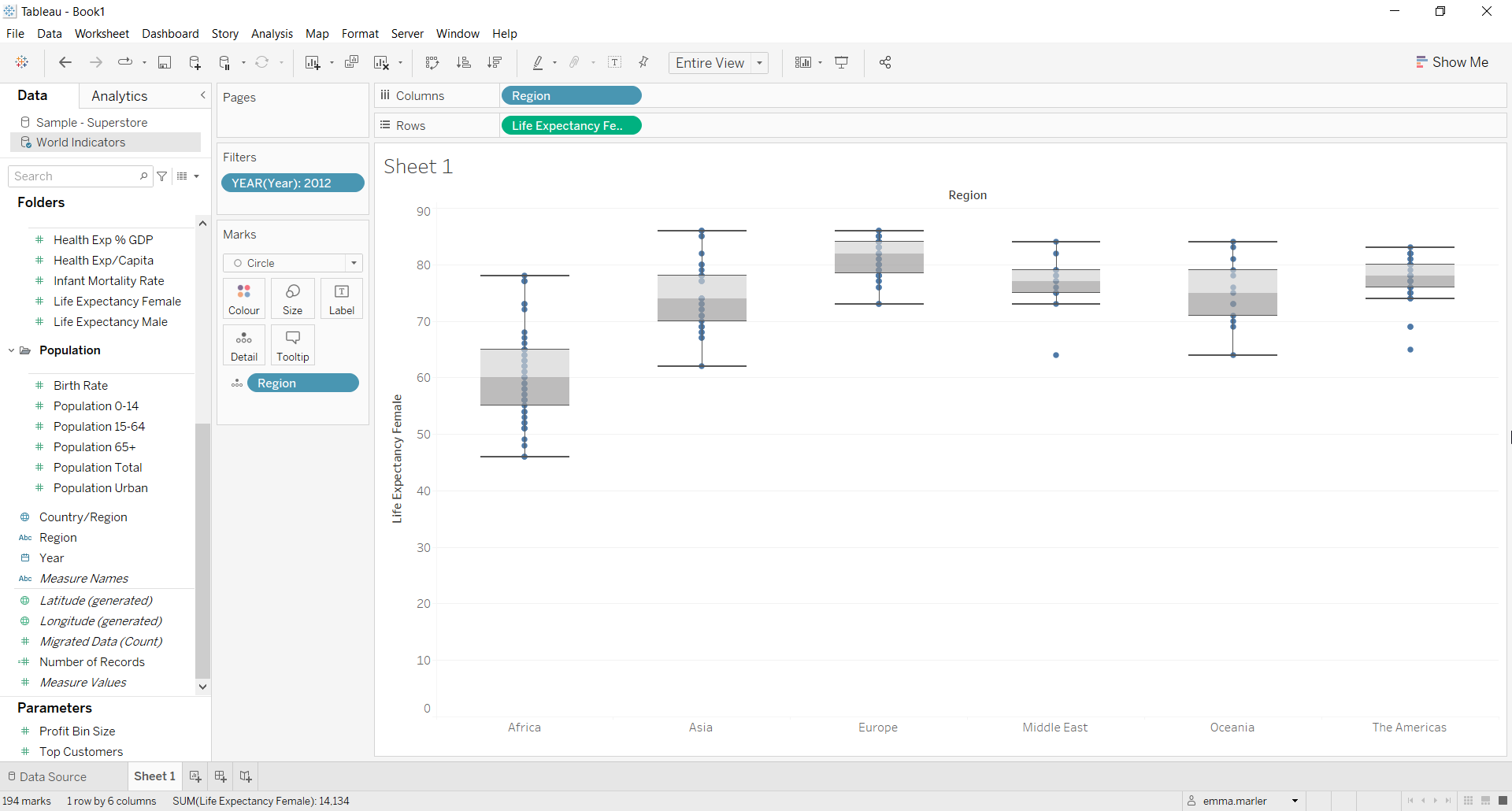
The box-plot (or box and whiskers plot) is a graphical representation of the values of a quantitative variable along an axis with respect to one or more dimensions. It is very useful for comparing the distribution of two or more groups of observations and highlighting any outliers.
It is a very effective visualization tool that allows you at a glance to understand how your data is distributed, and you can easily build it in Tableau.
Let’s now look at the different steps to build a box-plot on Tableau using the World Indicators dataset (available when installing Tableau Desktop), with which we will analyze the distribution of average female life expectancy for different geographic areas in a given year.
Step 1. Creating a box plot
- Connect to the data source World Indicators.
- Drag Region on Rows.
- Drag Life Expectancy Female on Rows as well. From the Show me tab select the box plot (as shown by blue circle).

- Click on Analysis at the top and select Aggregate meaures.
- Drag Region to Columns.

- Enter the Year field in Filter Cards and select a specific year (e.g., the last year in which the data was collected).
- Right click on the number of Nulls that appear on the view and select Hide indicator.
- Fit to Entire view. Done!

Don’t wait! Contact us to learn more and continue to follow upcoming news on our website and LinkedIn channel.