Donut Charts are certainly one of the most widely used visualization tools in data analysis. Although classic Pie Charts provide a reasonable sense of proportion, they often are limited tool when it comes to presenting a deeper level of detail.
For example, if we wanted to see the distribution (in percentage or absolute value) of sales among the various departments of a Company, the use of a simple Pie Chart would answer this question perfectly; but what if we wanted to incorporate information on overall sales into the same visualization? Here’s where Donut Charts turn out useful! These charts are built on a classic Pie Chart, but they incorporate a “blank” space in the center that can be used to show information at a higher level: in our case, total sales.
Let’s see then how to build a Donut Chart on Tableau step-by-step. Our goal is to create a chart showing sales by Segment for the Superstore. In addition, we would also like to display total sales at the center.
Step 1: Create a Pie Chart
Let’s start by creating a connection to the Sample – Superstore dataset, which can be found among Tableau’s Saved Data Sources. We then proceed to:
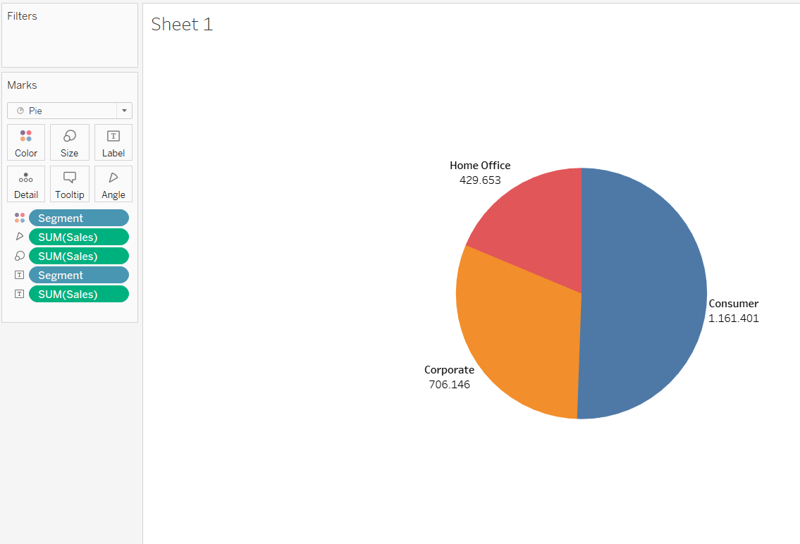
- Select the fields Segment and Sales in Tableau Desktop
- Select Pie Chart from the Show Me Tab, this way we will have:
- Segment on Color Mark
- Sales on Size Mark
- Then drag Sales and Segment on the label mark
Step 2: Create two Separate Marks
In the Row Shelf add two Pills AVG(0), simply by typing twice avg(0) and clicking Enter.

At this point, we should have two separate Marks on the Mark Card in order to handle the two graphic elements indipendently:
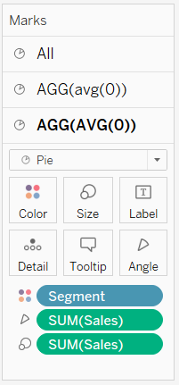
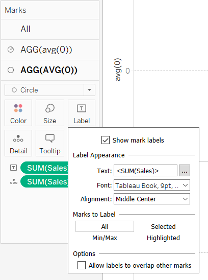
In the second Mark Card substitute the type of Mark from Pie to Circle. Remove all fields from the Marks and set a white color from the Color Mark. Reduce the Mark Size and drag the Sales field onto the Label Mark with “Middle Center” Alignment so that it is at the centre of the circle.
Step 3: Switch to a Dual Axis Chart
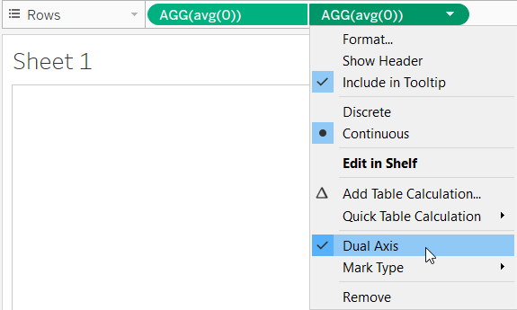
At this point create a Dual Axis Chart with a right-click on the second Pill AGG(AVG(0)) on the Row Shelf > Dual Axis.
Manage the size of the two objects independently and remove the zero line: right-click on View > Format > Format Lines > Zero Lines = NULL.
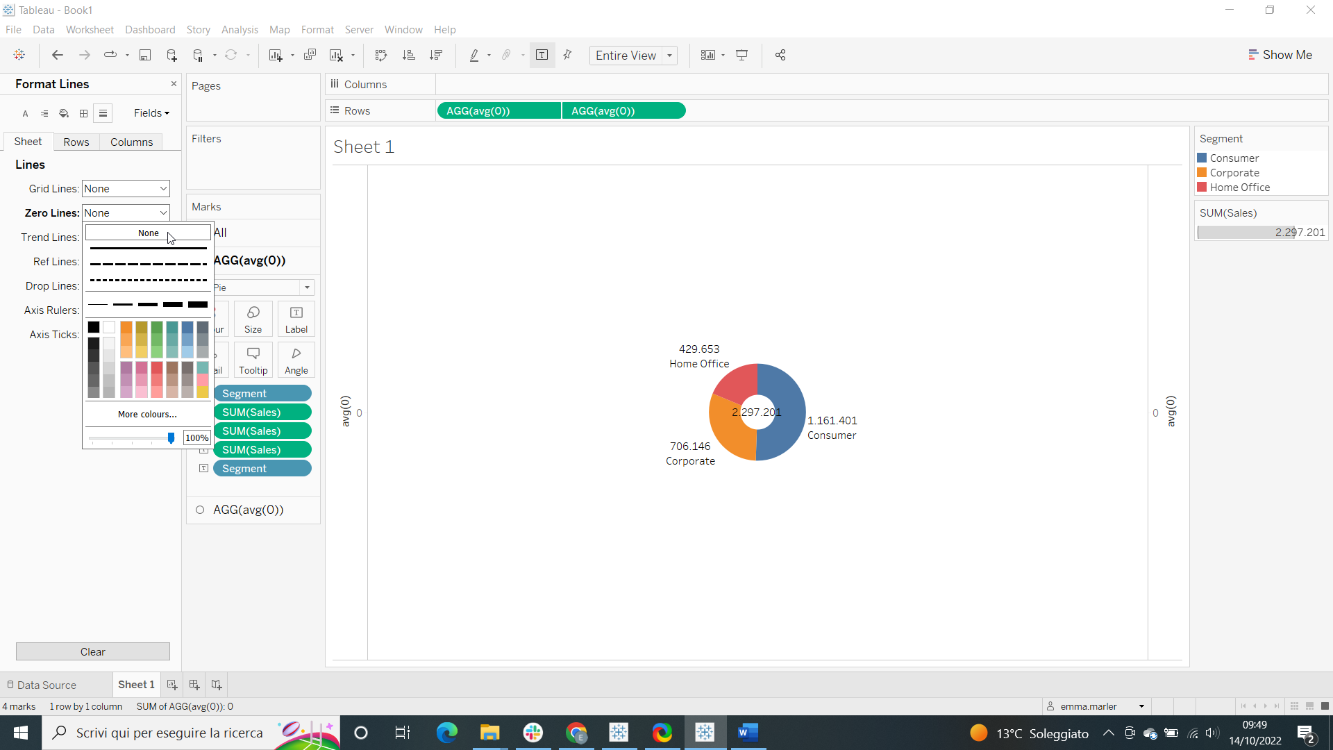
Your Donut Chart is ready and you can customize it as you prefer from the Marks Card!
Don’t wait! Contact us to learn more and continue to follow upcoming news on our website and LinkedIn channel.