Imagine walking into a restaurant: your overall experience is not just about the taste of the food but also about the welcome you receive, how easily you find a table, and the clarity of the menu. UX (User Experience) focuses on this entire journey, while UI (User Interface) is the visual appeal of the dish served—the plating, colors, and arrangement of the food. In a digital product, both must work in harmony to deliver a seamless and enjoyable user experience.
In this article, you’ll explore the differences between UX and UI design, their distinct characteristics, and how they come together in the design of a dashboard.
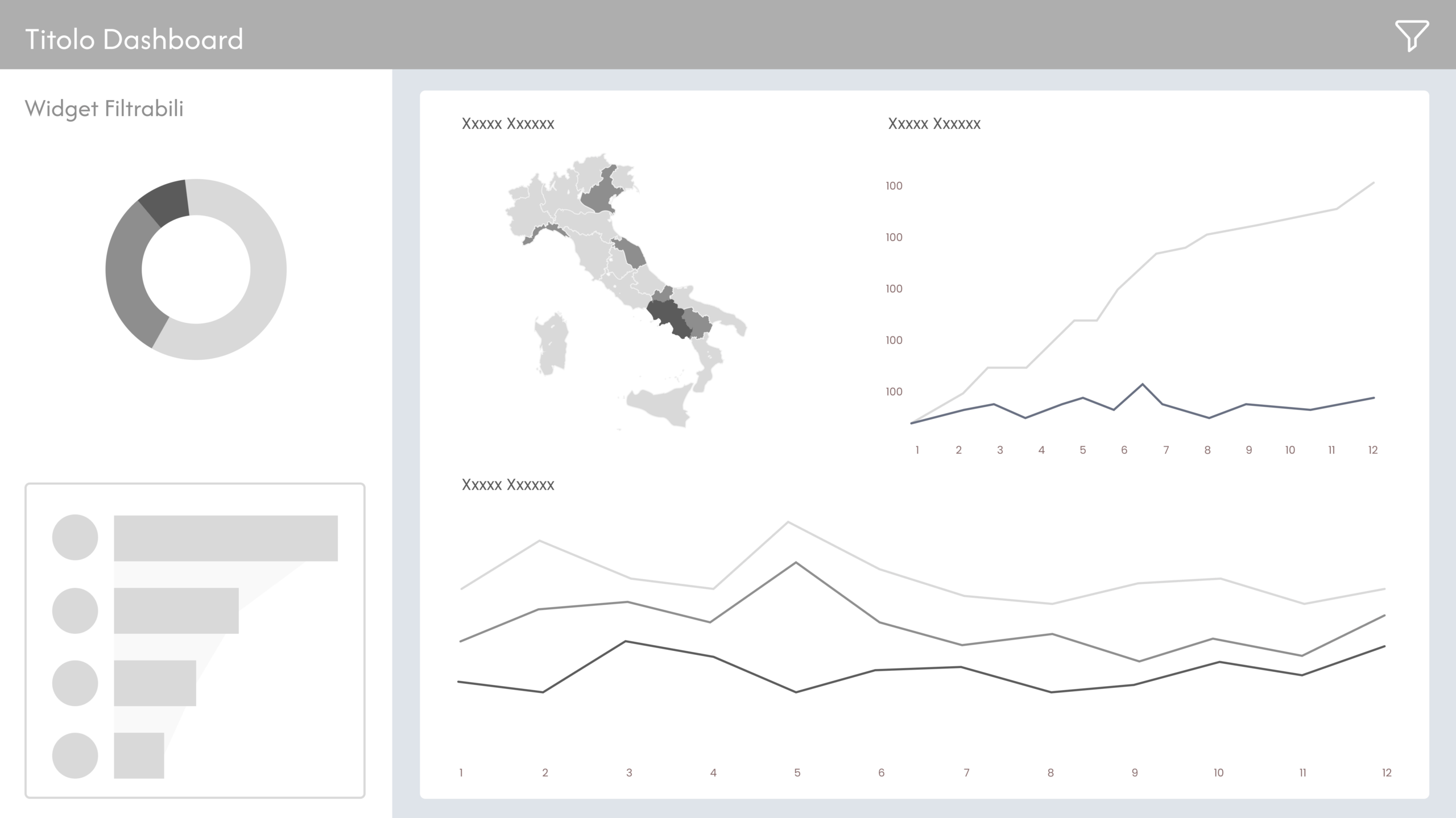
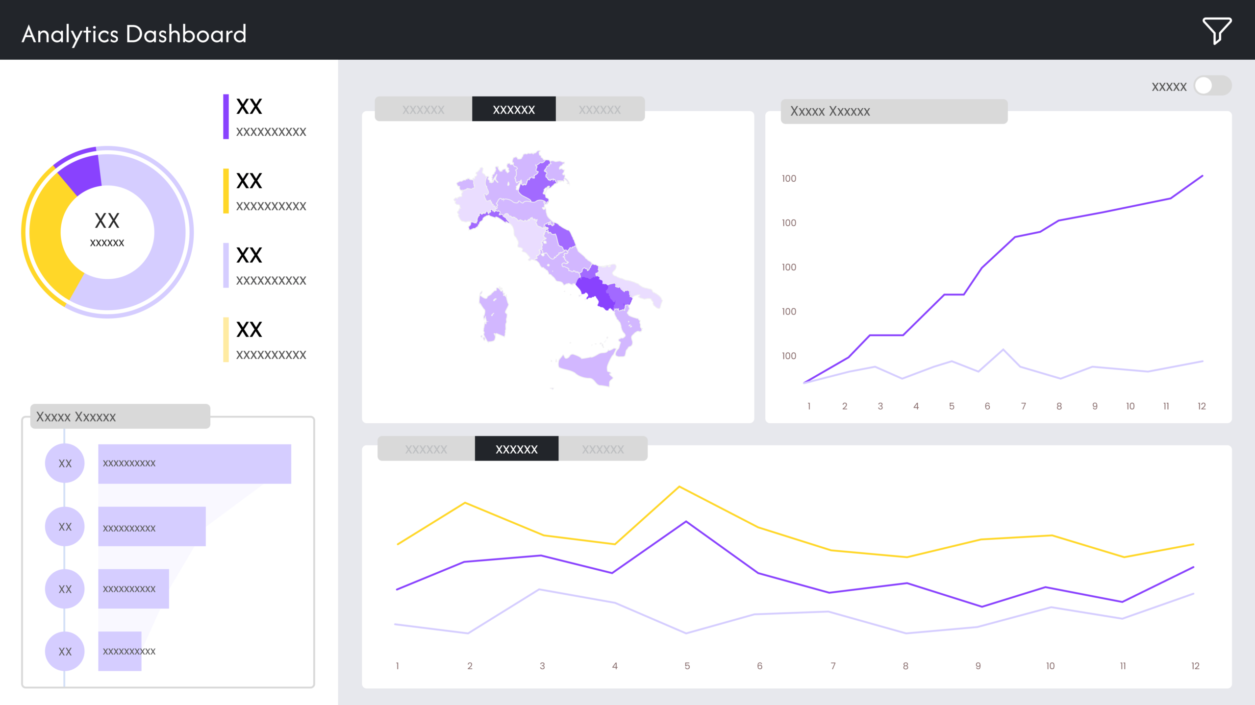
UX & UI in Dashboard Design
In the specific case of dashboards, UX and UI must work together to ensure that data is presented clearly and comprehensibly. UX and UI are complementary disciplines that come into play at different stages—at the beginning and the end of the design process.
- UX structures information according to the user’s logic, defining the layout in which the dashboard will be read and the overall information architecture.
- UI translates this structure into a visually clear and engaging interface, using colors, typography, spacing, and interactions to enhance the user experience.
Le 5 fasi della progettazione UX
1. User Research
To design an effective dashboard, it is essential to understand the audience’s needs from the very beginning. User research helps identify the fundamental requirements of the target audience. UX Designers use tools such as user personas—representations of ‘typical users’ based on real research and data—and user journeys, which are maps that illustrate how users interact with a product or service. These tools help analyze touchpoints, emotions, and obstacles users encounter, which are crucial for optimizing the overall experience.
2. Information Architecture
Once user needs are understood, the next step is to define the product’s structure. Information architecture is used to logically organize content, ensuring a clear and meaningful hierarchy.
3. Wireframes and Prototypes
This phase involves creating wireframes and interactive prototypes, allowing designers to test the design and gather feedback before final development. Low-fidelity mockups of dashboards are often created at this stage to assess whether the designed structure aligns with the intended content hierarchy.
4. Usability Testing
Prototypes are particularly useful as they undergo usability testing to identify any obstacles in the user experience. If issues arise or certain elements prove too complex, the design is iterated and improved accordingly.
5. Continuous Optimization
Even after a product is launched, UX work does not stop. User feedback plays a key role in continuously improving the overall experience.
UI in Digital Design
If UX defines the “what” and “why” of a product, UI focuses on the “how.” An effective interface must ensure visual consistency through:
- Clear layout and visual hierarchy: every element should be strategically positioned to guide the user’s attention. The content hierarchy should translate into a visual hierarchy. If certain data is more important than others, it should stand out—perhaps by placing it in the foreground—so that it becomes the first piece of information the user sees and reads.
- Colours and typography: the colour palette and fonts should be chosen to ensure readability, accessibility, and alignment with the brand’s identity.
- Interactive elements: buttons, menus, tooltips, and animations enhance navigation and make the design more intuitive.
- High-fidelity prototypes: while UX designers work on low-fidelity wireframes, UI designers transform these structures into realistic mockups, refining all visual and interactive details. At this stage, the prototype will closely resemble the final product that will later be developed.
As Steve Jobs famously said:
“Good design is not just about how it looks, but how it works.”
Designing a digital product means balancing functionality and aesthetics, strategy and visual design, UX and UI.
Read all our articles on Data Visualization
Would you like to learn more about Data Viz and view the world through data?
Visualitics Team
This article was written and edited by one of our consultants.
Share now on your social channels or via email: